
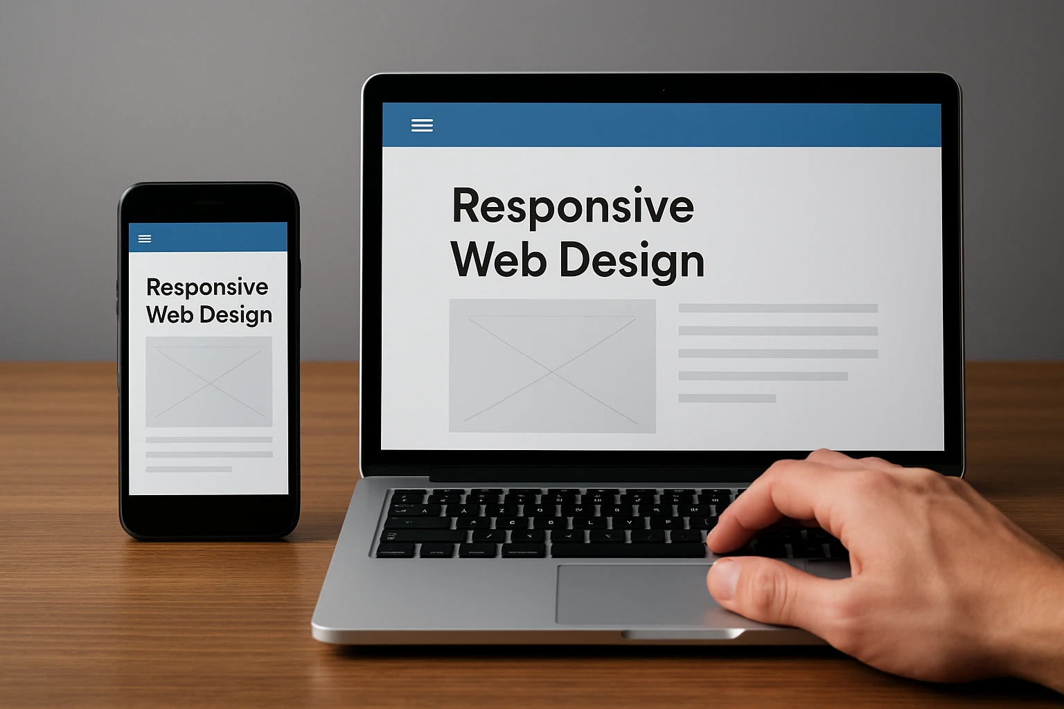
If your website still pinches on a phone or sprawls on a widescreen, this guide is your shortcut to modern, responsive web-design that actually converts. In plain English, we are talking about layouts that flex elegantly across screens, boost Core Web Vitals, and play nicely with search. Whether you are revamping a corporate site, scaling an online store, or launching a startup landing page, these tools help you move faster with fewer surprises. And because Internetzone I pairs Web Design (mobile responsive, SEO (Search Engine Optimization)-focused) with National and Local SEO (Search Engine Optimization), eCommerce Solutions, Reputation Management, Adwords-Certified PPC (Pay-Per-Click) Services, and Managed Web Services, you will also see where each tool fits into a growth stack.
Here is the promise. You will get clear selection criteria, a concise comparison table, and 10 vetted picks with use cases so you do not waste weeks testing. Along the way, I will share field notes from projects where a simple switch, like adopting utility classes or adding a device lab, cut delivery time by 25 percent. With mobile now responsible for well over half of global traffic according to multiple analytics benchmarks, the right stack is not a nice-to-have. It is your edge.
Selection Criteria for Responsive Web-Design Tools
Choosing tools is a little like picking hiking gear. You need the right fit for your terrain and the confidence that it will not fail when the weather shifts. For this roundup, I scored each tool on mobile responsiveness, performance impact, accessibility, maintainability, ecosystem strength, and learning curve. I also weighed integration with common stacks, like WordPress as a CMS (Content Management System), React for interactive UI (User Interface) work, and analytics or testing platforms. Finally, I considered licensing and pricing, because predictable costs matter when you are planning a year of releases or working across many brands.
- Mobile fidelity: Fluid grids, modern units like clamp, and reliable media queries in CSS (Cascading Style Sheets).
- Performance: Support for lean bundles, image optimization workflows, and Core Web Vitals such as Largest Contentful Paint and Cumulative Layout Shift, with the acronyms LCP (Largest Contentful Paint) and CLS (Cumulative Layout Shift) expanded here for clarity.
- Accessibility: Semantic patterns, ARIA (Accessible Rich Internet Applications) support, and keyboard navigation out of the box.
- Maintainability: Scalable theming, component reuse, and sane naming that future teams can understand.
- Ecosystem: Plugins, templates, and active communities to avoid vendor lock-in.
- Testing: Built-in or easy pairing with device emulators and live device clouds.
At-a-Glance Comparison
| Tool | Type | Learning Curve | Pricing | Standout Strength | Best For |
|---|---|---|---|---|---|
| Bootstrap 5 | CSS (Cascading Style Sheets) framework | Low | Free | Battle-tested grid and components | Speedy rollouts with consistency |
| Tailwind CSS (Cascading Style Sheets) | Utility-first CSS (Cascading Style Sheets) | Medium | Free | Design system precision and small bundles | Custom brand systems |
| Webflow | No-code builder | Low | Subscription | Design to production visuals | Marketing teams and rapid tests |
| Figma | Design and prototyping | Low | Freemium | Auto Layout and constraints | Cross-team collaboration |
| Framer Sites | Visual site builder | Low | Subscription | Performance-focused publishing | Landing pages and product sites |
| Material UI (User Interface) for React | React component library | Medium | Freemium | Accessible, responsive components | App-like sites |
| Responsively App | Multi-device preview | Low | Free | Side-by-side device views | Daily responsive checks |
| Chrome DevTools Device Mode + Lighthouse | Browser tools | Low | Free | Debugging and audits | Performance and layout fixes |
| BrowserStack Live | Cloud device testing | Low | Subscription | Real devices and browsers | Release validation |
| WordPress Block Themes | CMS (Content Management System) theming | Low | Freemium | Pattern-driven layout control | Content-heavy sites |
Watch This Helpful Video
To help you better understand responsive web-design, we’ve included this informative video from Sajid. It provides valuable insights and visual demonstrations that complement the written content.
Responsive Web-Design Selection Criteria in Action
Numbers make this practical. Google researchers have reported that as page load time moves from one to three seconds, the probability of bounce increases significantly, which is why tools with lean outputs win. Deloitte studies have linked performance improvements to conversion lifts in retail and travel, so I flagged solutions that encourage modern CSS (Cascading Style Sheets) like container queries and efficient JavaScript (JS) bundles. Accessibility affects both users and rankings, so systems with semantic components and ARIA (Accessible Rich Internet Applications) patterns scored higher. Finally, integration with SEO (Search Engine Optimization) workflows matters at Internetzone I, because search intent, site architecture, and metadata influence how we structure navigation and components from day one.
#1 Bootstrap 5
Bootstrap 5 remains a reliable foundation when you need consistent spacing, a responsive grid, and accessible components that behave across browsers. Its layout utilities make it simple to refactor legacy HTML (HyperText Markup Language) and CSS (Cascading Style Sheets) into fluid columns with sensible breakpoints, so teams can sprint without bikeshedding class names. I have used Bootstrap in enterprise redesigns where multiple departments touched the code, and the shared vocabulary reduced merge conflicts and sped up QA by a surprising margin. Pair it with Lighthouse in Chrome DevTools to watch metrics like LCP (Largest Contentful Paint) and CLS (Cumulative Layout Shift) stabilize as you standardize patterns and remove custom one-offs.
Best for: Companies that want dependable, responsive components with minimal setup.
- Standout features: Mature grid, forms, navbars, and accessibility templates with ARIA (Accessible Rich Internet Applications) guidance.
- Works with build tools to purge unused CSS (Cascading Style Sheets) for smaller payloads.
- Great docs and community patterns for common layouts.
#2 Tailwind CSS (Cascading Style Sheets)
Tailwind CSS (Cascading Style Sheets) gives you utility classes that map directly to design tokens, so spacing, color, and typography become codified instead of improvised. The big win is control. You can craft truly unique brand systems without shipping bloated overrides, and PurgeCSS workflows help you deliver tiny CSS (Cascading Style Sheets) files in production. On a recent Internetzone I engagement, switching to Tailwind trimmed initial CSS (Cascading Style Sheets) by more than half and made color contrast audits effortless. If your team designs in Figma with tokens, Tailwind mirrors that logic in code so designers and developers speak the same language.
Best for: Product teams and agencies building bespoke, scalable design systems.
- Standout features: First-class dark mode, container queries support, and fluid type scales.
- Excellent plugin ecosystem for forms, typography, and animations.
- Encourages consistent, accessible UI (User Interface) patterns.
#3 Webflow
Webflow is a visual builder that lets you design responsive layouts, publish fast pages, and iterate with marketing without waiting on a sprint. It exposes HTML (HyperText Markup Language), CSS (Cascading Style Sheets), and interactions in a clean interface, so non-technical collaborators can manage content while developers focus on complex integrations. I have seen Webflow cut time-to-first-test from weeks to days, which is priceless when running paid experiments alongside Adwords-Certified PPC (Pay-Per-Click) Services. Export code when needed, or keep it hosted for speed and uptime that help SEO (Search Engine Optimization) efforts.
Best for: Marketing sites, campaign landing pages, and rapid A/B experiments.
- Standout features: Robust CMS (Content Management System), staging workflows, and fine-grained breakpoints.
- Performance-friendly publishing and built-in forms.
- Animations and interactions without heavy JavaScript (JS).
#4 Figma
Figma is the collaboration engine behind many responsive design wins. Auto Layout and constraints let you prototype components that stretch and snap across sizes, so dev handoff becomes a formality. When Internetzone I runs design sprints, we codify tokens in Figma and validate spacing and hierarchy in device frames before any HTML (HyperText Markup Language) or CSS (Cascading Style Sheets) ships. That front-loaded clarity saves hours in QA, reduces DOM (Document Object Model) churn, and aligns SEO (Search Engine Optimization) requirements like heading structure and tap-target sizes right in the design phase.
Best for: Cross-functional teams aligning on responsive components before build.
- Standout features: Auto Layout, responsive constraints, and component variants.
- Shareable prototypes for stakeholder buy-in.
- Design tokens and plugins that map cleanly to codebases.
#5 Framer Sites
Framer Sites blends a visual editor with a performance-minded publishing stack, making it perfect for high-polish marketing pages. The responsive controls feel natural if you prototype in Figma, and shipping is fast enough for weekly experiments. I like Framer for product launches where motion, micro-interactions, and crisp typography must look premium on any screen. Because it emphasizes speed and accessibility out of the box, your Core Web Vitals like LCP (Largest Contentful Paint) and CLS (Cumulative Layout Shift) often start in a healthy zone, which supports SEO (Search Engine Optimization) momentum from day one.
Best for: Product and SaaS landing pages that demand visual finesse and quick iteration.
- Standout features: Quick publishing, responsive controls, and graceful animations.
- Starter templates reduce setup time.
- Pairs nicely with analytics and heatmaps for optimization.
#6 Material UI (User Interface) for React
Material UI (User Interface), often called MUI, equips React teams with accessible, responsive components that scale to complex app-like sites. Grids, responsive props, and theming give you deep control without reinventing core patterns, and the documentation covers real-world layout pitfalls. In multi-role projects at Internetzone I, we use Material UI (User Interface) when dashboards, account areas, or configurators need to feel native at any breakpoint while staying fast and compliant with accessibility. With tree-shaking and CSS (Cascading Style Sheets)-in-JS options, you can keep bundles lean, which helps with both UX (User Experience) and SEO (Search Engine Optimization).
Best for: React-based platforms and authenticated experiences that need robust components.
- Standout features: Grid and Box components, responsive props, and theme customizability.
- Accessibility baked in with ARIA (Accessible Rich Internet Applications) patterns.
- Enterprise-ready documentation and patterns.
#7 Responsively App
Responsively App is a developer-friendly viewer that mirrors your site across many device sizes at once. It removes the tedious tab-switching that slows down layout debugging, so you can catch off-by-one pixel issues before QA. I recommend it as an everyday companion alongside your editor and local server. When we adopted Responsively App on a retail project, the team spotted breakpoint conflicts in minutes that previously hid until BrowserStack tests, saving a full sprint over the quarter.
Best for: Daily development checks and rapid breakpoint debugging.
- Standout features: Side-by-side synchronized scrolling and clicks.
- Network throttling and device presets.
- Open source and free for teams.
#8 Chrome DevTools Device Mode + Lighthouse
Chrome DevTools Device Mode emulates device screens and inputs, while Lighthouse audits performance, accessibility, and SEO (Search Engine Optimization) best practices. Together, they act like a fitness tracker for your front end. You can throttle the network, simulate slow CPUs, and watch layout shifts in the Performance panel to tame CLS (Cumulative Layout Shift). Run Lighthouse to quantify improvements, then iterate until your metrics clear the thresholds that correlate with higher engagement according to widely cited industry data. It is simple, free, and essential on every build.
Best for: Identifying layout bugs and proving performance gains before release.
- Standout features: Device emulation, network throttling, and actionable audit reports.
- Highlights tap targets, contrast, and heading structure issues.
- Great for continuous improvement and reporting to stakeholders.
#9 BrowserStack Live
Emulators help, but nothing beats real devices. BrowserStack Live streams actual phones and browsers from the cloud, so you can validate interactions, fonts, and tricky hardware quirks on demand. When Internetzone I prepares a big release, we run a short test plan on priority devices to eliminate last-mile surprises, especially for eCommerce checkouts. This practice protects revenue and reputation, two pillars our Reputation Management and SEO (Search Engine Optimization) teams care about deeply.
Best for: Cross-browser and cross-device validation before campaigns and launches.
- Standout features: Access to hundreds of real devices and browser versions.
- Debug tools, screenshots, and network logs.
- Reliable for regulated or high-stakes industries.
#10 WordPress Block Themes
WordPress has evolved far beyond templates. With Block Themes and patterns, content teams can assemble responsive pages confidently while guarding brand consistency. You get layout control, global styles, and reusable sections without custom code for every change. For organizations that publish often, this lowers cost and accelerates updates that support SEO (Search Engine Optimization) campaigns, PPC (Pay-Per-Click) landing pages, and localized content for National and Local SEO (Search Engine Optimization). Pair with a performance-minded host and an image CDN (Content Delivery Network) to keep pages light.
Best for: Content-heavy sites that need frequent, safe updates by non-technical editors.
- Standout features: Pattern library, global styles, and responsive columns.
- Extensive plugin ecosystem for eCommerce and lead generation.
- Editable by marketers without developer intervention.
How to Choose the Right Option
You will pick faster if you anchor on goals. Are you optimizing for speed to market, long-term maintainability, or both? If you need a flexible, brand-first system, Tailwind CSS (Cascading Style Sheets) or Material UI (User Interface) will shine. If your marketing team needs autonomy for landing pages, Webflow or Framer empowers them without breaking design. For content-heavy publishing, WordPress with Block Themes gives editors safe control while developers build new blocks and integrations. Whatever you select, budget time for testing on real devices, because polished breakpoints and predictable interactions are where conversions live.
| Scenario | Primary Goal | Recommended Tools | Why It Works |
|---|---|---|---|
| Brand redesign with unique look | Custom design system | Tailwind CSS (Cascading Style Sheets), Figma | Tokenized design maps directly to utilities |
| Marketing launches weekly | Speed to market | Webflow, Framer Sites | Non-developers can publish rapidly |
| Complex app-like site | Robust components | Material UI (User Interface) for React | Accessible, responsive building blocks |
| Editorial website | Scalable content | WordPress Block Themes | Reusable patterns and global styles |
| Quality assurance | Cross-device confidence | Responsively App, BrowserStack, Chrome DevTools | Emulation plus real device testing |
At Internetzone I, our process blends these choices with strategy. We begin with SEO (Search Engine Optimization) research to guide information architecture, design responsive components in Figma, implement with either Tailwind CSS (Cascading Style Sheets) or Material UI (User Interface), and validate with Lighthouse and BrowserStack. For businesses that juggle multiple campaigns, our Managed Web Services keep versions in sync, while our Adwords-Certified PPC (Pay-Per-Click) Services and Reputation Management squads align creative with conversion and trust. The result is a site that adapts to every screen, attracts qualified traffic, and converts predictably.
Your Next Move for Lightning-Fast Mobile Experiences
Here is the headline: the right responsive web-design toolkit turns screens of all sizes into revenue engines. Imagine your team shipping pages that feel handcrafted on every device, while analytics, SEO (Search Engine Optimization), and performance metrics rise in unison over the next 12 months. Which combination from this top 10 gets you there fastest, and what will your first test look like this week?
Elevate Responsive Web-Design with Internetzone I
Internetzone I delivers Web Design (mobile responsive, SEO (Search Engine Optimization)-focused) that boosts visibility, strengthens reputation, and drives growth for companies of all sizes.