
If you are responsible for traffic, leads, and revenue, your website has to look sharp and load fast on every screen. That is where the right responsive design web toolkit pays for itself. In this guide, I am rounding up eight tools our clients ask about most, along with practical advice on where each shines. Expect transparent pros, quick pricing context, and the exact use cases Internetzone I sees across small businesses and enterprise teams alike.
Here is why this matters now: mobile visitors account for well over half of global web traffic, and research widely reported by major platforms shows people abandon pages that take longer than a few seconds to load. Teams that embrace disciplined responsiveness often see meaningful lifts in conversion rate and organic visibility. As a digital partner, Internetzone I blends Search Engine Optimization (SEO), Web Design (mobile responsive, SEO-focused), eCommerce solutions, Reputation Management, AdWords-Certified Pay-Per-Click (PPC) Services, and Managed Web Services to help you turn design choices into business outcomes.
Selection Criteria for Responsive Design Web Tools
Not every team needs the same stack. To keep this list useful, I scored tools against six practical dimensions I see drive results for Companies of all sizes aiming to enhance their online visibility, reputation, and overall digital marketing performance. If you have ever wondered, “Do we need a builder, a framework, or just better testing,” these criteria will help you decide quickly and confidently.
- Impact on page speed and Core Web Vitals, including render time and layout stability
- Depth of device and browser coverage, especially for older and mid-tier phones
- Accessibility support and guardrails to improve inclusive design from day one
- Workflow efficiency: collaboration, handoff, and automation features that save hours
- Learning curve and team fit: designers, developers, marketers, or all of the above
- Value for money: transparent pricing and a realistic path to return on investment
| Criterion | Why It Matters | Weight |
|---|---|---|
| Performance | Faster pages lift engagement and search visibility | 25 percent |
| Device Coverage | Fewer cross-browser surprises post-launch | 20 percent |
| Accessibility | Better usability and legal risk reduction | 15 percent |
| Workflow | Shorter cycles from design to deploy | 15 percent |
| Learning Curve | Faster onboarding, fewer errors | 10 percent |
| Value | Return on investment across quarters, not weeks | 15 percent |
#1 Google Chrome DevTools Device Mode
Chrome’s built-in DevTools Device Mode is the fastest way to preview breakpoints, simulate touch, and throttle networks without leaving your browser. It is perfect for quickly catching layout hiccups that only appear on certain widths. With flexible viewport controls, geolocation simulation, and performance traces, it brings your debugging and optimization into one window.
Watch This Helpful Video
To help you better understand responsive design web, we’ve included this informative video from Jesse Showalter. It provides valuable insights and visual demonstrations that complement the written content.
At Internetzone I, we use Device Mode during daily standups to confirm fixes before moving to broader testing. The network throttling feature is a favorite because it exposes shaky interactions customers feel on slow connections first. If you are just getting started, this should be your first stop.
- Why it stands out: Instant, zero-cost testing across many device presets
- Notable features: Viewport emulation, network throttling, sensors, performance panel
- Pricing snapshot: Free, included in Chrome
- Best for: Developers needing rapid, iterative checks within the browser
#2 Google Lighthouse and PageSpeed Insights
Performance and accessibility are non-negotiable in 2026. Lighthouse and PageSpeed Insights provide a consistent scorecard for performance, accessibility, best practices, and search-readiness, along with actionable audits. You can run Lighthouse locally in Chrome or via a command line interface (CLI), while PageSpeed Insights pulls field data where available for a more realistic read on real users.
Internetzone I bakes these audits into sprint checkpoints so speed and stability never become “we will fix it later.” We pair recommendations with content and design tweaks to move the needle quickly, then verify improvements using a blend of lab and field data for confidence.
- Why it stands out: Objective metrics and clear, prioritized fixes
- Notable features: Core Web Vitals reporting, opportunities, diagnostics, lab and field data
- Pricing snapshot: Free
- Best for: Teams who want a reliable scorecard tied to measurable outcomes
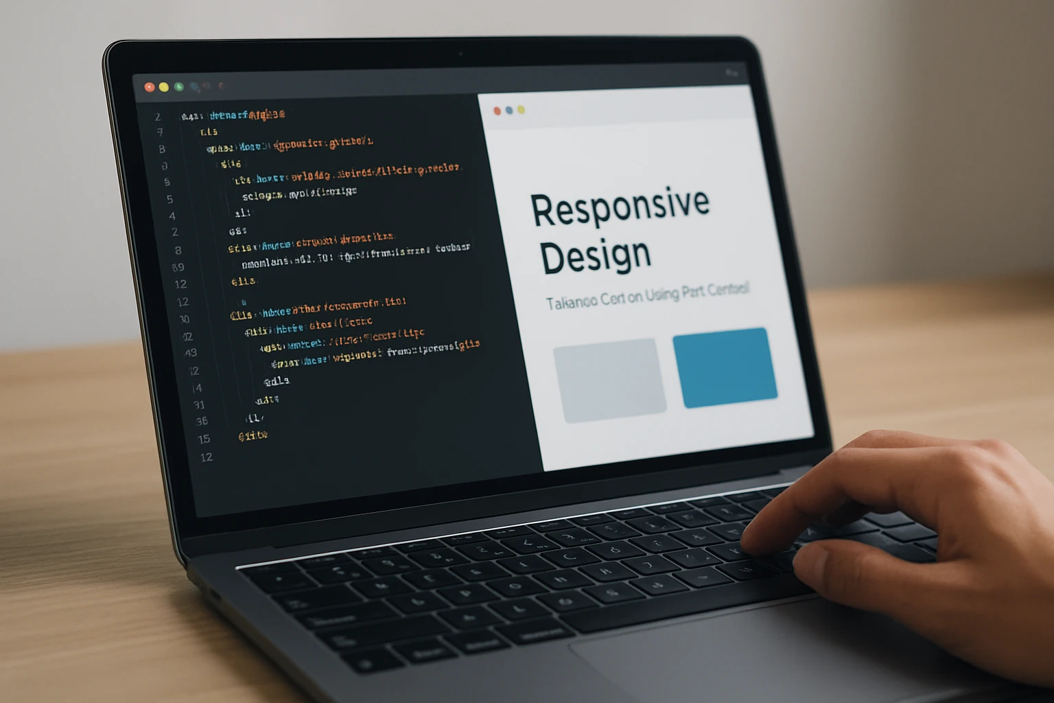
#3 Figma Auto Layout for Responsive Prototypes
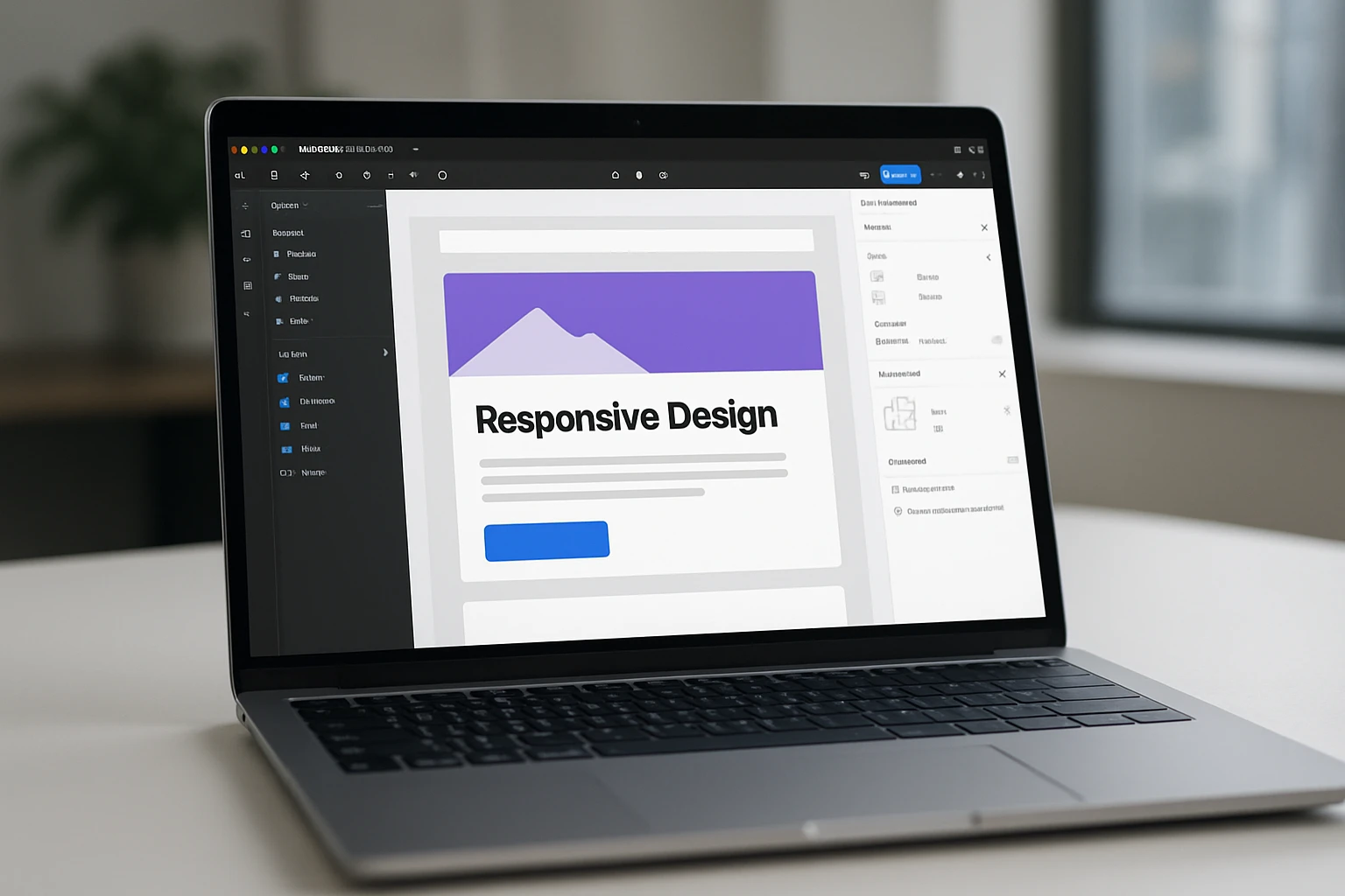
Figma’s Auto Layout and constraints let designers model fluid components that adapt to different widths before a single line of HyperText Markup Language (HTML) ships. When designers hand off responsive-ready components, developers spend less time guessing. Pairing component variants with layout grids produces realistic page flows that reduce rework later.
We often invite clients into live Figma sessions at Internetzone I to decide how elements should collapse or reorder. This shortens debates and creates a shared language between design, content, and development. When everyone can see how a card grid behaves at 320, 768, and 1280 pixels, decisions get easier.
- Why it stands out: Pixel-perfect prototypes that mirror production behavior
- Notable features: Auto Layout, constraints, component variants, responsive preview
- Pricing snapshot: Free tier; paid plans add collaboration and advanced libraries
- Best for: Design teams aligning stakeholders before code
#4 BrowserStack Live for Real-Device Testing
Emulators are convenient, but nothing beats a real device. BrowserStack Live streams actual phones and browsers so you can verify gestures, fonts, and hardware-accelerated transitions. It is a powerhouse for quality assurance when you must sign off on support matrices your legal and marketing teams agreed on.
At Internetzone I, we run pre-launch checklists across a curated device set representing your audience’s most common models. We catch edge cases like viewport flicker on certain Android builds and odd keyboard overlaps in form flows, then log reproducible evidence your team can fix fast.
- Why it stands out: Real devices, not just emulation
- Notable features: Live testing, screenshots, device cloud, geolocation tests
- Pricing snapshot: Paid, with trials for evaluation
- Best for: Regulated or high-stakes launches where realism matters
#5 Responsively App for Side-by-Side Views
Responsively App displays your site across multiple synchronized viewports at once. Scroll one, and they all scroll. It is a simple idea that exposes layout drift instantly, making it ideal for grid-heavy pages or marketing sites with many sections vying for attention.
Our developers and content strategists use it to spot headlines that wrap awkwardly or icons that shrink too aggressively. Because you can set custom sizes, it is easy to mirror your actual analytics distribution and design for reality, not just popular presets.
- Why it stands out: True simultaneous multi-viewport testing
- Notable features: Sync scroll and clicks, custom device profiles, hot reloading
- Pricing snapshot: Free, open source
- Best for: Teams needing fast visual diff checks across many widths
#6 Bootstrap 5.x for a Battle-Tested Grid
When you need a dependable grid and responsive utilities, Bootstrap’s grid remains a favorite. Its column system, spacing helpers, and components accelerate production while keeping layouts consistent. The documentation is deep, and many developers already know it, which lowers onboarding friction.
Internetzone I uses Bootstrap selectively where speed-to-value is paramount, particularly for marketing pages and validated patterns. With careful pruning and a focus on performance budgets, you can ship a polished experience that remains lightweight and maintainable.
- Why it stands out: Mature ecosystem and predictable results
- Notable features: Responsive grid, utility classes, accessible components
- Pricing snapshot: Free
- Best for: Teams who want conventions that reduce design drift
#7 Tailwind CSS for Utility-First Control
Tailwind CSS (Cascading Style Sheets) offers a utility-first approach that keeps styling in your markup, making responsive states explicit through readable modifiers. For teams that value design systems and small bundles, it compiles only what you use, which can meaningfully improve load times.
We often recommend Tailwind CSS (Cascading Style Sheets) when marketers need rapid iteration and developers want guardrails. Responsive variants like “md:” and “lg:” make intent obvious during code review, and design tokens keep branding tight across campaigns.
- Why it stands out: Speed, consistency, and tiny production builds
- Notable features: Utility classes, responsive variants, theming with design tokens
- Pricing snapshot: Free
- Best for: Product teams and startups building design systems quickly
#8 Webflow for No-Code Responsive Sites
Webflow blends a visual designer with production-grade code output, letting you craft responsive layouts without touching code unless you want to. Its content management system (CMS) powers dynamic pages, and the visual breakpoint controls make it approachable for marketers who need autonomy.
At Internetzone I, we use Webflow for validated use cases where time-to-market beats heavy engineering, then layer in Search Engine Optimization (SEO) and conversion best practices. For teams with frequent launches, it can reduce bottlenecks while maintaining quality.
- Why it stands out: Designer-friendly, production-ready publishing
- Notable features: Visual breakpoints, content management system (CMS), interactions, hosting
- Pricing snapshot: Freemium; paid tiers unlock advanced features and publishing
- Best for: Marketing teams and small businesses that need speed and control
How to Choose the Right Responsive Design Web Tool
Start with your bottleneck. If performance is lagging, prioritize diagnostics and code frameworks. If approvals are slow, strengthen design collaboration. If unpredictable bugs delay launches, invest in real-device testing. The right stack usually includes one planning tool, one build framework or builder, and one testing suite.
- Define must-have breakpoints and content priorities for mobile, tablet, and desktop.
- Set a performance budget and track it from prototype to production.
- Adopt accessibility checks as part of your definition of done.
- Run real-device smoke tests on your top five audience devices before go-live.
- Measure post-launch with both lab and field data to confirm real-world wins.
| Tool | Type | Standout Feature | Learning Curve | Pricing | Best For |
|---|---|---|---|---|---|
| Chrome DevTools | Browser debugging | Device Mode and throttling | Low | Free | Every developer |
| Lighthouse and PageSpeed | Performance audits | Core Web Vitals guidance | Low | Free | Results-focused teams |
| Figma | Design and prototype | Auto Layout and constraints | Low to Medium | Free to Paid | Design-first teams |
| BrowserStack Live | Real-device testing | Device cloud coverage | Medium | Paid | Quality assurance and launches |
| Responsively App | Multi-viewport preview | Side-by-side sync | Low | Free | Agencies and content teams |
| Bootstrap 5.x | Framework | Responsive grid | Low | Free | Conventional buildouts |
| Tailwind CSS | Framework | Utility-first control | Medium | Free | Systematized design |
| Webflow | No-code builder | Visual breakpoints | Low | Freemium to Paid | Marketing-led sites |
Need a sanity check? Picture a simple decision diagram: if you lack a design system, start with Figma and either Bootstrap or Tailwind CSS (Cascading Style Sheets). If bugs on specific devices stall releases, add BrowserStack Live and Responsively App. If rankings and conversions lag, pair Lighthouse with design and content changes. Internetzone I guides this process end to end and maintains your stack with Managed Web Services so improvements stick.
Next Steps for Responsive Design Web Success
Great responsive experiences turn casual scrollers into customers by making every tap and scroll feel effortless. In the next 12 months, performance and accessibility will matter even more as algorithms and user expectations tighten. Imagine launching campaigns knowing your layouts flex beautifully and load in a blink across any device. What would your team ship if your responsive design web decisions were fast, confident, and consistently effective?
Elevate Responsive Design with Internetzone I
Get Web Design (mobile responsive, SEO-focused) that boosts visibility, strengthens reputation, and drives performance for Companies of all sizes seeking measurable growth.