If you had to bet your next quarter on one website upgrade, what would you choose? I’d pick a mobile-first makeover guided by a responsive design company that lives and breathes results, not just pixels. Today, most visitors meet your brand on a small screen, and they make snap decisions in seconds. That means your layout, speed, and message must work perfectly together on every device, while still supporting Search Engine Optimization (SEO) and Pay-Per-Click (PPC) campaigns that fuel your pipeline.
In this friendly, no-fluff playbook, I’ll walk you through 12 proven steps that Internetzone I uses to build responsive, revenue-ready sites. Along the way, you’ll see how design meets analytics, why Web Vitals matter, and how content plus structure can transform conversions. You will get practical tactics, a couple of real-world examples, and benchmark tables you can keep on your desk. Ready to replace guesswork with a plan you can actually ship?
Why Mobile-First Wins in 2025: Stats That Matter
Let’s start with reality. Mobile now accounts for roughly 60 percent of global web traffic, and shoppers bounce fast when pages lag. Industry research suggests that over 50 percent of visits drop if a page takes more than 3 seconds to load, while even a 1 second delay can dent conversions by 7 percent or more. Google’s mobile-first indexing means your mobile experience is effectively your website in the eyes of search, so the cost of ignoring small screens is compounding. If you care about Search Engine Results Page (SERP) visibility, you must care about speed, structure, and accessible design.
Beyond traffic, think about behavior. Thumb reach zones influence where your primary Call to Action (CTA) sits. Crisp semantics in HyperText Markup Language (HTML) improve crawler understanding and overall accessibility for users. Core Web Vitals like Largest Contentful Paint (LCP), Interaction to Next Paint (INP), and Cumulative Layout Shift (CLS) signal real User Experience (UX) health to both users and algorithms. When you get these right, you raise engagement, reduce bounce, and give Search Engine Optimization (SEO) and Conversion Rate Optimization (CRO) a tailwind.
The virtuous circle looks like this. Faster pages boost Click-Through Rate (CTR) from organic and ads, better structure clarifies intent, and cleaner forms increase submit rates. In turn, your Google Analytics 4 (GA4) dashboards show more qualified visitors moving deeper into the funnel, which lets your Pay-Per-Click (PPC) and remarketing budgets work harder. In short, mobile-first is not a design trend. It’s a revenue-minded approach where performance, content hierarchy, and technical choices can compound returns and help improve your return on investment (ROI).
The Responsive Design Company Mindset: Strategy Before Screens
The best websites start long before wireframes. A high-performing responsive design company maps business outcomes to user journeys, then builds a content and layout plan around only what matters. We ask: which single action should a mobile visitor take on your homepage, product page, or service page? What information calms risk and builds trust? How do we design for the moments that matter, not just the pages? That means prioritizing hierarchy, message clarity, and speed budgets before drawing the first rectangle.
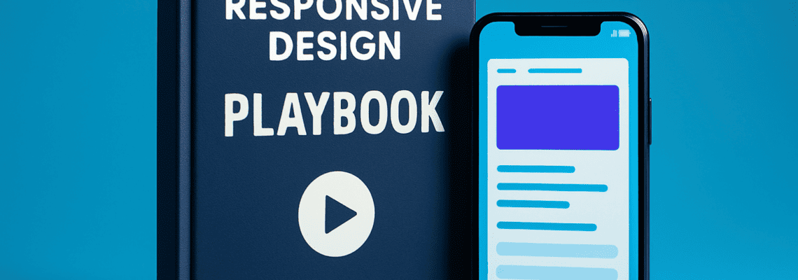
Watch This Helpful Video
To help you better understand responsive design company, we’ve included this informative video from Sajid. It provides valuable insights and visual demonstrations that complement the written content.
At Internetzone I, this mindset connects every discipline. National and Local Search Engine Optimization (SEO) research guide your information architecture. AdWords (Google Ads) Certified Pay-Per-Click (PPC) Services validate which messages convert. Web Design (mobile responsive, SEO-focused) translates strategy into layouts that load fast and read naturally. eCommerce Solutions refine product discovery and checkout. Reputation Management brings reviews and proof into the flow. Managed Web Services keep the engine tuned with updates, monitoring, and security. Strategy first, screens second, growth throughout.
12-Step Playbook to Mobile-First Sites That Convert

- Set Baselines With Data — Audit speed, navigation, and conversions across devices using Google Analytics 4 (GA4), Heatmaps, and PageSpeed tools. Capture Core Web Vitals like Largest Contentful Paint (LCP), Interaction to Next Paint (INP), and Cumulative Layout Shift (CLS), along with Time to First Byte (TTFB). Decide your Key Performance Indicators (KPI) and define acceptable thresholds.
- Clarify Jobs to Be Done — For each key page, name the one job a mobile visitor came to complete. Then strip away distractions that do not serve that job. Fewer choices often mean faster decisions and better Conversion Rate Optimization (CRO).
- Design the Information Architecture — Build your navigation and internal links to mirror how people search and decide. Use semantic HyperText Markup Language (HTML) headings, logical URLs, and descriptive labels. This helps Search Engine Optimization (SEO) and accessibility, and it makes sense to humans.
- Wireframe for Thumb Zones — On small screens, put primary Call to Action (CTA) buttons where thumbs naturally reach and keep forms short. Use progressive disclosure to hide secondary details behind accordions. Your User Experience (UX) team should test with real hands, not just diagrams.
- Use a Fluid Grid and Type Scale — Adopt fluid spacing, responsive columns, and scalable typography. Your Cascading Style Sheets (CSS) should embrace min, max, and clamp functions to keep everything legible. This avoids abrupt breakpoint jumps and keeps consistency.
- Budget for Performance — Set image, font, and JavaScript (JS) budgets up front. Use next-gen formats, compress assets, defer non-essential scripts, and rely on a Content Delivery Network (CDN). Track speed with each pull request so Time to First Byte (TTFB) and Largest Contentful Paint (LCP) never regress.
- Build Accessibility In — Incorporate accessibility best practices and consider Americans with Disabilities Act (ADA) implications from the start. Proper labels, contrast, focus states, and keyboard navigation help everyone, and they reduce legal and usability risk.
- Structure for Search — Lean on schema markup and crisp HyperText Markup Language (HTML) semantics for rich snippets and better crawlability. Map internal links to topic clusters. This is where Search Engine Optimization (SEO) architecture sets the stage for sustained growth.
- Polish High-Intent Templates — Product pages, service pages, and lead gen forms carry revenue. Add social proof, trust badges, frictionless inputs, and smart defaults. Test short vs. long forms with A/B (Split Testing) and watch your Key Performance Indicator (KPI) dashboard for impact.
- Optimize Local Signals — Keep Name, Address, Phone number (NAP) consistent, embed maps correctly, and place reviews near the Call to Action (CTA). For multi-location brands, give each location a dedicated, mobile-friendly page tuned for Local Search Engine Optimization (SEO).
- Secure and Comply — Enforce Secure Sockets Layer (SSL), cookie consent, and privacy notices, and consider General Data Protection Regulation (GDPR) needs. Security is a ranking and trust factor, and it protects your Customer Relationship Management (CRM) data flows.
- Measure, Learn, Iterate — Build a repeatable testing plan. Use A/B (Split Testing), scroll-depth, and Interaction to Next Paint (INP) trends to prioritize changes. Monthly sprints help your Managed Web Services team protect gains and push new wins.
Benchmarks, KPIs, and Web Vitals: What Good Looks Like
If you cannot measure it, you cannot improve it. Before a redesign, lock in targets that tie speed and clarity to business outcomes. Your goal might be to raise mobile conversion rate by 30 percent, cut bounce by 20 percent, and reach green across Core Web Vitals. Tie those to Key Performance Indicators (KPI) your team can check weekly, right in Google Analytics 4 (GA4) and Search Console. When everyone knows what winning looks like, decisions get faster and tradeoffs get smarter.
Use the table below to set pragmatic mobile targets. You can adjust by industry, but these ranges are a strong starting point for a responsive, growth-focused site.
| Metric | Mobile Target | Why It Matters | Primary Owner |
|---|---|---|---|
| Largest Contentful Paint (LCP) | < 2.5 s | Perceived speed for the main content, boosts engagement and Search Engine Optimization (SEO) | Development and Performance |
| Interaction to Next Paint (INP) | < 200 ms | Responsiveness to user input, key for forms and nav | Development |
| Cumulative Layout Shift (CLS) | < 0.10 | Visual stability, prevents accidental taps on Call to Action (CTA) | Design and Front-end |
| Time to First Byte (TTFB) | < 0.8 s | Server responsiveness, impacts all other timings | DevOps and Hosting |
| Mobile Conversion Rate | +20 to +40 percent | Direct revenue or lead volume impact | Growth and Product |
| Bounce Rate | -15 to -30 percent | Signals relevance and usability | Design and Content |
| Organic Sessions | +25 to +50 percent | Reflects technical and content Search Engine Optimization (SEO) | Search Engine Optimization (SEO) |
To hit these marks, bake performance into the build. Use a Content Delivery Network (CDN), compress images, lazy-load non-critical components, and avoid render-blocking Cascading Style Sheets (CSS) and JavaScript (JS). Keep third-party scripts lean and consider a Progressive Web App (PWA) if speed is existential to your product. Most importantly, schedule monthly reviews so your Managed Web Services team guards against regression while your marketing team runs Conversion Rate Optimization (CRO) tests.
Case Study: How Internetzone I Turned Mobile Traffic Into Revenue

A regional retailer came to Internetzone I with a familiar story: plenty of mobile traffic, thin conversions, and negative reviews burying their best products. We kicked off with analytics and call listening to hear how shoppers described their problems. Then our Web Design (mobile responsive, SEO-focused) team rebuilt the product templates with clearer benefit bullets, larger tap targets, and a sticky Call to Action (CTA). We cut JavaScript (JS) weight by 42 percent, compressed images, and moved to a faster host to lower Time to First Byte (TTFB).
In parallel, National and Local Search Engine Optimization (SEO) teams refreshed category copy and structured data, while Reputation Management highlighted recent 5-star testimonials on key pages. AdWords (Google Ads) Certified Pay-Per-Click (PPC) Services drove high-intent visitors to the new templates to validate messaging quickly. In 90 days, mobile conversion rate rose 38 percent, bounce fell 27 percent, and Largest Contentful Paint (LCP) improved from 3.8 seconds to 2.1 seconds. The combination of cleaner structure, faster load, and stronger proof did the heavy lifting. The lesson is simple: when design, content, and performance move together, you do not need miracles, just coordination.
- Core Web Vitals: Largest Contentful Paint (LCP) 2.1 s, Interaction to Next Paint (INP) 160 ms, Cumulative Layout Shift (CLS) 0.06
- Search: +41 percent organic sessions after Search Engine Optimization (SEO) improvements and internal linking
- Paid: -19 percent cost per acquisition after landing page and quality score gains via Pay-Per-Click (PPC)
- Reputation: 240 new reviews, Name, Address, Phone number (NAP) corrected, and Local 3-Pack wins in 4 markets
Pricing, Timelines, and Ownership: What to Expect From Your Partner
Budgets vary, but clarity helps. A production-quality, mobile-first redesign usually spans 8 to 14 weeks depending on scope, content readiness, integrations, and approvals. Most teams prefer phased delivery: launch high-impact templates first, then iterate on secondary pages with A/B (Split Testing) informed by Google Analytics 4 (GA4) data. Your partner should outline milestones, roles, and acceptance criteria so decisions never stall. Transparent ownership of code, content, and assets prevents surprises down the line.
Here is a simple comparison to frame options. Use it to align stakeholders before you choose your build path.
| Option | Typical Cost | Speed to Launch | Depth of Expertise | Ongoing Support |
|---|---|---|---|---|
| Freelancer | $5k to $25k | Variable | Depends on one person | Limited availability |
| In-House Team | Salaries plus tools | Moderate to slow | Strong but focused | Requires permanent headcount |
| Responsive Design Company (Internetzone I) | $25k to $120k+ | Predictable sprints | Cross-discipline specialists | Managed Web Services and optimization |
Internetzone I combines Web Design (mobile responsive, SEO-focused), National and Local Search Engine Optimization (SEO), eCommerce Solutions, Reputation Management, and AdWords (Google Ads) Certified Pay-Per-Click (PPC) Services under one roof. That means your design, analytics, and growth levers are coordinated, not competing. With Managed Web Services, we maintain performance budgets, security updates, and ongoing Conversion Rate Optimization (CRO), so your site keeps getting faster, clearer, and more persuasive with every sprint.
Choosing the Right Responsive Design Company: Questions to Ask
Before you sign, ask questions that surface how a partner thinks. How will they set and enforce performance budgets for Time to First Byte (TTFB), Largest Contentful Paint (LCP), and Interaction to Next Paint (INP)? Which templates will they ship first, and why? How do they weave Search Engine Optimization (SEO) architecture into design decisions, not bolt it on at the end? What is their plan for accessibility and Americans with Disabilities Act (ADA) considerations? Who owns the code, the design system, and the analytics configuration in Google Analytics 4 (GA4)?
Ask to see dashboards and Key Performance Indicator (KPI) definitions from recent launches. Request a sample sprint plan, change log, and post-launch optimization roadmap. A confident partner will show how Call to Action (CTA) placement, copy tests via A/B (Split Testing), and semantic HyperText Markup Language (HTML) improvements compound results. And if you rely on traffic from ads, verify that AdWords (Google Ads) Certified Pay-Per-Click (PPC) Services and Search Engine Optimization (SEO) teams work directly with design and development. When everyone shares one scorecard, your odds of a breakout launch rise dramatically.
Twelve practical steps, one outcome: a faster, simpler, mobile-first site that wins more customers.
In the next 12 months, imagine your analytics telling a new story: green Web Vitals, rising organic visibility, and steady conversion lifts across devices thanks to clear structure and speed.
What would it mean to your pipeline if your responsive design company partner helped you capture every mobile moment that matters?
Additional Resources
Explore these authoritative resources to dive deeper into responsive design company.
Accelerate Responsive Design Company Gains with Internetzone I
Get Web Design (mobile responsive, SEO-focused) that lifts visibility, reputation, and conversions for companies of all sizes, guided by Internetzone I’s integrated digital marketing team.