
User Interface Design Online: 10 High-Impact Tweaks to Boost Conversions & SEO
If you are serious about growth, user interface design online is one of the most controllable levers you have for better sales and visibility. Think about it like tidying a storefront window while quietly repaving the sidewalk outside. The right interface choices guide customers to act while signaling relevance to search engines through clarity, speed, and structure. And here is the fun part. With a few targeted changes, you can measurably lift conversions and search performance without rebuilding your entire site or app from scratch, which is exactly where Internetzone I’s Web Design (mobile responsive, SEO (search engine optimization)-focused) expertise shines for companies of every size.
Why Small Interface Changes Deliver Outsized Growth
Here is a simple truth that still surprises teams. Most drop-offs do not come from catastrophic failures but from tiny frictions that stack up. A button that blends into the background, a form with one field too many, a headline that buries the value, or a layout that jitters on mobile can quietly crush your results. Industry studies frequently report that even a 0.1 second faster load can increase conversions by several percentage points, and more than half of visitors abandon pages that take over three seconds to load. Those micro-moments also influence your rankings because search algorithms prize speed, stability, and helpful content, all of which are shaped by interface decisions.
So where does this leave you if you are competing in crowded categories? It means your path to growth is not only building more pages or buying more ads, but polishing how people experience each click. Internetzone I works with companies of all sizes that feel stuck between inconsistent branding, flat search traffic, and rising ad costs. By pairing Web Design (mobile responsive, SEO (search engine optimization)-focused) with National and Local SEO (search engine optimization), eCommerce solutions, reputation management, Adwords-Certified PPC (pay-per-click) services, and managed web services, we remove friction in the buying journey while aligning your site’s technical and content signals with how search engines evaluate quality.
10 High-Impact Tweaks for User Interface Design Online
- Make the primary call to action impossible to miss. Use a strong verb, contrasting color, and a clear benefit like “Get My Free Quote” so people know exactly what happens next.
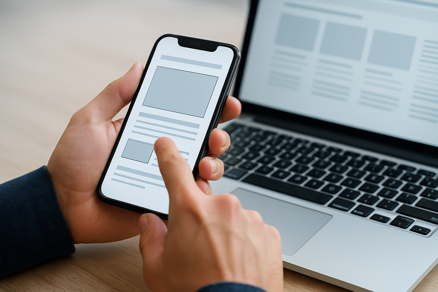
- Design for thumbs first on mobile. Place key actions within easy reach, enlarge tap targets, and keep navigation sticky so moving around feels effortless.
- Tighten your above-the-fold message. Use a short headline that states the value and a subhead that answers “Why should I trust you?” in one breath.
- Reduce form friction. Ask only for what you truly need, show progress on multi-step forms, and explain why you need each field to build trust.
- Use hierarchy that scans. Prioritize headings, short paragraphs, and generous whitespace so busy visitors can skim and still understand the story.
- Write microcopy that helps, not nags. Clarify errors in plain language and reassure visitors with specifics like “We never share your email.”
- Speed up the experience. Compress media, defer non-essential scripts, and minimize layout shifts to protect focus and keep visitors on the page.
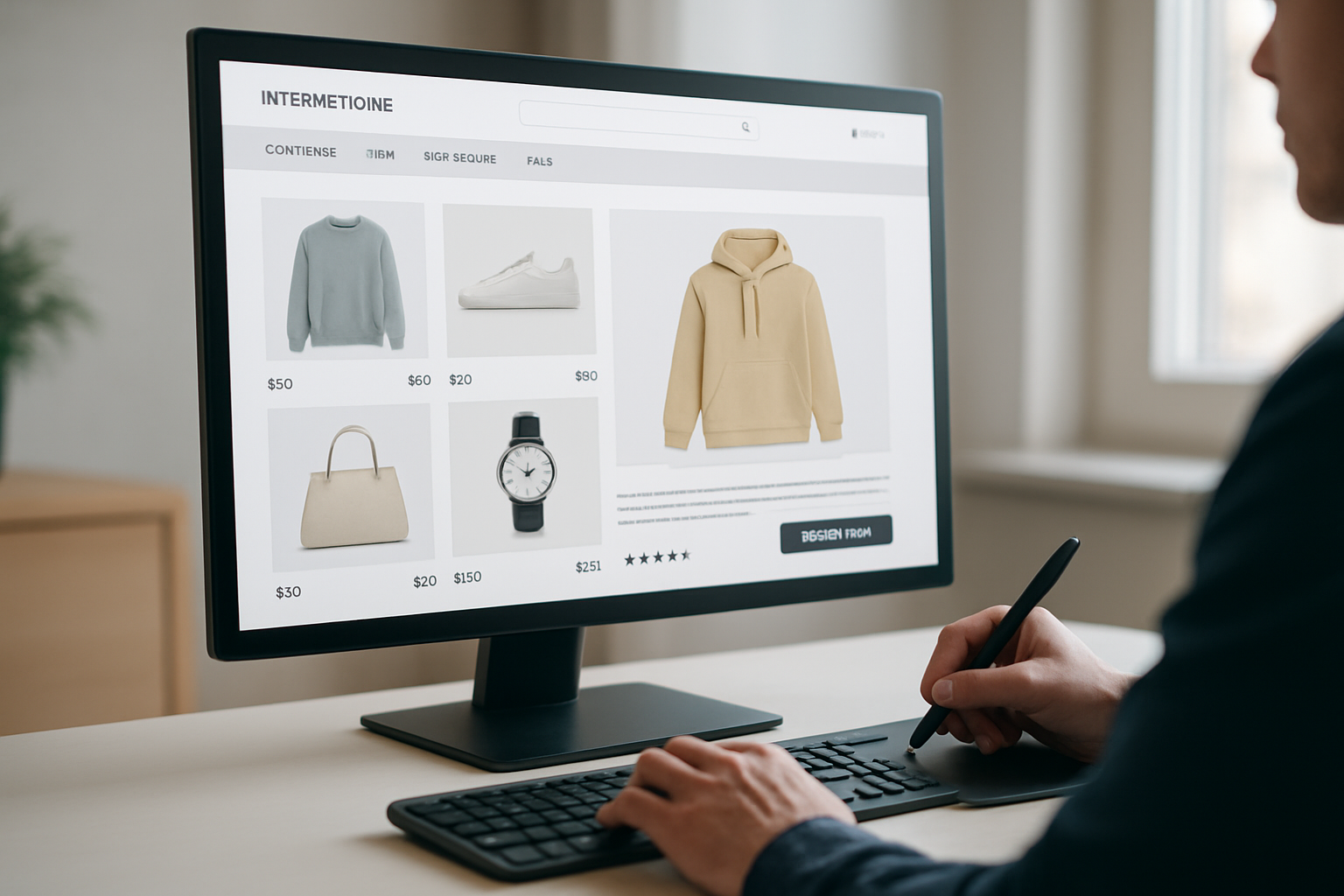
- Add credible social proof. Show reviews, client logos, certifications, and data-backed results close to the relevant action for immediate reassurance.
- Craft purposeful navigation. Name menus with visitor language, limit choices, and add contextual links to keep momentum without overwhelming people.
- Use consistent styles. Standardize buttons, inputs, and spacing so your interface feels predictable, which reduces cognitive load and mistakes.
Watch This Helpful Video
To help you better understand user interface design online, we’ve included this informative video from Simplilearn. It provides valuable insights and visual demonstrations that complement the written content.
You might be wondering which of these to do first and how to prove they worked. A practical approach is to begin where friction and impact intersect. If mobile traffic drives most sessions but the conversion rate is lagging, start with thumb-friendly layout changes, speed, and trust signals near your primary call to action. Then track a focused set of metrics like form completion rate, time to first interaction, and revenue per visitor. Internetzone I often couples these interface tweaks with content improvements and on-site schema so your helpful design is mirrored by helpful data for search engines. The effect compounds. When visitors stay longer, interact more, and return, you are creating a feedback loop that improves both conversion and discoverability.
Mobile-First Design: Speed, Accessibility, and Search
Mobile experiences are unforgiving, which is why the majority of interface wins show up first on smaller screens. Fast load, stable layout, and intuitive gestures ensure people do not abandon when they are just getting started. Beyond human patience, search systems look at signals like responsiveness and cumulative layout stability to judge quality. If your page jumps as ads or images load, people lose their place, and that frustration is visible in analytics. A mobile-first layout with optimized media and lightweight scripts protects focus, while semantic headings and descriptive links help screen readers and search crawlers understand the structure. Think of speed as table stakes and clarity as your competitive edge.
| Load Time | Typical Conversion Impact | Observed Behavior | Search Visibility Outlook |
|---|---|---|---|
| Under 2 seconds | Strong lift in completed actions | Lower bounce, more page views | Positive, aligns with quality signals |
| 2 to 3 seconds | Neutral to slight decline | Some abandonment on complex pages | Neutral if content is strong |
| 3 to 5 seconds | Noticeable drop in conversions | Skimming behavior and exits increase | Often negative unless offset by authority |
| Over 5 seconds | Severe conversion loss | High bounce and low engagement | Likely negative across competitive terms |
Accessibility is not optional if you want sustainable growth and a wider audience. Following the Web Content Accessibility Guidelines version 2.2 by using sufficient color contrast, focus states, keyboard navigability, and meaningful alt text descriptions can expand your market by 15 percent or more and reduce legal risk. It also sharpens your interface discipline. Clear labels, consistent patterns, and descriptive error states help everyone, not just visitors using assistive technology. Internetzone I builds accessibility into our Web Design (mobile responsive, SEO (search engine optimization)-focused) process because inclusive design is both the right thing to do and a powerful way to improve conversions and search performance at the same time. When your pages are easy to perceive, understand, and navigate, people breeze through to purchase or inquiry.
Trust, Microcopy, and Persuasion Patterns That Actually Work
Nothing torpedoes growth faster than doubt in a critical moment. That is why specific, honest microcopy and thoughtful trust signals carry so much weight. Instead of vague reassurances, give concrete details near the action. If you offer free shipping, say when it arrives. If you collect emails, say how often you send messages and what value to expect. Pair that with social proof positioned contextually. A testimonial beside your pricing table addresses price anxiety, while a review near the checkout button eases purchase nerves. Finally, do not hide how to reach you. Prominent contact options signal you stand behind your promise, which nudges hesitant visitors to engage.
- Replace “Submit” with benefit-led labels like “Send My Demo Link.”
- Explain privacy in plain language like “We will only email you about this request.”
- Show payment badges and guarantees near checkout, not in a distant footer.
- Use concise tooltips to clarify tough fields like “Company Size” or “Budget.”
- Place short testimonials or ratings beside the related feature or plan.
Case Study: Internetzone I Reworked a Retail Interface to Lift Conversions
A multi-location retailer came to Internetzone I with a familiar challenge. Search traffic was flat, online revenue had stalled, and reviews were scattered across platforms without a clear strategy. We started by auditing the interface and the funnel. The home page headline buried the value, mobile buttons were too small, and the form asked for unnecessary details early in the journey. We rewrote the above-the-fold copy, simplified navigation to three top choices, and redesigned the product pages for clarity, speed, and trust. Then we paired those interface upgrades with National and Local SEO (search engine optimization) cleanup, structured data, a review acquisition plan, and targeted Adwords-Certified PPC (pay-per-click) campaigns to capture demand while organic visibility ramped.
| Metric | Before | After | Change |
|---|---|---|---|
| Mobile conversion rate | 1.2 percent | 2.4 percent | 2x improvement |
| Average page load | 3.8 seconds | 2.1 seconds | 44 percent faster |
| Organic sessions | Baseline | +28 percent | Meaningful lift |
| Revenue per visitor | $3.10 | $4.35 | +40 percent |
| Review velocity | 5 per month | 35 per month | Trust momentum |
What made the difference was the combination of interface precision and multi-channel reinforcement. Web Design (mobile responsive, SEO (search engine optimization)-focused) reduced friction and improved clarity, while Local SEO (search engine optimization) ensured nearby shoppers found updated listings, accurate hours, and fresh photos. Reputation management turned satisfied customers into advocates with consistent follow-ups and smart review routing. Adwords-Certified PPC (pay-per-click) closed the loop by capturing high-intent searches and testing messages that later informed on-site copy. And because our managed web services kept updates and performance tuning on a schedule, gains held steady. This is the advantage of partnering with a team that treats design, search, and trust as one system working toward revenue.
Scaling Your Interface: Roadmap, Metrics, and Next Steps
If you have ever stared at a backlog and thought, “Where do we even begin,” you are not alone. The way forward is to prioritize changes with the highest impact on revenue and search visibility, then sequence them in sprints. Begin with a speed and usability sprint focused on the home page, top product or service pages, and your key conversion page. Follow with a trust and content sprint that places reviews, case studies, and helpful explanations where people hesitate. Then tackle navigation refinement and structured data so search systems can interpret your offers cleanly. Internetzone I leads this roadmap with clear goals, owners, and timelines so every tweak rolls up to measurable business outcomes.
| Phase | Primary Actions | Owner | Key Performance Indicator | Timeline |
|---|---|---|---|---|
| Weeks 1 to 2 | Speed fixes, mobile layout, compress media, stabilize layout | Design and development | Load time under 2.5 seconds, reduced layout shift | 14 days |
| Weeks 3 to 6 | Messaging overhaul, call to action redesign, form simplification | Design and marketing | Higher form completion, more click-through on calls to action | 28 days |
| Weeks 7 to 9 | Trust layer: reviews, guarantees, security badges, contact clarity | Marketing | Lower abandonment on checkout or lead forms | 21 days |
| Weeks 10 to 12 | Structured data, internal linking, Local listings cleanup | SEO (search engine optimization) | Higher impressions and top-3 rankings for target terms | 21 days |
- What matters more, traffic or conversions? The honest answer is both. Smart interfaces convert better and send stronger quality signals that can lift rankings over time.
- Do you need a redesign or a refresh? If your brand holds up but behavior metrics sag, a refresh of layout, copy, and speed is often faster and safer.
- How soon can you see results? Many sites see early wins within two to four weeks on engagement and conversion, with search momentum compounding over one to three months.
Smart Interface Choices That Build Rankings and Revenue
Ten focused improvements across clarity, speed, and trust can unlock higher conversions and stronger organic reach faster than a full rebuild. Imagine your next 12 months with a site that feels instant on mobile, speaks your customer’s language, and surfaces proof exactly where it counts, all while signaling quality to search engines. What could your team achieve if every click felt effortless and every message was unmistakably clear? If that future sounds compelling, it is time to align design and growth under one plan and one accountable partner.
Picture a roadmap where every small tweak stacks into measurable gains, from smoother forms to stronger visibility across local and national searches. And as you scale, ongoing performance tuning and reputation management protect those gains and keep you ahead of rivals who only chase trends. Ready to make user interface design online your most reliable growth lever?
Additional Resources
Explore these authoritative resources to dive deeper into user interface design online.
Elevate User Interface Design Online with Internetzone I
Internetzone I delivers Web Design (mobile responsive, SEO (search engine optimization)-focused) to grow visibility, strengthen reputation, and increase conversions for companies of every size.