
A shopper is standing in line, one hand on a basket, the other holding a 360-pixel-wide phone. Your homepage loads. The hero headline wraps into a jagged little stack. The subhead drops below the fold. The first button looks a hair too close to the menu. Suddenly the next tap feels risky.
That tiny moment is the whole responsive web design mobile size debate in 2026. Not in theory. In trust. If your layout feels cramped, broken, or just a little sloppy on mobile, you do not merely lose style points — you lose leads, sales, calls, bookings, and sometimes reputation.
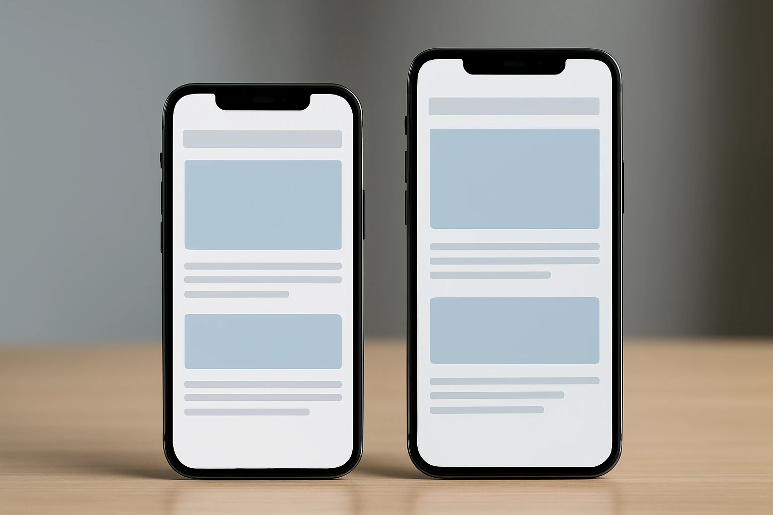
So what width should you actually design for? 320? 360? 390? Short answer: several. I have learned this the hard way on service sites, eCommerce builds, and lead-gen pages where one clipped form field quietly wrecked performance for weeks. If your team cares about visibility, conversion, and how your brand looks when people meet it on a phone first, this is for you.
Selection criteria: what counts as a useful mobile size in 2026
Who this is for
This guide is for teams that need more from mobile traffic: more calls, more form fills, better engagement, stronger search performance, and fewer embarrassing layout bugs. That applies to a local law firm, a Shopify store, a multi-location clinic, or a B2B manufacturer whose “Contact Sales” form still does a lot of the heavy lifting.
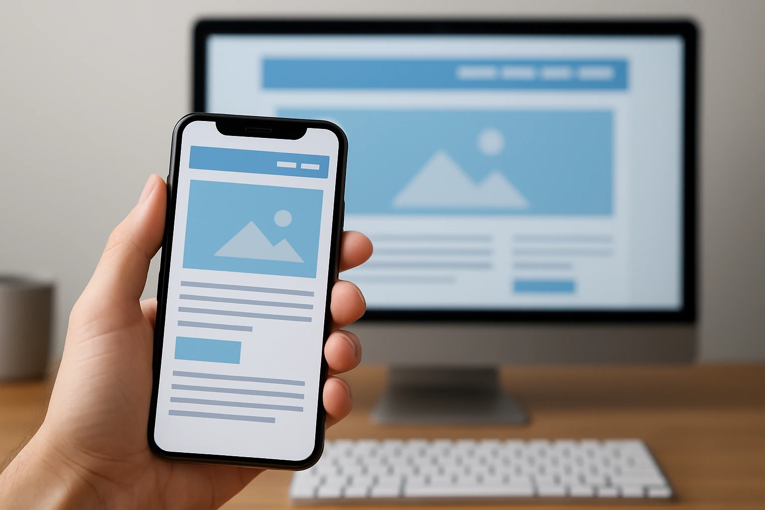
Why focus so hard on mobile? Because mobile is often the first handshake. A visitor on a 375 px screen decides in seconds whether your business feels credible. If the navigation is awkward or the hero reads like a train wreck, you do not get a second first impression.
Use analytics and real customer devices before choosing your primary baseline
Should you pick one width and call it a day? No. Start with your analytics. Look at your top mobile screen widths in GA4, then compare that with the phones your actual customers use in the wild. I like to ask clients to pull out three real devices from the office — usually one smaller Android, one newer iPhone, and one larger phone. You learn a lot faster from a real thumb and a real glare-filled screen than from a pristine artboard.
If most of your mobile visits cluster around 390 px and 412 px, that tells you where to judge polish. If your checkout still breaks at 320 px or 360 px, that tells you where to harden the layout. Those are two different jobs, and good teams treat them that way.
Think in CSS pixels and component behavior, not device marketing names
This is where a lot of teams get tripped up. They ask, “Should we design for iPhone whatever?” I would not. Think in CSS pixels and component behavior instead. Buttons, cards, forms, sticky bars, menus, product tiles — those are what live or die across widths.
Shaun Anderson of Hobo Web makes the point plainly: there is no single “best” screen size for responsive design. He also argues that the modern answer is to build intrinsically responsive systems, not just responsive pages. That matches what many of us see in production. What used to feel like a simple sizing question has become a bigger strategic decision about how your whole interface adapts.
There is no magic breakpoint; there are only useful test ranges.
| Pick | CSS width | What it reveals fast | Best for |
|---|---|---|---|
| #1 | 320 px | Overflow, broken nav, cramped forms | Finding small-screen failures early |
| #2 | 360 px | Real-world Android portrait pressure | Reality-checking your core mobile layout |
| #3 | 375 px | Default typography and spacing balance | Mainstream iPhone-oriented design review |
| #4 | 390 px | Roomier flagship composition | Judging polish, spacing, and hero hierarchy |
| #5 | 412 px | Large Android grid density | Cards, listings, and heavier interfaces |
| #6 | 428 px | Large iPhone breathing room | Product pages and media-rich sections |
| #7 | Landscape + transitional widths | Reflow under limited height or wider mobile states | System-level component behavior |
#1–#2: 320 px and 360 px as the smallest practical baselines
#1 at 320 px is your stress test. #2 at 360 px is your reality test. Best for: teams that want the smallest still-relevant mobile experience to survive before they start admiring bigger, prettier screens.
Watch This Helpful Video
To help you better understand responsive web design mobile size, we’ve included this informative video from Flux Academy. It provides valuable insights and visual demonstrations that complement the written content.
320 px: the legacy compact baseline that still exposes layout failures
320 CSS px has been around forever in responsive planning, and it still earns its keep. Not because it is the most common modern phone width, but because it exposes weakness fast. If your layout overflows here, you will usually see horizontal scrolling, clipped buttons, broken carousels, or form fields that feel like they were designed with tweezers.
Best for: catching long navigation labels, stacked CTA buttons, promo bars, coupon fields, and hero text that wraps into nonsense. I once watched a booking page turn “Request Consultation” into four lines at 320 px. The button still existed, technically. Functionally, it looked broken.
360 px: a common Android reference width for modern mobile testing
360 CSS px is one of the most useful everyday baselines you can test. It is common in Android portrait planning, and it often mirrors what real users bring to your site while walking through Target, sitting in a waiting room, or standing outside your storefront.
Best for: evaluating your homepage, service pages, and product listing layouts under realistic conditions. If your design only looks good at 390 px but feels crowded at 360 px, you probably have a system problem, not a one-off page problem.
What must never break here: navigation, forms, and first-screen readability
At 320 px and 360 px, I care less about decorative perfection and more about survival. Three things have to hold up:
- Your navigation has to open cleanly and stay tappable.
- Your forms have to remain readable when labels, errors, and keyboards appear.
- Your first screen has to tell the visitor what you do without making them squint.
If any of those fail, mobile users feel friction immediately. They may not say, “This site has a breakpoint issue.” They just leave.
If it works at 320 px, most larger phones become much easier to handle.
#3–#4: 375 px and 390 px for mainstream flagship phones
This is where many teams should judge polish. Best for: deciding whether your mobile experience feels merely functional or actually intentional on the kinds of phones people use every day.
375 px: a frequent iPhone reference width in design comps
375 px is a familiar iPhone reference width, and a lot of design files quietly orbit around it. That is not a bad thing. It is a solid place to check typography, button spacing, content rhythm, and whether your hero section reads like a confident brand or a pile of stacked boxes.
Best for: service pages, article templates, lead-gen landing pages, and any mobile layout where the first screen has to do real persuasion work. On a 375 px canvas, you can usually spot whether your line breaks feel natural or just barely acceptable.
390 px: a newer iPhone portrait width that reveals spacing issues
390 px gives you a little more breathing room, which sounds easy — until it is not. Teams often waste that extra width by cramming in one more icon, one more badge, one more line of copy, one more “helpful” link. Suddenly the screen feels busy again.
Best for: checking whether premium layouts actually feel premium. A polished mobile design at 390 px should feel calm, not empty; generous, not vague. If the page finally relaxes at this width, you know where your smaller breakpoints need more discipline.
Readability check: line length, button spacing, and image cropping
Here is the question I ask at 375 px and 390 px: does the page read well, or did it just technically fit? That is a huge difference. You are checking comfort now, not survival.
- Does the headline break naturally, without awkward orphan words?
- Do primary and secondary buttons have enough separation to avoid accidental taps?
- Do images crop well around faces, product edges, and overlaid text?
When a layout passes those checks, it stops feeling “responsive” in the obvious sense and starts feeling native to the device in the best way.
A layout that feels roomy at 390 px often reads as polished rather than sparse.
#5–#6: 412 px and 428 px for larger phones
Large phones can fool you. They hide small-screen failures, then expose a different class of problem: density. Best for: testing whether your grids, cards, sticky elements, and calls to action still breathe when the screen gets wider.
412 px: a common large Android portrait width
412 px is a useful large Android portrait width, especially for interfaces with cards, filters, maps, or repeated content blocks. It gives components more room, but that extra room is not a free pass. A weak layout does not become strong here. It just becomes a different kind of awkward.
Best for: directories, search results, dashboards, and category pages. If your cards looked clean at 360 px and now feel oddly cramped at 412 px, you may be squeezing too many layout ideas into mobile.
428 px: a common large iPhone portrait width
428 px is one of those widths that makes stakeholders say, “See? It looks great on my phone.” Sometimes they are right. Sometimes the layout only looks good because the screen is bailing you out. I see this a lot on product pages with review stars, price blocks, shipping copy, payment messaging, and sticky add-to-cart bars all trying to coexist at once.
Best for: product detail pages, media-heavy landing pages, and branded experiences that rely on composition. Use it to confirm breathing room, not to excuse clutter.
Watch for card crowding, awkward line wraps, and sticky CTA collisions
At 412 px and 428 px, large-phone issues show up in sneaky ways:
- Cards become denser instead of clearer.
- Text wraps in ugly spots because badges, icons, and metadata steal width.
- Sticky headers, cookie notices, chat widgets, and CTA bars start fighting over the viewport.
That last one matters more than teams expect. A mobile screen can feel huge in your hand and still run out of practical space fast.
Your mobile layout still needs breathing room on a 428 px screen.
#7: Landscape phones and transitional widths that stress the system
#7 is not one number — it is a pressure zone. Best for: sites that need to survive phone landscape mode and those in-between widths where small tablets, foldables, and wider mobile browsers make brittle layouts fall apart.
Landscape phones compress vertical space and can hide critical content below the fold
Landscape sounds generous because it is wider. Then you rotate the phone and realize you lost a chunk of vertical space. That changes how people scan. Your sticky header now feels taller. Your hero image hogs the screen. Your CTA may drop below the fold. If the keyboard opens, good luck.
Best for: testing menus, search, login, checkout, maps, booking flows, and anything with a sticky element. Landscape is often where “looks okay on mobile” quietly turns into “why can’t I finish this?”
Small tablets sit between mobile and desktop and often need a graceful reflow
Small tablets are where rigid desktop thinking and rigid mobile thinking both fail. Do not force a desktop layout too early, and do not keep a narrow mobile stack long after it stops making sense. Transitional widths reward components that can stretch, re-group, and keep hierarchy intact.
Best for: product galleries, pricing modules, comparison cards, multi-step forms, and content pages with side elements. A small tablet should feel like a clean reflow, not like your site got caught changing clothes.
Decide where one-column layouts should become two-column or card-based layouts
This is where system thinking matters most. Instead of designing a second mobile experience for landscape, set component rules. When can related form fields sit side by side? When can cards move to a two-up pattern? When should filters collapse again because they are stealing attention?
That approach lines up with Shaun Anderson’s preference for flexible, fluid, component-driven design that adapts gracefully to any screen. I agree. You do not need a second mobile design. You need components that know how to behave.
Don’t create a second mobile design for landscape; let the components reflow.
| Component | Keep it stacked when… | Let it reflow when… |
|---|---|---|
| Forms | Labels, hints, or errors start wrapping awkwardly | Related fields can sit side by side without confusion |
| Cards | Image and text feel cramped in two-up layouts | Each card still keeps clear spacing and readable text |
| CTA bars | They steal too much of the viewport height | They stay obvious without covering content or controls |
How to choose the right responsive web design mobile size for your site
Use analytics to pick your primary baseline and your top traffic devices
If you want the practical answer, here it is: choose the smallest set of breakpoints that protects your most important journeys on the devices your audience actually uses. That usually means one small failure-finder, one common Android width, one or two mainstream flagship widths, one large-phone check, and a landscape or transitional reflow test.
Do not chase a mythical perfect resolution. The modern goal is not a single number. It is a flexible, fluid, component-driven system. That is why the old question — “What is the best screen size?” — no longer gets you very far on its own.
Test mission-critical flows: navigation, forms, checkout, contact, and lead capture
Ask a blunt question: what tasks pay the bills on your site? Then test those tasks first. Not the pretty homepage animation. Not the fancy hover state no phone user will ever see. The actual journeys that create revenue or trust.
- Open the menu and get to the main service or product page.
- Use site search or category filters if they matter to conversion.
- Fill out the lead form with the on-screen keyboard open.
- Move through checkout, booking, or account creation without layout jumps.
- Reach the thank-you or confirmation state without confusion.
I like running these tests first at 320 px, 360 px, 390 px, 428 px, and one landscape state. That small set catches a surprising amount of pain without sending the team into breakpoint chaos.
Document the breakpoint rules in the design system so the team stays consistent
Once you find what works, write it down. Document where the header changes, where cards can become multi-column, how sticky elements behave, what minimum width a form field needs, and when imagery should swap crops. If you skip this step, your responsive behavior turns into folklore — and folklore does not scale.
A practical breakpoint system protects user tasks. It does not chase pixel-perfect sameness across every device. That is the real standard to hold.
Choose breakpoints to protect the journey, not to impress the design team.
| Site type | Start testing here | What success looks like |
|---|---|---|
| Lead generation | 320, 360, 390 | Headline clear, form usable, CTA obvious, no overlap with keyboard |
| eCommerce | 360, 390, 428, landscape | Product info readable, add-to-cart visible, sticky bars behave |
| Content-heavy sites | 375, 390, 412 | Comfortable reading rhythm, sane image crops, easy navigation |
| Directories or listings | 360, 412, transitional widths | Cards breathe, filters stay usable, scrolling feels controlled |
What Wins on Mobile in 2026
Build for ranges, not myths
The promise is simple: test a small, realistic set of widths, and your mobile experience stops feeling fragile.
Protect the journey first
Start at 320 and 360 for breakage, judge polish at 375 and 390, then confirm breathing room at 412 and 428 before stress-testing landscape and transitional reflow.
When you review your responsive web design mobile size choices this week, which journey will you protect first — navigation, lead capture, or checkout?
Improve Mobile Presence With Internetzone I
Internetzone I delivers mobile-responsive, SEO-focused web design and digital marketing that helps companies of all sizes improve visibility, reputation, traffic, and conversions.