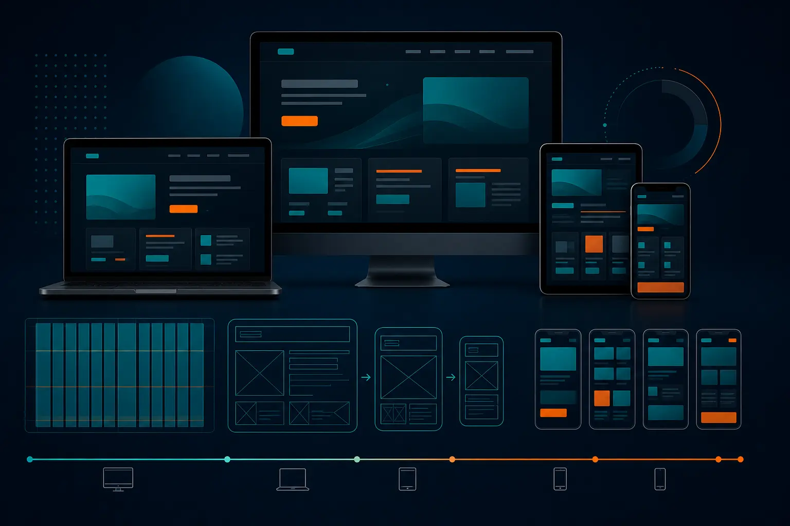
Best 9 Responsive Web Design Mobile First 2026
Best 9 Responsive Web Design Mobile First 2026
The 7:42 train is late, the platform is packed, and the marketer next to you is doing the only website test that really counts. She opens a homepage on her phone, taps once, taps again, and every target lands cleanly without pinch-zooming. No tiny menu. No sideways scroll. No muttering.
That moment is what responsive web design mobile first is supposed to feel like in 2026. Not fancy in a pitch deck. Not impressive only on a 27-inch monitor. Just clear, fast, and easy when your customer is standing in line, walking through O’Hare, or checking prices from the front seat of an Uber.
If you run a local service company, a growing eCommerce store, a B2B lead-gen site, or a brand that depends on search visibility, this is for you. I’m not walking you through abstract design theory here. I’m walking you through nine practical approaches I keep seeing work when real traffic, real forms, and real thumbs show up.
Selection criteria for responsive web design mobile first
Why smallest-screen-first matters
UXPin defines mobile-first design as designing for the smallest screen first and then scaling up to tablet and desktop views. I like that framing because it forces honesty early. What absolutely has to be on the page? What can wait? What should disappear entirely?
UXPin also describes mobile-first as a tenet of progressive enhancement, with graceful degradation as the opposite approach. I’ve worked both ways. Starting big and trimming down sounds efficient until your mobile version becomes a stripped, awkward copy of the desktop page. Starting small usually gives you a sharper page and fewer expensive fixes later.
If it does not work on a phone first, it is not ready for the shortlist.
Why accessibility is part of the shortlist
BrowserStack explicitly connects mobile-first design and accessibility, and that matches what you see in the wild. On a narrow screen, weak contrast, tiny type, and cramped tap targets fail fast. You do not need a formal audit to spot trouble. Try reading your own CTA outside at noon or filling your own form with one thumb.
BrowserStack also reports that 48.92 percent of web traffic comes from mobile users. That is not a side audience. That is almost half the room. If your most important pages are hard to read or act on at 390 pixels wide, you are making conversion harder for a massive share of visitors.
Why testing and scalability decide the winner
UXPin points out that different devices need different layouts based on screen size and orientation. That is why I did not pick ideas that only look good in a static mockup. The winners here scale cleanly when marketing adds a new testimonial block, legal adds a disclosure, or sales suddenly wants a live-demo banner above the fold.
Here is the quick scan I use before I trust a mobile-first approach on a revenue-driving page.
Criterion What makes the cut Why it matters
Small-screen clarity The main message and first action are obvious without zooming Visitors decide fast on a phone
Accessibility basics Readable type, strong contrast, and comfortable tap targets Usability and trust rise together
Scalable layout The page expands well to tablet and desktop without a redesign Teams need maintainable systems, not one-off heroics
Performance Images and media are sized for mobile reality Heavy pages kill attention
Testing proof The layout survives real devices and browser quirks A mockup is only a draft
#1–#3 Mobile-first foundations worth copying
The strongest mobile-first experiences do something surprisingly simple: they strip the page down to essentials, then add back detail without breaking the core task. That sounds obvious. It is not. Most teams still try to preserve every desktop idea and then wonder why the phone version feels crowded.
#1 Small-screen content hierarchy — best for content-heavy sites
Summary: Start by deciding what the smallest version of the page must do in the first screen or two. UXPin notes that the smallest version should contain only the essential features, and that principle saves a lot of messy compromise. I’ve cut a homepage from nine stacked modules to four before the page finally made sense.
Why it works: Content-heavy sites often suffer from equal-weight syndrome — every paragraph, badge, and explainer wants front-row placement. Mobile-first hierarchy fixes that by making you rank the page. Headline, proof, action. Then supporting detail. Then secondary content. Not the other way around.
Best for: Content-rich service sites, education pages, resource hubs, and any homepage where multiple stakeholders keep asking for “just one more section.”
#2 Progressive enhancement — best for teams shipping in phases
Summary: Build the core experience first, then layer in richer interactions as screen size and capability allow. UXPin frames mobile-first as progressive enhancement, which is a practical mindset, not just a technical slogan. Your page should still communicate and convert before fancy effects arrive.
Why it works: When launch dates move, budgets tighten, or engineering bandwidth gets squeezed, progressive enhancement keeps the essentials alive. Your primary message, form, navigation, and proof still work even if the carousel, animation, or advanced filtering comes later in Sprint 2 or Sprint 5.
Best for: Teams rolling out redesigns in stages, companies migrating CMS platforms, and marketing departments that need something solid live before all the polish is finished.
#3 Fluid layouts and breakpoints — best for sites with evolving templates
Summary: Use flexible grids, relative sizing, and content-based breakpoints instead of designing for a tiny list of trendy devices. UXPin reminds us that different devices need different layouts based on screen size and orientation. That means your breakpoints should respond to content stress, not a poster on the studio wall.
Why it works: Devices keep changing. A rigid layout built around one phone width ages fast. I usually start testing around widths like 360, 768, 1024, and 1280 pixels, then shift based on where headlines wrap badly, cards collide, or forms become awkward. The content tells you where the page breaks.
Best for: Websites with growing component libraries, flexible CMS templates, and teams that regularly publish new landing pages without calling a designer every Thursday.
Start with the minimum viable page, not the full desktop page.
#4–#5 Layout patterns that reduce friction
What breaks first on mobile? Usually navigation, forms, and page structure. The best layouts make those three things feel almost boring — and boring is good when a visitor came from search or an ad and just wants the next step.
#4 Thumb-friendly navigation — best for lead-generation sites
Summary: Put your most important actions where a thumb can reach them quickly, and stop forcing people through bloated navigation menus. On small screens, simplified menus, sticky call buttons, and clear “Get Quote” or “Book Now” actions outperform cleverness every time.
Why it works: BrowserStack describes mobile-first design as creating a user-friendly, consistent experience across devices of different screen sizes. On a phone, consistency means fewer choices and less hunting. A visitor from Google Ads at 8:15 a.m. should not need three taps to find the contact path.
Best for: Lead-generation sites, local service companies, clinics, home services, law firms, and any business where the primary mobile task is call, book, or request information.
#5 Single-column landing pages — best for campaigns and promotions
Summary: Build a straight path: headline, value, proof, CTA. Then keep moving. A single-column layout is one of the cleanest mobile-first patterns because it removes the side-by-side clutter that collapses awkwardly on smaller screens.
Why it works: Different devices need different layouts, as UXPin notes, and a stacked landing page handles that reality well. You keep the reading flow intact from phone to desktop, and you make campaign measurement easier because there is one dominant action. Less branching. Less leakage.
Best for: Seasonal campaigns, webinar signups, product launches, paid social pages, and PPC traffic where message match needs to stay tight from ad click to conversion.
#6–#7 Accessibility and speed wins
Mobile-first is not just layout choreography. It is readability, contrast, tap comfort, and load speed. If the page looks clean but feels exhausting to use, you have not solved the problem.
#6 Accessible typography and contrast — best for public-facing brands
Summary: Use readable type sizes, comfortable spacing, clear link treatment, and contrast that holds up in real-world lighting. BrowserStack explicitly links mobile-first design and accessibility, and that connection is easy to see once you test your own pages on a sunny sidewalk instead of a dim office.
Why it works: Accessibility issues surface faster on phones. Dense text becomes intimidating. Weak contrast disappears. Tiny tap areas create misfires. A readable mobile page feels calmer and more trustworthy, especially for brands serving broad audiences where age, vision, context, and device quality vary wildly.
Best for: Public-facing brands, healthcare, education, nonprofit, finance, and any organization that cannot afford to make basic reading and navigation harder than they need to be.
#7 Optimized images and media — best for speed-sensitive pages
Summary: Compress media, serve the right size for the screen, and stop treating the hero section like a film trailer. BrowserStack says 48.92 percent of web traffic is mobile, so mobile performance affects a very large audience. If your first image weighs too much, almost half your visitors feel the penalty.
Why it works: Speed affects patience. Patience affects conversion. I have seen beautiful pages buried under a 3 MB hero image, auto-playing video, and oversized logos that added nothing to meaning. Your media should support the message, not delay it.
Best for: Speed-sensitive landing pages, eCommerce category pages, product detail pages, news content, and any page that depends on fast first impressions from mobile traffic.
-
Compress large hero images before upload.
-
Use responsive image sizing instead of one oversized file for every device.
-
Lazy-load non-critical media lower on the page.
-
Ask whether video adds clarity or just weight.
Mobile-first is also accessibility-first.
#8–#9 Testing and real-world proof
You can admire a polished prototype all afternoon and still miss the problem that tanks form completions on Safari. Trust comes from what survives reality, not what looked tidy at the review meeting.
#8 Real-device and cross-browser testing — best for complex device mixes
Summary: Test on actual phones and across browsers before you call the job done. That means iPhone and Android, Chrome and Safari at minimum, plus portrait and landscape where it matters. Common knowledge says this is the practical way to confirm a responsive layout behaves as intended, and experience backs that up.
Why it works: Real devices reveal weirdness emulators often hide — sticky bars covering buttons, keyboards shoving forms into odd positions, viewport jumps, and tap targets getting clipped. I still catch more issues on a real phone in five minutes than I do in an hour of static review.
Best for: Businesses with mixed audiences, enterprise teams, franchises, schools, or any website where a broken mobile form means a missed lead, application, or sale.
#9 Airbnb, Dropbox, and Slack examples — best for inspiration, not imitation
Summary: Study known examples for principles, not aesthetics. BrowserStack lists Airbnb, Dropbox, and Slack as examples of mobile-first website designs, and they are useful because each shows a strong command of hierarchy, clarity, and scalable interaction.
Why it works: Examples help teams see what good prioritization looks like. Airbnb is good for focused task flow. Dropbox is good for clarity and restraint. Slack is good for structured messaging and clean expansion across breakpoints. But copying their exact look is usually a trap. Their budgets, design systems, and user expectations are not yours.
Best for: Teams needing inspiration, stakeholder alignment, design audits, and internal conversations about what “simple” really means when everyone keeps asking for more blocks on the page.
A pretty mockup is not proof; a page that survives real devices is.
How to choose the right option
Match the pattern to your content density
Start with the shape of the page. Is it dense, broad, and full of explanation? Then small-screen hierarchy and fluid breakpoints should lead. Is it short and action-focused? Thumb-friendly navigation and a single-column flow will usually get you farther, faster. UXPin emphasizes that different devices need different layouts because screen size and orientation change the design problem, and that is exactly why content density matters so much.
Here is a quick decision matrix I would actually use with a marketing team.
If your page is... Start with Add next Watch out for
Content-heavy service or resource page #1 Small-screen content hierarchy #3 Fluid layouts and breakpoints Overstuffed intros and buried CTAs
Lead-generation site #4 Thumb-friendly navigation #6 Accessible typography and contrast Tiny buttons and menu overload
Campaign or promotion page #5 Single-column landing pages #7 Optimized images and media Distracting secondary links
Large, evolving website #3 Fluid layouts and breakpoints #8 Real-device and cross-browser testing Template drift after launch
Public-facing brand with broad audience needs #6 Accessible typography and contrast #7 Optimized images and media Good-looking but unreadable pages
Match the pattern to your team workflow
BrowserStack frames mobile-first as a way to create a consistent experience across device sizes. That consistency does not come from design alone. It comes from a team that can maintain what it launches. If your designers and developers work in phases, progressive enhancement is a smart default. If your marketing team constantly publishes new templates, fluid systems and testing discipline matter more than intricate one-off layouts.
The strongest choice is the one your team can maintain consistently after launch. If nobody will compress images, review contrast, or test forms on real devices after week one, pick a simpler pattern now. Fancy pages fail quietly when ownership gets fuzzy.
Choose the pattern that fits your content, not the trendiest one.
What to do after your responsive web design mobile first launch
Launch on the smallest screen first
Ship the mobile version with confidence before you expand the experience. UXPin describes mobile-first as designing for the smallest screen and then moving up to larger breakpoints, and that order still makes the most sense when you care about clarity.
Measure what changes after release
Watch mobile conversion rate, form completion, page speed, and top-task success. With 48.92 percent of web traffic coming from mobile, according to BrowserStack, you do not need a huge sample to learn something useful fast.
Set the next review date
Put a date on the calendar now — 30 days, one sprint, or one campaign cycle from launch. Progressive enhancement is a mindset, not a one-time event. Pages drift as content changes.
Ship the mobile version first, then keep refining it with real usage data.
Start small, scale carefully, and verify on real screens — that is the promise of responsive web design mobile first, and it still beats flashy desktop-first redesigns that crumble on a train platform.
Your next move is simple: open your own site on your phone, try the top task, and note what feels slow, cramped, or confusing. What will you change first?
Grow Mobile Reach With Internetzone I
Get mobile-responsive, SEO-focused web design plus SEO, PPC, eCommerce, and reputation support that helps companies improve visibility, traffic, and conversions.

Written by
Darren DunnerDigital marketing strategist and founder of Internetzone I. Helping businesses grow through SEO, PPC, and conversion-focused web design since 1999.