Best 11 Responsive Web Design Mobile-First 2026
Best 11 Responsive Web Design Mobile-First 2026
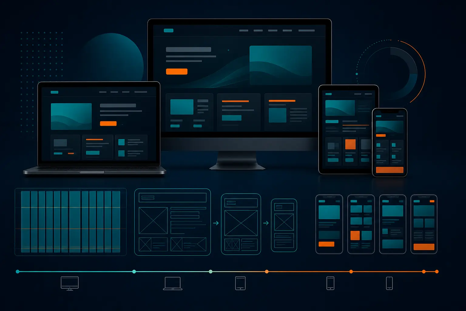
If your company is planning a redesign this year, responsive web design mobile-first needs to be at the center of the conversation. More than 60 percent of web traffic now comes from phones, and in many industries that share is even higher, which means the smallest screen often shapes the first impression, the first click, and the first lead. A smooth mobile experience feels like walking into a bright, organized storefront, while a clunky one feels like trying to read a menu through a keyhole.
This guide is for companies of all sizes that want better online visibility, stronger search rankings, healthier reputations, and better overall digital marketing performance. Maybe you run a local service business. Maybe you manage a national brand. Maybe your eCommerce store gets plenty of visits but too few purchases. The eleven priorities below reflect what actually matters in 2026, and they line up with how Internetzone I helps businesses grow through Search Engine Optimization (SEO), Web Design (mobile responsive, SEO-focused), eCommerce solutions, reputation management, AdWords-certified Pay-Per-Click (PPC) services, and Managed Web Services.
Selection Criteria for Responsive Web Design Mobile-First
So, what made these eleven priorities worth including? Simple: each one directly improves at least one business outcome that matters, such as discoverability, usability, trust, conversion rate, or long-term site stability. We did not choose flashy trends that look amazing in a pitch deck and break down on a real phone during a real commute. Instead, we focused on practical decisions that help mobile users find what they need, act quickly, and leave with a better impression of your brand.
That matters because design never works alone. A beautiful homepage cannot rescue weak site structure. Fast loading alone cannot fix confusing navigation. And strong traffic will not help if your forms are painful on mobile. Internetzone I approaches web projects with that bigger picture in mind, connecting mobile-first design with National and Local Search Engine Optimization (SEO), eCommerce development, reputation management, paid campaign landing pages, and ongoing maintenance so the website supports the full marketing engine, not just the visual layer.
-
Performance: Does it improve speed, stability, and mobile usability?
-
Search visibility: Does it support stronger Search Engine Optimization (SEO) and better indexing?
-
Conversions: Does it help visitors call, book, buy, or inquire with less friction?
-
Scalability: Will it still work across new screen sizes and future content needs?
-
Maintainability: Can your team keep it effective after launch?
Priority What It Improves Best Fit
Content-first hierarchy Clarity, trust, faster action Lead generation sites
Fluid grids Consistency across devices Growing brands
Touch-friendly navigation Usability, lower bounce rate Service and content-heavy sites
Speed-optimized media Load time, engagement, sales eCommerce and visual brands
Readable typography Accessibility, trust Content-rich industries
Content-based breakpoints Future-proof layouts Multi-device audiences
Performance tuning Rankings, interaction, stability Competitive markets
Conversion-focused forms Leads and sales Paid traffic and service businesses
Search-ready structure Organic visibility Local and national companies
Mobile-first eCommerce Cart completion, revenue Online stores
Ongoing testing and management Stability, reputation, growth Busy teams that need support
#1 Content-First Layout Hierarchy
Mobile-first design starts with one brutally helpful question: what absolutely must a visitor see first? On a phone, space is tight, so the headline, value proposition, trust signals, and main action need to show up early. Think of it like packing a carry-on bag for a long trip, because only the essentials make it onboard. For a roofing company, that might mean service areas, reviews, financing options, and a tap-to-call button before any oversized visual filler.
#2 Fluid Grids and Flexible Containers
Fixed layouts age fast. Fluid grids let your content adjust naturally to phones, tablets, laptops, wide monitors, and the in-between devices that keep showing up every year. If rigid layouts are like stiff cardboard boxes, flexible containers are more like water, because they take the shape of whatever screen they land in. That flexibility is a big reason responsive web design mobile-first continues to outperform desktop-first designs in real-world usability.
-
Why it stands out: It reduces broken layouts, awkward spacing, and device-specific headaches.
-
Best for: Brands with broad audiences, evolving content, or multiple traffic sources.
#3 Touch-Friendly Navigation
Ever tapped the wrong menu item with your thumb and instantly felt annoyed? That is not a user problem. It is a navigation problem. Great mobile navigation uses clear labels, generous tap targets, sticky access to key actions, and fewer competing choices. When visitors can move through your site without pinching, zooming, or second-guessing, they stay longer and trust the experience more.
-
Why it stands out: It removes friction fast and makes key pages easier to reach from any screen size.
-
Best for: Multi-page sites, local businesses, and organizations with layered service offerings.
#4 Speed-Optimized Images and Media
Beautiful media should help your brand, not punish your load time. On mobile, people are often browsing on inconsistent connections, so oversized images, autoplay video, and heavy scripts can quietly kill conversions. Compressing media, serving modern formats, and loading lower-page assets only when needed can make a dramatic difference. For an online retailer, that often means smoother browsing, more product views, and fewer abandoned sessions before checkout even begins.
-
Why it stands out: Faster pages improve engagement, search performance, and sales potential.
-
Best for: eCommerce stores, hospitality brands, agencies, and image-heavy websites.
#5 Readable Typography and Accessible Spacing
Small text does not look premium on a phone. It looks exhausting. Mobile-first websites need readable font sizes, clear contrast, comfortable spacing, and a strong visual rhythm so people can scan without effort. That is especially important in industries where trust matters instantly, like healthcare, legal services, finance, and home services. If visitors need to squint, scroll awkwardly, or hunt for the next line, you are creating friction before they even reach your offer.
-
Why it stands out: It improves accessibility, readability, and the feeling of professionalism.
-
Best for: Content-heavy sites and brands where credibility influences every inquiry.
#6 Content-Based Breakpoints
One of the smartest shifts in 2026 is moving beyond device-based breakpoints and focusing on content-based breakpoints instead. In plain English, you do not redesign for one specific phone model. You let the layout adapt whenever the content itself starts to feel cramped or awkward. That makes your site more durable as new devices, foldable screens, and embedded browser experiences continue to grow. Future-proofing is not glamorous, but it saves time, money, and redesign fatigue later.
-
Why it stands out: It creates stronger layouts for real content, not just a checklist of popular screens.
-
Best for: Businesses planning long-term growth or frequent content expansion.
#7 Performance Tuning for Rankings and Stability
Search engines still reward sites that load their most important content quickly, respond fast to taps, and stay visually stable while the page builds. Users reward them too. If a mobile page jumps around while someone tries to hit a button, trust drops in seconds. Internetzone I treats performance as a business issue, not just a technical one, because faster pages support stronger Search Engine Optimization (SEO), lower bounce rates, and better lead flow from both organic and paid traffic.
-
Why it stands out: It strengthens rankings, usability, and overall campaign efficiency.
-
Best for: Competitive industries, paid landing pages, and businesses with high mobile traffic volume.
#8 Conversion-Focused Forms and Calls to Action
If your mobile form asks for ten fields, you are basically asking people to leave. Strong mobile-first conversion design shortens forms, uses clear labels, supports autofill, and places action buttons where thumbs can reach them naturally. This is especially important when businesses invest in AdWords-certified Pay-Per-Click (PPC) services, because sending paid visitors to a clunky mobile form is like paying for a taxi and then stopping three blocks away from the destination. The design should make action feel obvious and easy.
-
Why it stands out: It turns traffic into measurable inquiries, bookings, and purchases.
-
Best for: Lead generation campaigns, landing pages, and appointment-based businesses.
#9 Search Engine Optimization-Ready Site Structure
Responsive design alone will not rank if the site architecture is messy. Clean headings, logical internal links, crawlable navigation, useful service pages, location pages, and structured data all matter. This is where responsive web design mobile-first and Search Engine Optimization (SEO) need to work together instead of living in separate silos. Internetzone I is especially strong here, because its National and Local Search Engine Optimization (SEO) strategy connects page structure, keyword intent, user flow, and mobile usability so businesses can compete for both broad and nearby searches.
-
Why it stands out: It helps search engines understand your site and helps users find answers faster.
-
Best for: Multi-location brands, local companies, and organizations chasing stronger organic visibility.
#10 Mobile-First eCommerce Product Experience
For online stores, the product page is where interest becomes revenue. Shoppers need fast image galleries, easy variant selection, thumb-friendly filters, clear shipping information, and checkout flows that do not feel like homework. Many stores still lose customers because the cart works fine on desktop but becomes frustrating on mobile. Internetzone I helps solve that through eCommerce solutions that connect mobile-first design with search visibility, trust-building elements, and cleaner paths from product discovery to purchase.
-
Why it stands out: It removes friction from the highest-value part of the customer journey.
-
Best for: Retailers, subscription brands, and businesses expanding online sales in 2026.
#11 Ongoing Testing, Reputation Signals, and Managed Support
A website launch is not the finish line. New content, third-party tools, plugin updates, review widgets, and advertising scripts can all affect mobile performance over time. That is why the best mobile-first sites keep testing forms, monitoring load time, reviewing user behavior, and making small improvements every month. Internetzone I brings that longer-term view through Managed Web Services, reputation management, and campaign support, helping businesses protect their visibility, maintain a positive online image, and keep digital marketing assets working together.
-
Why it stands out: It protects gains after launch and keeps your site aligned with business growth.
-
Best for: Busy teams that need ongoing oversight, maintenance, and reputation-aware web support.
How to Choose the Right Option
You do not need to tackle all eleven priorities at once. The smart move is to start with the biggest source of friction in your current site. If you already get traffic but not enough calls or form fills, focus on navigation, trust signals, and conversion design. If your offers are strong but rankings are weak, start with structure, performance, and Search Engine Optimization (SEO)-ready page architecture. If you run an online store, checkout speed and product usability usually deserve attention before cosmetic upgrades.
Here is the real question: are you choosing a prettier website, or a better-performing one? The best businesses choose the second option every time. Internetzone I is valuable here because it does not separate web design from the rest of your growth strategy. Instead, it connects Web Design (mobile responsive, SEO-focused) with National and Local Search Engine Optimization (SEO), eCommerce, reputation management, AdWords-certified Pay-Per-Click (PPC) services, and Managed Web Services so your site becomes the center of a coordinated digital presence.
-
Identify the main mobile action: Do you want calls, appointments, purchases, quote requests, or store visits?
-
Audit the friction: Look for slow pages, broken layouts, awkward menus, and overly long forms.
-
Prioritize revenue impact: Fix the pages closest to conversion before polishing low-value sections.
-
Match design with marketing: Make sure content, Search Engine Optimization (SEO), and paid campaigns support the same journey.
-
Plan for maintenance: Build in ongoing testing so your site stays strong after launch.
Business Goal Start With Internetzone I Support
More local leads #1, #3, #9, #11 National and Local Search Engine Optimization (SEO), Web Design (mobile responsive, SEO-focused), Reputation Management
Better paid campaign results #4, #7, #8 AdWords-certified Pay-Per-Click (PPC) services, landing page strategy, performance tuning
Higher eCommerce sales #4, #7, #10 eCommerce solutions, mobile checkout improvements, technical Search Engine Optimization (SEO)
Less maintenance stress #6, #11 Managed Web Services, monitoring, ongoing site improvements
If you are evaluating an agency or internal plan, ask for more than mockups. Ask how the design will improve rankings, support review visibility, strengthen conversion paths, and hold up after launch. That answer tells you whether you are buying decoration or durable digital growth.
Why 2026 Will Reward Mobile-First Brands
The winners in 2026 will not just look good on phones, they will feel effortless there.
Imagine where your brand could be in the next 12 months if every visit loaded faster, every screen built trust, and every tap moved people closer to action.
When competitors are still squeezing desktop ideas onto small screens, will your business treat responsive web design mobile-first like the growth engine it really is?
Turn Mobile Visits Into Revenue With Internetzone I
Internetzone I builds Web Design (mobile responsive, SEO-focused) that helps companies of all sizes strengthen visibility, reputation, traffic, and conversions.

Written by
Darren DunnerDigital marketing strategist and founder of Internetzone I. Helping businesses grow through SEO, PPC, and conversion-focused web design since 1999.