
9 Conversion-First UX Interface Design Patterns to Boost SEO, Usability & Sales
Here is the simple truth I tell clients all the time: when you treat ux interface design like a revenue system rather than a paint job, everything gets easier. Your traffic sticks, your pages climb in Search Engine Optimization (SEO) results, and your sales funnel stops leaking. In practice, UX (User Experience) is the chain reaction between layout, copy, speed, and trust that nudges a visitor to act. After conducting site audits at Internetzone I, I have seen well-executed Web Design (mobile responsive, SEO-focused) turn quiet sites into growth engines in a matter of weeks.
If we were chatting over coffee, I would ask a blunt question: does your homepage explain what you do, for whom, and what to do next in 5 seconds or less? That moment is where UX (User Experience) either wins or loses. The right structure reduces cognitive load, improves Core Web Vitals like Largest Contentful Paint (LCP), Cumulative Layout Shift (CLS), and Interaction to Next Paint (INP), and signals quality to search engines and humans. The payoff feels almost unfair, because small interface choices compound across every channel, from PPC (Pay-Per-Click) to email to organic search.
What Is ux interface design and Why It Powers Growth?
Think of ux interface design as the choreography of attention across your site. The interface is the stage, the audience is your traffic, and the script is your content hierarchy. UX (User Experience) design coordinates visual priority, navigation, microcopy, speed, and accessibility to reduce friction at every step. UI (User Interface) is the look and the controls, while UX (User Experience) is the feeling of effort or ease; when they align, Search Engine Optimization (SEO) improves because users stay longer, engage more, and share your pages.
Why does this matter for rankings and revenue? Search engines reward behavior that great UX (User Experience) creates: fast load times, low pogo-sticking, meaningful internal linking, and clear topical relevance. Structured data using JSON-LD (JavaScript Object Notation for Linked Data) improves rich results, while accessible patterns that improve usability expand your reachable audience. At Internetzone I, we combine National and Local SEO (Search Engine Optimization) with Web Design (mobile responsive, SEO-focused) and eCommerce solutions to translate design choices into measurable outcomes. The result is a site that looks great, reads clearly, converts quickly, and can be maintained with a modern CMS (Content Management System).
The Data-Backed Case for Conversion-First Patterns
Let me give you a few reality checks I share in stakeholder workshops. Mobile now represents roughly two-thirds of site sessions for most industries, so performance and readability on small screens decide your revenue trajectory. Pages that hit core thresholds for LCP (Largest Contentful Paint) under 2.5 seconds and good INP (Interaction to Next Paint) often see double-digit conversion gains, based on aggregated industry studies and our own engagements. Reducing form fields from eleven to five can increase lead submissions by 100 percent or more, while placing a primary CTA (Call To Action) above the fold reliably increases click-through rates. The lesson is simple: specific, repeatable UX (User Experience) patterns create predictable lifts.
Watch This Helpful Video
To help you better understand ux interface design, we’ve included this informative video from Simplilearn. It provides valuable insights and visual demonstrations that complement the written content.
| Pattern | Primary Metric Improved | Typical Lift Range | SEO (Search Engine Optimization) Signal Impact |
|---|---|---|---|
| Clarity-First Hero with Primary CTA (Call To Action) | Click-through to key pages | 10 to 35 percent | Improved engagement and reduced bounce |
| Sticky Navigation plus Breadcrumbs | Pages per session | 8 to 25 percent | Better crawl paths and internal linking |
| Smart Search and Index-Friendly Filters | Findability and conversion | 12 to 40 percent | Unique indexable pages and intent coverage |
| Progressive Disclosure for Long Content | Time on page | 15 to 45 percent | Higher dwell time and topic depth |
| Skimmable Cards with Schema | Product-service click-through | 10 to 30 percent | Rich results via JSON-LD (JavaScript Object Notation for Linked Data) |
| Trust and Social Proof Blocks | Conversion rate | 8 to 32 percent | E-E-A-T (Experience, Expertise, Authoritativeness, Trustworthiness) signals |
| Fast, Mobile-First Forms | Lead completion rate | 25 to 120 percent | Fewer bounces from slow or broken steps |
| Contextual Help and Guided Onboarding | Task completion | 10 to 28 percent | Lower frustration and exits |
| Light-Weight Popovers with Consent | Email capture or offer engagement | 6 to 22 percent | Less intrusive, better Core Web Vitals |
If you are wondering whether these ranges apply to your unique industry, the short answer is yes, with context. Local service brands see the biggest gains from clarity and trust proof, while eCommerce often wins with smarter filters, cards, and forms. The great news is that these patterns are modular. Internetzone I deploys them through Managed Web Services so they can be tested via A/B (Split) testing and rolled out without disrupting your existing stack, backed by CDN (Content Delivery Network) optimizations and SSL/TLS (Secure Sockets Layer/Transport Layer Security) security.
9 Conversion-First Patterns That Lift SEO, Usability, and Sales
1) Clarity-First Hero with a Single, Primary CTA (Call To Action)

Open with a headline that names the problem you solve, the audience you serve, and the benefit they get. Add a concise subhead, one primary CTA (Call To Action) button, and trust badges or a short stat for proof. Keep the hero lean to improve Largest Contentful Paint (LCP), use alt text and semantic headings to support screen readers and assistive technologies, and ensure the layout scales in Responsive Web Design (RWD). Clients at Internetzone I who adopt this pattern often see click-through to money pages increase by double digits within the first month.
2) Sticky Navigation plus Breadcrumbs That Never Get in the Way
A sticky header saves the scroll back to top on mobile and reduces drop-off. Pair it with descriptive labels and breadcrumbs so users always know where they are, which also helps crawlers map your information architecture. Keep it slender for minimal Cumulative Layout Shift (CLS), and reserve one slot for a contrasting CTA (Call To Action) link. This small addition improves pages per session and internal link equity, two subtle wins that compound Search Engine Optimization (SEO) performance.
3) Smart Site Search and Index-Friendly Filters
When visitors search on-site, they are telling you exactly what they want. Make search prominent, add natural language tolerance, and show instant results with highlight snippets. For collections, use filters that do not create duplicate crawlable URLs (Uniform Resource Locators); canonicalize or noindex facets, and implement schema for product or article lists via JSON-LD (JavaScript Object Notation for Linked Data). This balance improves findability for people and prevents Search Engine Optimization (SEO) bloat for bots.
4) Progressive Disclosure for Long Content
Walls of text look intimidating on a phone, and they can slow down reading and decision-making. Break complex topics into accordion sections or tabs designed for keyboard navigation and assistive technologies. Keep content server-rendered so search engines can see it all at once, and include summary sentences above the fold so users feel oriented. Done right, this pattern increases time on page without hiding your best copy from crawlers.
5) Skimmable Product or Service Cards with Structured Data
Cards are scanners’ best friends. Show the essentials in a fixed order: title, short benefit, key attribute icons, price range or starting price, and a clear CTA (Call To Action). Add review stars, availability, or business type using schema in JSON-LD (JavaScript Object Notation for Linked Data) to unlock rich results, and test images for clarity on small screens. This is a core ux interface design move that shortens the path from curiosity to click.
6) Trust and Social Proof Near Each Key Action
Place proof exactly where hesitations occur: next to pricing, next to forms, and near checkout or booking steps. Mix formats such as star ratings, a one-sentence testimonial, logos, and a mini case metric, and keep all content verifiable and recent to build E-E-A-T (Experience, Expertise, Authoritativeness, and Trustworthiness). Social proof is not decoration; it is risk removal. Expect measurable increases in conversion rate when proof sits within a scroll or two of your primary CTA (Call To Action).
7) Fast, Mobile-First Forms with Smart Defaults
Every extra field is a fence to jump. Use input masks, auto-complete, and progressive steps so users never face a wall of inputs, and offer social or email-only options when appropriate. Validate in-line, delay heavy scripts, and reduce reflows to protect Interaction to Next Paint (INP) and overall perceived speed. We regularly see lead counts double when form fields drop below six, especially when paired with clear privacy notes and reputation signals.
8) Contextual Help, Not Noisy Overlays
Tooltips, inline FAQs, and tiny explainers next to tricky fields beat interruptive modals. Keep a help icon near the sticky header and surface a link to your knowledge base for deeper support. If you use chat, trigger it on intent signals such as repeated scrolls in a section rather than instantly, and ensure it is keyboard accessible. The result is less frustration, more task completion, and happier Support teams who get better-qualified questions.
9) Light-Weight Popovers with Consent and Exit Intent
Popovers can work when they are respectful. Cap frequency, delay appearance until a user shows intent, keep the payload small, and ensure focus trapping and Escape key support for keyboard users. Offer a genuine value exchange such as a template, a discount, or a briefing, and let users say no easily. This approach protects Core Web Vitals and keeps Search Engine Optimization (SEO) signals positive by avoiding sudden layout shifts or slowdowns.
- Pro tip: test one pattern per template at a time and track a single KPI (Key Performance Indicator).
- Pro tip: use server-side rendering for critical content so crawlers index it reliably.
- Pro tip: document wins in a simple UX (User Experience) playbook your team can reuse.
How Internetzone I Applies These Patterns Across Industries
Internetzone I is a full-service partner that connects design choices to revenue through National and Local SEO (Search Engine Optimization), Web Design (mobile responsive, SEO-focused), eCommerce solutions, Reputation Management, Adwords-Certified PPC (Pay-Per-Click) Services, and Managed Web Services. Our approach starts with research: heatmaps, analytics, and UX (User Experience) interviews to isolate friction on your highest-intent pages. Then we redesign key templates, add structured data, strengthen internal linking, and tune performance with a CDN (Content Delivery Network), image compression, and caching. Finally, we iterate with A/B (Split) tests until we see statistically confident gains in conversion rate, qualified leads, or revenue per visitor.
Here is a quick story. A regional retailer asked us to improve mobile conversions without hurting Search Engine Optimization (SEO). We implemented a clarity-first hero, slim sticky nav, product cards with schema, and a two-step checkout form. Within 90 days, mobile conversion rate rose 38 percent, organic sessions increased 22 percent, and paid spend became more efficient as Quality Scores climbed in PPC (Pay-Per-Click). Because our Managed Web Services team handled updates, there were no deployment delays or security gaps, and SSL/TLS (Secure Sockets Layer/Transport Layer Security) stayed current throughout.
- National and Local SEO (Search Engine Optimization): topic clusters, internal links, and technical fixes.
- Web Design (mobile responsive, SEO-focused): pattern libraries and performance budgets.
- eCommerce Solutions: index-safe filters, enriched product data, and checkout optimization.
- Reputation Management: review acquisition and response workflows tied to key pages.
- Adwords-Certified PPC (Pay-Per-Click) Services: landing pages matched to keyword intent.
- Managed Web Services: updates, security, uptime, and ongoing UX (User Experience) tests.
Implementation Roadmap: 90-Day Plan and Checklist
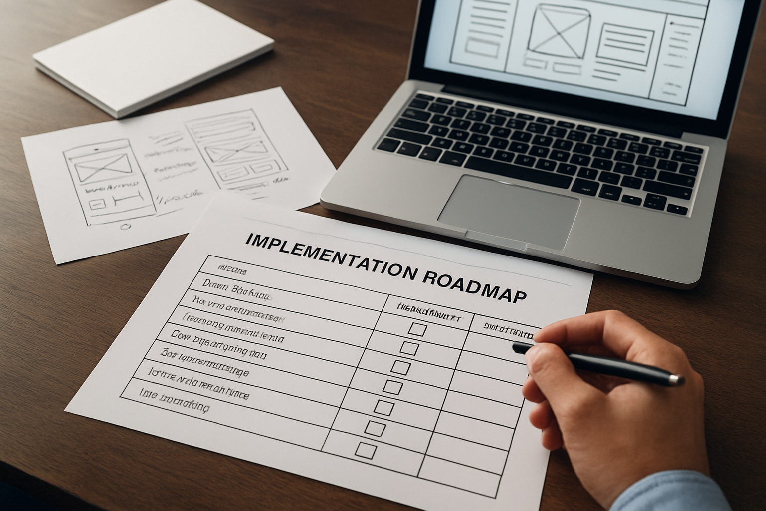
You do not need a replatform to see wins. Start with a 90-day sprint focused on the highest-impact templates and friction points. Align stakeholders around clear KPIs (Key Performance Indicators) such as form completion rate, add-to-cart rate, or demo bookings. Then schedule weekly check-ins so research, design, content, and engineering stay synchronized without scope creep. Internetzone I organizes work like this to reduce risk and keep momentum steady from week one.
| Phase (Weeks) | Focus | Key Activities | Primary Owner | Top KPI (Key Performance Indicator) |
|---|---|---|---|---|
| 1 to 2 | Discovery | Analytics audit, heatmaps, UX (User Experience) interviews, tech checks | Internetzone I Strategy + Your Stakeholders | Bounce rate on top pages |
| 3 to 5 | Design | Wireframes, copy hierarchy, usability review, performance budget | Internetzone I Design | Time to First Byte and LCP (Largest Contentful Paint) |
| 6 to 8 | Build | Template dev, schema via JSON-LD (JavaScript Object Notation for Linked Data), QA (Quality Assurance) | Internetzone I Dev + Your Dev | INP (Interaction to Next Paint) and CLS (Cumulative Layout Shift) |
| 9 to 10 | Test | A/B (Split) tests for hero, nav, forms; tracking validation | Internetzone I CRO (Conversion Rate Optimization) | Primary conversion rate |
| 11 to 12 | Scale | Roll-out to more templates, documentation, backlog planning | Internetzone I Managed Web Services | Revenue or lead volume |
- Define your north-star KPI (Key Performance Indicator) and success thresholds before design starts.
- Ship the smallest viable set of patterns on one high-impact template.
- Measure, learn, and then scale changes to related templates.
- Keep usability and performance budgets in every pull request.
- Revisit copy and internal links quarterly to match search intent shifts.
From Pattern to Profit: Your Next Moves
Conversion-first design turns every scroll, tap, and click into momentum for Search Engine Optimization (SEO), usability, and sales. When patterns focus attention, remove friction, and amplify trust, performance compounds. The sites that win are not the flashiest; they are the clearest and fastest to understand.
In the next 12 months, teams that systematize UX (User Experience) decisions will move faster than competitors who redesign once and hope for the best. Imagine a playbook that your marketing, product, and engineering teams all use, with each change mapped to a KPI (Key Performance Indicator) and a revenue goal. What would your growth look like if you treated ux interface design as your unfair advantage?
Additional Resources
Explore these authoritative resources to dive deeper into ux interface design.
Elevate UX Interface Design with Internetzone I
Internetzone I’s Web Design (mobile responsive, SEO-focused) lifts rankings, builds trust, and grows sales for Companies of all sizes aiming to enhance their online visibility, reputation, and digital marketing performance.