
If you are tired of guessing what will move the needle, adobe experience design can be your new unfair advantage. When you can turn ideas into clickable prototypes quickly, you can validate messages, layouts, and flows before you invest in full builds. That is how smart teams stack fast wins without burning budgets. In this playbook, I will show you 12 conversion-focused templates and the usability tests that prove which version actually converts, all tuned for mobile-responsive, Search Engine Optimization (SEO)-friendly delivery.
Here is the best part. You do not need a massive team to see results. At Internetzone I, we have watched lean marketing groups outpace bigger competitors by combining rapid prototypes, lightweight research, and practical analytics. Think of it like wind-tunnel testing for your site experience. You test the shape in a safe space first, then you release the design that flies.
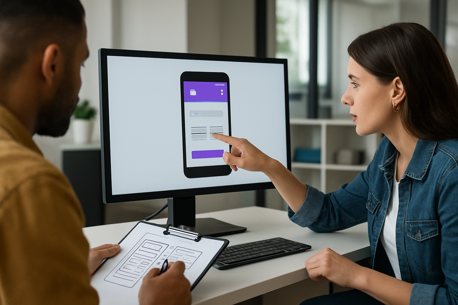
Adobe Experience Design That Drives Conversions
Let us demystify the term. Adobe XD (Adobe Experience Design) is a powerful way to wireframe, design, and prototype the journeys your visitors take, from the first scroll to the final purchase. What makes it special for growth is the feedback loop it enables. You can draft a hero section, simulate a checkout, or map a lead form, then watch real people try it. The insights are immediate, actionable, and often surprising.
Two data points should shape your priorities. First, studies from Google suggest that more than half of mobile visitors abandon a site that takes longer than three seconds to load. Second, analyses from the Baymard Institute commonly report cart abandonment rates around 69 percent. Both are design problems as much as technology problems. Clear content hierarchy, concise forms, scannable product info, and performance-friendly assets start inside your prototype, long before a developer writes a single line of code.
I learned this the hard way. A client insisted their pricing page needed more features and animations. In testing, participants ignored the bells and whistles and asked a simple question. What do I get and how is it different from the next plan up. We simplified the layout, shortened microcopy, and added a risk-reducer. Free migration and cancel anytime. The redesigned section, first proven in adobe experience design, later lifted signups by double digits once launched.
The 12 Conversion-Focused Templates You Can Plug In Today
Why reinvent the wheel when patterns already exist that people instantly understand. The following templates are battle-tested starting points. Each one includes a goal, a primary Key Performance Indicator (KPI), and a quick usability test to run on your prototype before any code ships. Use one, or chain several together into a high-performing funnel. To keep momentum, iterate weekly. Your team ships the winning patterns while the next round of tests runs in the background.
Watch This Helpful Video
To help you better understand adobe experience design, we’ve included this informative video from Adobe Creative Cloud. It provides valuable insights and visual demonstrations that complement the written content.
| Template | Best For | Primary KPI (Key Performance Indicator) | Core Element | Quick Test |
|---|---|---|---|---|
| Hero With Value Proposition and Social Proof | Homepages, campaign landers | CTR (Click-Through Rate) to next section | Strong headline, benefit bullets, testimonial | 5-second test to confirm message recall |
| Sticky Product Detail With Add-to-Cart | eCommerce product pages | CVR (Conversion Rate) and AOV (Average Order Value) | Sticky purchase module, trust badges | First-click test on purchase actions |
| Pricing Table With Plan Toggle | Software as a Service sales pages | Plan selection CVR (Conversion Rate) | Monthly versus annual toggle, money-back note | A/B (split testing) headline and plan labels |
| Lead Gen With Multi-Step Form | Business-to-Business campaign pages | Form completion rate | Progress indicator, minimal fields per step | Task-time test for form step completion |
| Resource Library With Faceted Search | Search Engine Optimization hubs | CTR (Click-Through Rate) to content | Filters by topic, industry, format | Tree test for findability |
| Long-Form Sales Page With Jump Links | High-consideration offerings | Scroll depth, demo requests | Anchored table of contents, sticky Call To Action (CTA) | Eye-tracking or click heatmap review |
| Competitor Comparison Page | Switch campaigns | Clicks on request demo and trial | Side-by-side checklist, objection handling | Open card sort for feature naming |
| Checkout With Progress Indicator | eCommerce conversion flow | Checkout completion rate | Guest checkout, address auto-complete | Task completion test for purchase |
| Appointment Booking With Calendar Embed | Professional services | Booked appointments | Real-time availability, confirmation details | First-click test on scheduling |
| Webinar Registration With Timezone Aid | Lead capture | Sign-up rate | Speakers, key takeaways, replay option | 5-second test to verify value recall |
| Onboarding Checklist With Progress | Post-signup activation | Activation rate and time-to-value | Checklist with context tips | Usability walkthrough with think-aloud |
| Contact Page With Smart Routing | Sales and support triage | Qualified inquiry volume | Topic routing, expected response time | Tree test for contact paths |
Steal these with pride. In adobe experience design, link key buttons to a success screen so you can measure task completion and misclicks. Keep visual design simple during testing so content and flow win on merit. Once a pattern proves its worth, dial in brand elements and motion. That is when you lock the gains in code and scale traffic with Search Engine Optimization (SEO) and Pay-Per-Click (PPC) once the experience is ready.
Rapid Usability Tests for Faster UX Wins
Speed beats guesswork. These fast tests reveal friction before it tanks your campaign. Better yet, they are easy to run on low-fidelity or high-fidelity prototypes. Invite five to eight people who match your audience, record sessions with consent, and look for repeating themes. If three people stumble on the same step, fix it. If a message takes longer than five seconds to recall, sharpen it.
- 5-second test: Show the hero for five seconds. Ask what the page offers, who it is for, and what to do next. If answers are scattered, simplify the value proposition.
- First-click test: Give a task. Where would you click to start a free trial. Research from the Nielsen Norman Group suggests that a correct first click strongly predicts success later in the journey.
- Task completion test: Script real tasks. Buy this item with a coupon. Book a call for Tuesday. Measure success rate, time on task, and error count.
- Card sorting and tree testing: Let users organize content and test your navigation labels. You will improve information architecture and reduce pogo sticking.
- Mobile stress test: Load your prototype on older phones, simulate slow networks, and try one-handed use. If it feels crowded or confusing, increase tap targets and spacing.
- Accessibility audit: Check color contrast, focus states, and keyboard navigation. Better accessibility improves conversions and satisfies compliance.
- A/B (split testing) in production: After prototype validation, run controlled experiments in the live site. Pair it with analytics to ensure you are testing the right thing.
Inside adobe experience design, string together screens with hotspots so participants can complete a full journey. Say your eCommerce page looks beautiful but the microcopy on shipping is vague. Participants will hesitate, ask clarifying questions, and bounce. Small content fixes can rival big redesigns on impact. The faster you learn, the faster you ship, the faster you grow.
Mobile-Responsive, SEO-Focused Web Design Blueprint
Here is the blueprint we use at Internetzone I when a client says, We want more qualified traffic and better conversions. It blends mobile-responsive layout decisions, Search Engine Optimization (SEO) fundamentals, and clean content design. Start in adobe experience design to visualize the structure, then verify performance and accessibility before launch. When your mockups respect constraints early, developers deliver speed without heroics later.
- Content-first layout: Draft headlines and body copy before the visuals. Design sections that answer who is this for, why should I care, and what do I do next.
- Semantic HTML and internal linking: Use proper heading levels and descriptive links. This helps screen readers and supports search engines.
- Performance budget: Limit fonts, compress assets, and reserve space for media to avoid layout shifts. Track Largest Contentful Paint (LCP), Interaction to Next Paint (INP), and Cumulative Layout Shift (CLS).
- Mobile gestures and tap targets: Ensure 44 pixel minimum targets and thumb-friendly navigation. Test with real hands, not just your mouse.
- Structured data: Add schema for products, reviews, and FAQs to enhance snippets and improve discoverability.
- Trust signals: Prominent reviews, guarantees, and logos near primary actions. Social proof reduces hesitation.
Internetzone I can align this blueprint with your broader growth engine. That includes National and Local Search Engine Optimization (SEO), Adwords-Certified Pay-Per-Click (PPC) Services, eCommerce Solutions, Reputation Management, and Managed Web Services. The handoff is seamless. We validate patterns in prototypes, translate them into a mobile-responsive, Search Engine Optimization (SEO)-friendly build, then amplify with content and campaigns so the right visitors arrive at a page that already converts.
Metrics That Matter: Benchmarks, Targets, and ROI Tracking

What gets measured gets improved. Tie every design decision to a metric and a business outcome. When a stakeholder asks why we made the CTA bigger or reduced fields, you can point to a hypothesis and a number. Start with a small scorecard. As you mature, add diagnostic metrics to diagnose surprises. Keep a calendar of changes so you can connect outcomes to the work, not luck.
| Metric | What It Indicates | Good Target | Tooling |
|---|---|---|---|
| CVR (Conversion Rate) | How effectively a page drives desired actions | Lift of 10 to 30 percent per iteration | Analytics and experiment platforms |
| CTR (Click-Through Rate) | Engagement with navigation and CTAs | 2 to 5 percent on key modules | Click maps and event tracking |
| LCP (Largest Contentful Paint) | Perceived load speed | Under 2.5 seconds on mobile | Page speed tools and lab tests |
| INP (Interaction to Next Paint) | Responsiveness to user input | Under 200 milliseconds | Web Vitals and performance logs |
| CLS (Cumulative Layout Shift) | Visual stability as content loads | Below 0.1 | Page speed tools and audits |
| AOV (Average Order Value) | Bundling and cross-sell effectiveness | 3 to 10 percent lift from merchandising | eCommerce analytics |
| NPS (Net Promoter Score) | Post-purchase advocacy signal | Consistent quarterly improvement | Survey and feedback tools |
A quick note on attribution. Pair experiments with annotated timelines and holdout groups when possible. If Paid Search spends jump, conversion rate may look better even if the design did not change. That is why Internetzone I tracks channel mix across National and Local Search Engine Optimization (SEO) and Pay-Per-Click (PPC), then attributes uplifts to the right combination of experience and traffic. Your finance team will thank you.
Case Notes: How Internetzone I Turns Prototypes Into Profit
Retail example: A mid-size outdoor gear brand had strong traffic but flat revenue. We used adobe experience design to prototype a sticky add-to-cart and streamlined shipping copy. Usability sessions showed confusion around delivery times. The live update included clarified estimates and guest checkout. Within six weeks, conversion rate improved in the low double digits and returns decreased because expectations were set clearly.
Services example: A multi-location healthcare provider struggled with phone bookings clogging the front desk. We mocked a three-step appointment flow with a progress bar and time zone clarity. Testing revealed that patients worried about insurance acceptance. We added a quick eligibility note and a reassurance message near the booking button. After launch, booked appointments rose and no-show rates tightened thanks to better confirmations.
B2B example: A software firm needed enterprise leads, not more clicks. We built a comparison page template and a lean multi-step form with smart routing. In testing, prospects gravitated to a single key differentiator. We moved that message higher and added a short proof section. Opportunities increased and sales cycle time shortened. It is the same playbook every time. Prototype, observe, edit, then promote with content and advertising when it is truly ready.
Your Next Step to a Mobile-Responsive, Search-Ready Build
If you want a shortcut, Internetzone I can own the entire loop. We translate your goals into adobe experience design prototypes, run fast usability tests, and turn the winners into a mobile-responsive, Search Engine Optimization (SEO)-focused site. Then we fuel it with National and Local Search Engine Optimization (SEO), Adwords-Certified Pay-Per-Click (PPC) Services, eCommerce Solutions, Reputation Management, and Managed Web Services. The result is a dependable growth system where each launch is more confident than the last.
Here is a simple weekly cadence you can adopt right away:
- Monday: Prioritize one conversion question. Example. Will a shorter headline lift demo requests.
- Tuesday: Build two versions in adobe experience design and prep a script.
- Wednesday: Run five participant sessions, record notes, and tally success rates.
- Thursday: Ship the winner and document the hypothesis, result, and lesson learned.
- Friday: Report results, queue the next test, and align traffic plans with the new experience.
This rhythm works because it respects your team’s reality. You have campaigns to run, features to ship, and budgets to defend. A lightweight loop lowers risk while raising confidence. Tiny experiments compound into meaningful revenue quickly when your site is mobile-responsive and aligned with search intent.
Quick checklist for teams:
- Every page has one primary Call To Action (CTA) and one secondary option.
- Forms ask only for what sales will actually use.
- Headlines answer who it is for and what outcome it unlocks.
- Navigation labels use customer language, not internal jargon.
- Important actions are reachable within one or two clicks on mobile.
If you follow this playbook for eight weeks, you will build a habit of learning that outperforms one-off redesigns. Your leadership will see a track record of steady improvements backed by data and customer feedback. And your team will stop arguing opinions and start comparing outcomes. That is how modern growth happens.
Bold promise, delivered fast. This playbook shows how to turn prototypes into profit with 12 templates and quick tests that remove risk from your next launch. In the next 12 months, teams that move ideas through adobe experience design and usability validation will pull ahead of competitors who rely on hunches. What would it change for your business if every release shipped with proof that customers can understand it and act on it?
Additional Resources
Explore these authoritative resources to dive deeper into adobe experience design.
Accelerate Adobe Experience Design Wins with Internetzone I
Launch mobile-responsive, SEO (Search Engine Optimization)-focused web design that converts, helping companies of all sizes improve visibility, reputation, and marketing performance.