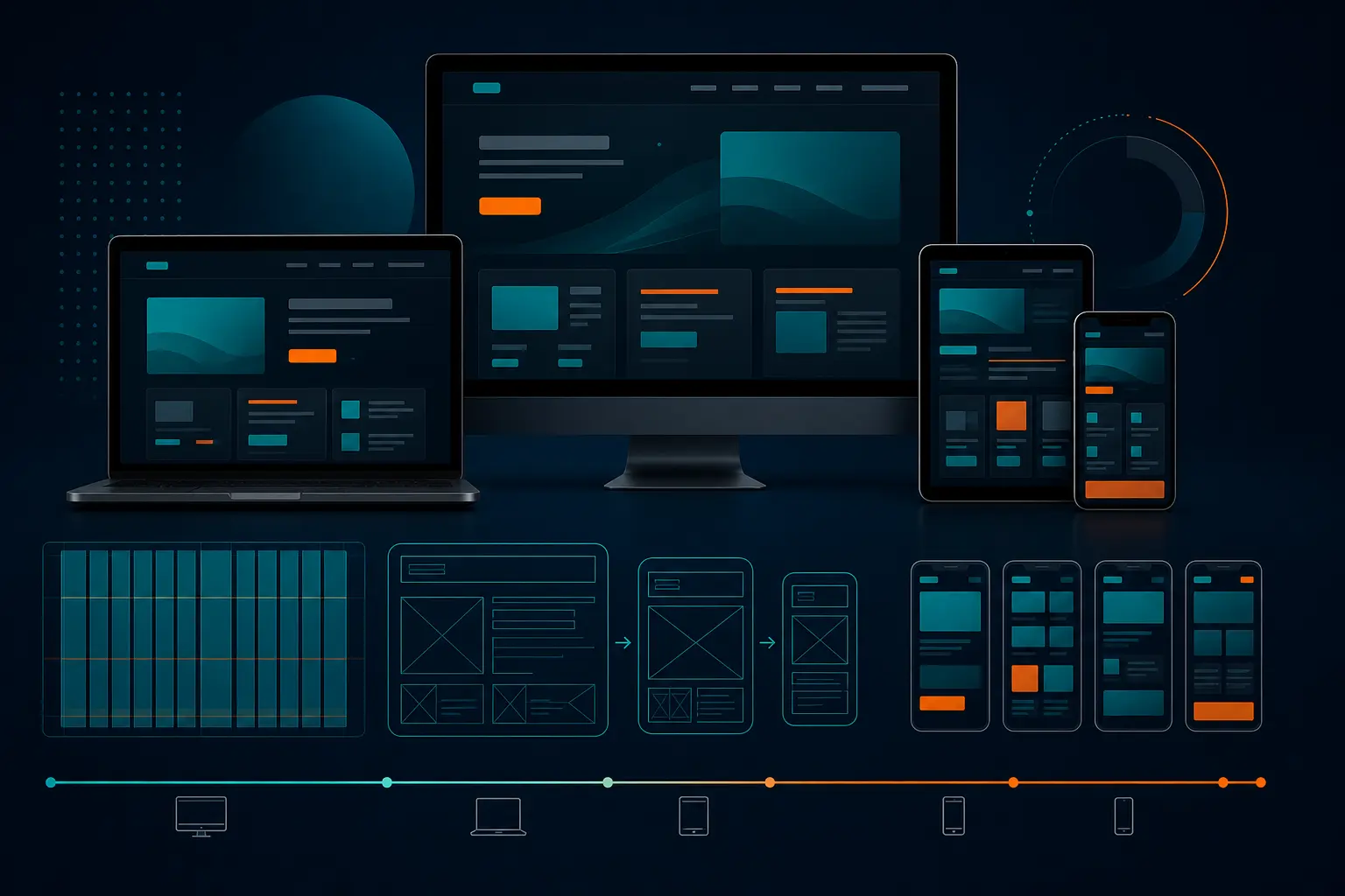
Best 7 Mobile Responsive Web Design Template 2026
Best 7 Mobile Responsive Web Design Template 2026
You’re waiting in line for coffee, one hand holding your phone, the other digging for your wallet. A homepage opens. The headline stays readable. The menu makes sense. The contact button is big enough to tap without pinching or zooming. No squinting. No sideways scrolling. Just clarity.
That’s the standard a mobile responsive web design template has to hit in 2026. Not “technically responsive.” Not “looks okay if you rotate the phone.” I mean genuinely usable on the screens people actually use — iPhone, Pixel, iPad, laptop, the whole messy real world.
If you’re running a service company, an ecommerce shop, a SaaS startup, a personal portfolio, or a local business with actual customers searching from parking lots and waiting rooms, this guide is for you. I’ve seen too many teams fall for gorgeous demos that collapse the moment real copy, real photos, and real phone numbers get dropped in. Pretty mockups are easy. Pages that convert on a 390px-wide screen? That’s the hard part.
So instead of chasing hype, we’re looking at seven template styles that hold up where it counts: mobile readability, editing freedom, and the kind of trust-building structure that helps you get calls, leads, bookings, or sales.
Selection Criteria
Responsive layout rules that survive small screens
Editing freedom for branding and content changes
The second filter is control. Can you swap in your own colors, headlines, sections, photos, and offers without breaking the layout? That matters more than people think. Six months from now, your team will want to change a promotion, add a testimonial, update hours, or replace a hero image. If the template fights you every step of the way, it’s the wrong template.
I always ask one boring but revealing question: can your team update this page on a Tuesday afternoon without calling a developer? If the answer is no, keep moving.
Trust, speed, and SEO basics that support marketing goals
A strong template also has room for the stuff that gets people to act: proof, contact details, clean headings, fast-loading sections, and obvious calls to action. Good. But “looks great” is only part of the job.
You also want lightweight sections, sensible spacing, and a structure that supports search visibility. A slow autoplay video, three competing buttons, and a vague hero line can wreck a page fast. Trust markers like reviews, logos, FAQs, and direct contact info should feel built in — not bolted on later.
** A template only qualifies if it works on every screen size the customer actually uses.
Template Type Strongest Mobile Advantage Best For
Minimal agency Clear value prop and CTA in the first screen Agencies, studios, B2B services
Consulting or professional services Trust-focused layout with credentials and process Consultants, firms, advisors
Product showcase Clean product cards and obvious buy buttons Smaller catalogs, featured products
Landing page Single-goal structure with visible form or CTA Lead gen, campaigns, ad traffic
Startup or SaaS Fast product story with feature blocks and proof Apps, software, new launches
Portfolio Easy scanning of projects and visuals on phones Creators, freelancers, studios
Local business Hours, location, tap-to-call, and reviews up front Restaurants, clinics, contractors, shops
Let’s start with the templates that service brands usually need first — the ones that make the offer, proof, and next step obvious before your visitor gets impatient and bails.
#1 Minimal Agency Template
Why it works on mobile
This is the clean, stripped-down workhorse. One strong headline. One supporting line. One primary call to action. Then a few stacked sections for services, proof, and results. On mobile, that structure shines because it doesn’t ask the screen to do too much. You’re guiding the eye instead of overwhelming it.
For service brands, this is usually the safest starting point. Your visitor lands, sees what you do, and knows where to tap next. That first screen carries a lot of weight — especially for agencies, designers, marketers, and consultants selling expertise rather than physical inventory.
What to customize first
Swap generic copy immediately. “We create amazing solutions” tells nobody anything. Write a plain-English offer instead. For example: “SEO and web design for multi-location law firms” is far more useful than vague brand poetry. Then replace stock photography with real team shots, real client logos, and one or two testimonials that sound human.
Because this template style is simple, it benefits from high editing freedom. You want that freedom here, because a minimal layout only works when every word earns its place.
Best for
Best for agencies, creative studios, B2B services, and any company with a small set of clearly defined offers. If your business can explain its value in one sentence and back it up with proof, this style is hard to beat.
If the first screen on mobile does not answer what you do in five seconds, the template is not doing its job.
#2 Consulting or Professional Services Template
Why it works on mobile
This style is a little less minimalist and a little more trust-heavy. Think consultant, accountant, law practice, IT advisor, financial planner, or B2B expert. These templates usually lead with a promise, then quickly move into credibility: certifications, years of experience, client types, process steps, and maybe a short bio.
On mobile, that matters because professional services buyers are skeptical. They want reassurance fast. A clean “how we work” section, a few recognizable trust markers, and a visible “book a consultation” button can do more than a flashy hero ever will.
What to customize first
Put your credentials and niche up front. If you serve healthcare clinics in Dallas or manufacturers in Ohio, say so. Add headshots that look current, not cropped from a 2017 conference badge. Keep your primary CTA visible, and make the offer easy to understand at a glance — exactly what service pages should do on mobile.
Also trim long paragraphs. I’ve seen consulting templates that read like a white paper on desktop and a punishment on a phone. Break copy into short proof-based sections instead.
Best for
Best for consultants, coaches, legal and financial firms, managed service providers, and specialized B2B companies where trust is the sale.
Now let’s move into templates where tapping the right button really is the whole game — products, forms, pricing blocks, and campaign traffic.
#3 Product Showcase Template
Why it works on mobile
A strong product showcase template puts the item first and gets out of the way. Large product image. Short benefit-led headline. Price, key features, and a buy or inquire button that doesn’t hide under three carousels and a wall of tabs. When the grid collapses properly, shoppers can browse one-handed without friction.
This is the template type I like for smaller catalogs, featured collections, and brands that want a cleaner path than a giant marketplace-style layout. Product grids, pricing blocks, and variant selectors need to adapt cleanly on smartphones and tablets. If they don’t, every other design decision is irrelevant.
What to customize first
Start with image quality and button placement. A blurry hero shot and a tiny “Add to Cart” button can sink the page before your product copy gets a chance. Then add essentials close to the CTA: shipping info, return policy, short specs, and a plain-language reassurance point. Nike, Apple, and countless Shopify stores do this because it works — the buyer shouldn’t have to dig for confidence.
A ready-made starting point only helps if the mobile layout stays sane once real products are loaded in.
Best for
Best for ecommerce brands with hero products, smaller stores, seasonal collections, direct-to-consumer launches, and product-led microsites.
If a product grid requires horizontal scrolling on mobile, skip it.
#4 Landing Page Template
Why it works on mobile
Landing page templates are built for focus. One offer. One audience. One next step. That could be booking a call, requesting a quote, downloading a guide, registering for a webinar, or starting a trial. On mobile, that narrow purpose is gold. It reduces cognitive clutter and keeps the main form or CTA visible without forcing the visitor to hunt for it.
This is where a lot of ad traffic lives. If someone clicked from Google Ads or Instagram, you do not want them landing on a mini sitemap. You want a clear page with a promise, a little proof, and a fast decision path.
What to customize first
Match the headline to the traffic source. If the ad promised “same-day HVAC repair in Phoenix,” the page should say exactly that. Then shorten the form. Unless you truly need seven fields, don’t ask for them. Keep social proof nearby, not buried 900 pixels down the page.
I also like to test button language here. “Get My Quote” often beats vague text like “Submit,” simply because it answers the obvious question: what happens after I tap?
Best for
Best for paid campaigns, lead generation, event signups, quote requests, downloads, webinars, and any single-offer push where distraction is the enemy.
Smaller brands have different needs. They usually need credibility fast, fewer moving parts, and a site they can actually maintain after launch. That’s where the next three styles earn their keep.
#5 Startup or SaaS Template
Why it works on mobile
A startup or SaaS template needs to explain the product quickly. That means a sharp value proposition, feature blocks, a screenshot or interface preview, social proof, and a simple action like “Book Demo” or “Start Free Trial.” On mobile, the best versions compress a big product story into a smooth vertical sequence.
This style works especially well when you need to look credible before you have a giant brand footprint. A professional starting point matters for lean teams trying to look established without hiring a full in-house design crew on day one.
What to customize first
Lead with the outcome, not the feature list. “Reduce scheduling chaos for dental offices” lands better than “AI-enabled workflow orchestration.” Then keep screenshots readable on phones. If your UI image turns into a postage stamp on mobile, it isn’t helping.
Add one pricing cue, one trust cue, and one human face if you can. A testimonial from a named customer in Austin or Toronto beats a faceless “trusted by innovators” badge every time.
Best for
Best for SaaS products, startups, app launches, beta programs, and subscription-based services that need a clear story plus a clean conversion path.
#6 Portfolio Template
Why it works on mobile
Portfolio templates live or die on scanning. People want to see the work — fast. A good one uses a clean project grid, strong thumbnails, concise captions, and a lightweight project-detail structure that doesn’t punish mobile users with giant media files and endless scrolling.
Designers, photographers, developers, architects, and videographers often overcomplicate this. You do not need five animation tricks to prove you’re talented. You need crisp work samples, a short intro, and a contact path that doesn’t disappear below a dramatic full-screen intro.
What to customize first
Curate ruthlessly. Six strong projects beat twenty-six random ones. Make sure each thumbnail has a consistent ratio, each case study opens quickly, and each page answers basic questions: what was the project, what did you do, and what happened after? If you’ve ever watched a potential client bounce because a gallery took forever to load on LTE, you know why this matters.
For imagery-heavy templates, compress media and keep captions simple. Portfolio and local-business layouts should make visuals easy to scan on a phone, not bury them under decorative clutter.
Best for
Best for freelancers, creators, studios, developers, photographers, architects, and anyone whose work itself is the proof.
#7 Local Business Template
Why it works on mobile
This one is brutally practical, and that’s why it converts. A local business template should surface location, hours, service area, reviews, and contact options quickly on mobile. Think about how people search for a dentist, roofer, salon, pizza place, or auto shop. They’re often on the move. They want to call, map the location, or book — now.
The best versions make tap-to-call obvious, place key trust markers near the top, and keep the homepage focused on the next action. Google Maps behavior has trained users well here: if they can’t figure out where you are or how to reach you in seconds, they’ll try the next listing.
What to customize first
Update your name, address, phone number, hours, and service area before you touch decorative sections. Then add review snippets, photos of the real location or team, and one prominent action button like “Call Now,” “Book Appointment,” or “Get Estimate.” If you have multiple locations, make sure that experience is painless on a phone.
Don’t hide practical details behind a hamburger menu if you can help it. For local intent, utility beats cleverness.
Best for
Best for restaurants, medical practices, salons, home service companies, gyms, repair shops, and any business where local trust and quick contact matter more than elaborate storytelling.
For smaller brands, clarity beats complexity: one main goal per page is usually enough.
How to Choose the Right Mobile Responsive Web Design Template
Match the template to the primary conversion goal
Start with the page goal, not the visual style. Do you need a phone call, a quote request, a purchase, a booking, a demo signup, or a portfolio inquiry? Once you answer that, the shortlist gets much easier. Service brands usually do well with minimal agency or consulting layouts. Campaign traffic belongs on landing pages. Local businesses need contact-first templates. Simple, but people skip this step all the time.
Primary Goal Best Template Match Must-Have Mobile Element
Get calls or consultations Minimal agency / consulting Visible CTA in first screen
Sell products Product showcase Large buy button and clean product cards
Capture leads Landing page Short form above the fold
Explain software fast Startup or SaaS Readable feature stack and demo CTA
Show creative work Portfolio Fast-loading visual grid
Drive local actions Local business Hours, map, tap-to-call
Test the layout on real phone widths
Do not trust desktop preview mode alone. Open the template on an actual phone — ideally the device your audience uses most. I usually test on something around 390px wide, then check a larger phone and a tablet. Navigation, images, buttons, pricing blocks, and forms should still feel natural. If a field gets cut off, a menu becomes awkward, or a headline turns into six tiny lines, that’s not a small issue. That’s the issue.
A useful test is whether the template feels normal on a real device, not just acceptable in Chrome DevTools. Phones reveal friction instantly. Your thumbs know before your brain does.
Test the template on the device your audience uses most, not only in desktop preview mode.
Check how easily your team can edit content later
This is the part buyers underrate. Whether you use a platform or another one, the principle is solid: choose a template your team can maintain without drama.
If changing a homepage CTA, swapping a holiday offer, or updating office hours feels risky, you’ll stop updating the site. And stale sites leak trust. Pick a layout that gives you clean sections, editable blocks, and enough flexibility to evolve without needing a redesign every quarter.
Launch the Template That Works on Every Screen
Recap the mobile-first rule
The best choice isn’t the flashiest demo. It’s the one that stays readable, useful, and believable on every screen. Responsive, fully editable, and designed to work across computers, tablets, and smartphones is the right north star. If a template fails readability or editability, I’d drop it — even if the desktop version looks fantastic.
Shortlist two templates for side-by-side testing
Don’t compare demos filled with perfect placeholder copy. Load the same real headline, same real photo, same CTA, and the same contact details into two finalists. Then check both on your phone. Which one explains the offer faster? Which one makes the next action easier? Which one feels more trustworthy in the first ten seconds?
You’ll usually know pretty quickly. A side-by-side test cuts through a lot of design theater.
Launch with the one that is easiest to edit
The most practical decision is the one that balances mobile usability with ongoing content control. If one template is slightly prettier but the other is far easier for your team to update, I’d usually pick the editable one. That choice ages better. Promotions change. Services evolve. Staff pages need updates. A site that your team can maintain wins long after launch week.
Here’s the promise: the right mobile responsive web design template** stays readable, tappable, and trustworthy on every screen.
Shortlist two options, test them on a real phone, and choose the one your team can edit without breaking a sweat.
When you look at your next template demo, what matters more — a prettier first impression or a site your customers and staff will still love using six months from now?
Build Smarter Mobile Pages With Internetzone I
Mobile-responsive, SEO-focused web design helps companies of any size strengthen visibility, protect reputation, and turn more traffic into inquiries or sales.

Written by
Darren DunnerDigital marketing strategist and founder of Internetzone I. Helping businesses grow through SEO, PPC, and conversion-focused web design since 1999.