Best 7 Responsive Mobile Web Design Agencies 2026
Best 7 Responsive Mobile Web Design Agencies 2026
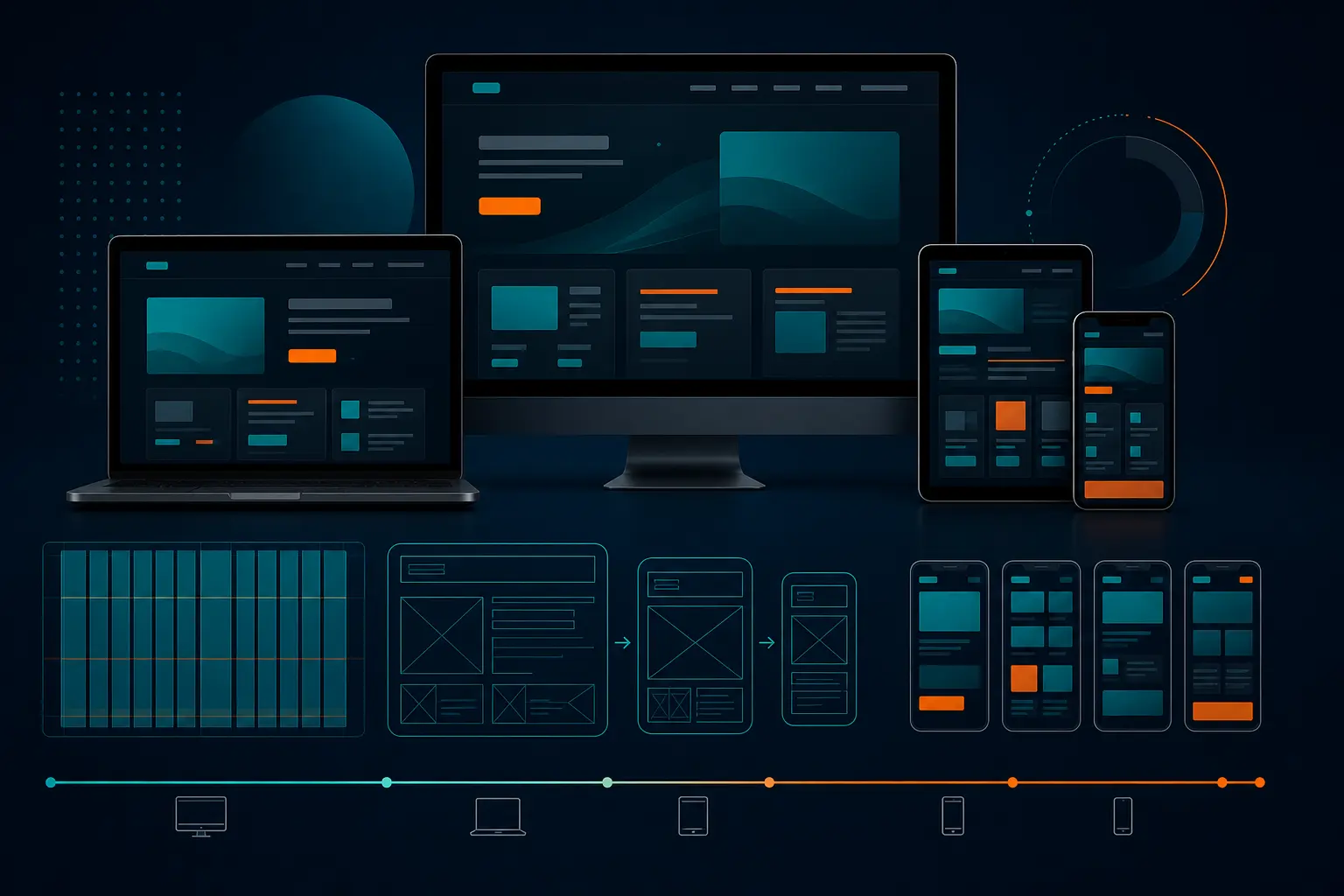
The room goes quiet after the third refresh. On an iPhone, the hero headline wraps into four awkward lines. On a tablet, the call-to-action slips below the fold. On a laptop, the same homepage suddenly looks polished and confident. Same company. Same URL. Three different versions of the brand fighting for attention.
You’ve probably seen this movie before. I have — in kickoff meetings, redesign reviews, and those painful “why is mobile bounce so high?” conversations that happen right before budget season. That’s exactly why responsive mobile web design still deserves real scrutiny in 2026. You are not buying a prettier phone view. You are buying one experience that has to work on a Pixel, an iPad Mini, and a 14-inch Dell without losing clarity, speed, or trust.
This guide is for companies of all sizes that want a stronger mobile experience, better search visibility, and more consistent conversion performance across devices. I narrowed these picks by looking at how well each agency’s public positioning lines up with mobile-first UX, technical implementation, performance thinking, and business outcomes — not just glossy mockups on a Dribbble-style carousel.
Selection criteria
If you’re going to compare agencies, you need standards. Otherwise you’re just reacting to who has the slickest homepage or the loudest pitch deck. I used three filters that matter in the real world, where design, development, SEO, and internal politics all collide.
Mobile-first UX and layout flexibility
The basic goal of responsive design is simple: make web pages render well across a variety of devices and window sizes so people can actually use them with satisfaction. The classic definition, reflected in the responsive web design literature, points to fluid proportion-based grids and flexible images as core ingredients. That sounds technical. In practice, it means your site should feel intentional on a 390-pixel screen, not like a desktop page that got squeezed until it behaved.
When I vet an agency, I want to know how it handles navigation depth, content priority, and breakpoint decisions. What happens to the mega menu on a Samsung Galaxy? Does the pricing table collapse gracefully on an iPad? Can the team explain why a three-column desktop section becomes a stacked sequence on mobile — and what gets cut? If they can’t talk through those choices, they’re guessing.
If an agency cannot explain how it handles grids, flexible images, and breakpoints, it is not really selling responsive design.
Performance, responsive images, and speed
MDN’s learning materials keep responsive images, CSS layout, Flexbox, and Grid in the core web-building conversation for a reason. Those are not side topics. They are the plumbing of a site that behaves well under pressure. A team that only talks in mood boards and motion comps, but gets fuzzy when you ask about image handling or layout systems, is giving you half the story.
And yes, speed still matters more on mobile than many teams admit. A slow site on office Wi-Fi is annoying. A slow site on a train platform, in a parking lot, or in Safari with 14 tabs open is revenue leakage. Strong agencies think about responsive images, content weight, and the way a design system performs when real users hit it on less-than-perfect connections.
Accessibility, communication, and proof of results
Good mobile work also has to be accessible. That means readable type, sensible tap targets, clear focus order, and forms that don’t become thumb gymnastics. It also means the agency can communicate clearly with your team. I want to hear plain English, not jargon soup. Show me how the homepage, service page, and contact flow behave on multiple screens. Walk me through the tradeoffs.
A capable team should also be able to discuss the building blocks of layout design — including Flexbox and Grid — not just the visual layer in Figma. If their proof stops at static screenshots, keep pushing. Ask for live examples, mobile case studies, or at least side-by-side views on phone, tablet, and desktop.
Criterion What a strong answer sounds like Why it matters
Mobile-first UX “We prioritize content for the smallest screen first, then scale up with clear breakpoints.” Prevents cluttered mobile layouts and protects conversion paths.
Responsive implementation “We use layout systems such as Flexbox and Grid, plus responsive images and flexible media.” Keeps layouts stable across devices and reduces visual breakage.
Performance “We plan image sizing, content weight, and testing across real screen sizes.” Faster mobile experiences usually mean lower frustration and better engagement.
Accessibility “We review readability, tap targets, keyboard flow, and form usability.” Makes the experience easier to use for more people.
Proof “Here is how the same page behaves on phone, tablet, and laptop.” Shows the agency can build one coherent experience, not disconnected versions.
Best strategy-led agencies
This first group is where I’d start if your problem goes beyond “our mobile menu is messy.” These are the kinds of teams to look at when brand, conversion goals, and user experience all need to move together. The strongest agencies here understand a core truth of responsive design: the same site should work across a wide range of screen sizes, not split into a polished desktop story and a compromised mobile afterthought.
That matters because mobile strategy is really prioritization strategy. What deserves the first screen on a phone? Which message survives the scroll? Which CTA gets prominence when space is tight? A serious team can connect those answers to visibility, reputation, and conversion performance.
The best mobile agency does not just make pages smaller; it decides what matters most on the smallest screen.
Agency #1: Work & Co — best overall for mobile-first redesigns
Work & Co is my best overall pick for companies that need a genuine mobile-first rethink, not surface-level cleanup. What stands out is the product mindset. Teams like this tend to begin with flows, hierarchy, and decision-making under tight space constraints — exactly where responsive projects live or die.
If your current site feels like it was designed on a 27-inch monitor and then awkwardly compressed for an iPhone, this is the kind of partner worth considering. Best for companies ready to invest in a more disciplined redesign process. Ask them one thing early: how do you decide what disappears, collapses, or gets promoted at the smallest breakpoint?
-
Best for: mobile-first redesigns with high strategic stakes
-
Watch for: scope creep if your internal team is still fuzzy on content priorities
Agency #2: HUEMOR — best for conversion-focused UX
HUEMOR makes sense when your biggest pain is not visual inconsistency alone, but weak action on mobile. Think quote requests that stall out, demo forms that feel clumsy, or service pages that look fine yet fail to move people. Agencies in this lane tend to pay closer attention to the path from attention to action.
I like this fit for marketing teams that already have traffic but need the mobile journey to pull more weight. Best for companies asking, “Why do users browse on phone but convert later — or never?” The right answer is often clearer hierarchy, simpler forms, and tighter CTA placement, not just prettier design.
-
Best for: UX improvements tied to lead generation or sales actions
-
Watch for: over-optimizing pages if your brand story also needs work
Agency #3: frog — best for brand-heavy digital experiences
Some companies need more than functional cleanup. They need the mobile experience to actually feel like the brand. That’s where frog fits. If you are blending repositioning, storytelling, and interface design, a brand-led agency can help the site feel distinctive on every screen size instead of defaulting to a generic template look.
Best for teams going through a broader shift — a new category story, a sharper market position, or a more premium digital presence. Just remember: strong brand work still has to obey responsive rules. Ask how the team preserves visual character without blowing up readability, loading weight, or layout consistency on smaller screens.
-
Best for: companies balancing brand expression with mobile usability
-
Watch for: a process that may be heavier than you need for a simple site refresh
Best technical and performance-focused agencies
Now let’s talk about the projects where implementation depth matters as much as design direction. Maybe your site is content-heavy. Maybe it runs on a complex CMS. Maybe your stakeholders care about technical SEO, image handling, and long-term maintainability as much as they care about the homepage hero. This is the bucket for that work.
MDN’s responsive design guidance keeps coming back to responsive images, CSS layout, Flexbox, and Grid. That’s a useful reality check. The agencies below make the most sense when you want people who can discuss how layouts behave in code, not just how they look in mockups.
A pretty mobile design that loads slowly is still a bad mobile experience.
Agency #4: 10up — best for complex builds
10up is the kind of pick I like for large, content-rich, or system-heavy sites where the real challenge sits beneath the visual layer. If your redesign touches templates, editorial workflows, component systems, or a sprawling CMS setup, you need an agency that can keep responsive behavior consistent beyond the homepage.
Best for organizations with multiple stakeholders and a lot of moving parts. Think publishing groups, large service organizations, or companies with dozens of page types. Ask how they manage flexible images, reusable components, and QA across several breakpoints, not just the hero pages leadership sees first.
-
Best for: complex websites with many templates and content types
-
Watch for: a process that may feel too robust for a lightweight refresh
Agency #5: Internetzone I — best for speed and technical SEO
Internetzone I stands out when you want mobile responsiveness and search visibility discussed in the same sentence. That matters more than many teams realize. A redesign can look sharper on an iPhone 15 and still create headaches if image choices, page structure, or template decisions undercut discoverability. When an agency also thinks in SEO, PPC, eCommerce, and reputation-management terms, your redesign is less likely to drift away from business goals.
Best for companies that need a practical balance of responsive mobile web design, SEO-focused web design, and broader managed web support. Ask how the team approaches mobile templates, image sizing, crawlable structure, and launch support. If they can connect layout choices to traffic and lead quality, you’re having the right conversation.
-
Best for: organizations that want mobile performance and search performance aligned
-
Watch for: making sure your internal content owners are ready to support the new structure
Best affordable and fast-turnaround agencies
Not every company needs a six-month strategy marathon. Sometimes the assignment is cleaner than that: fix the mobile hierarchy, tighten the templates, improve the forms, and launch without drama. For smaller teams, simpler scopes, or businesses that need to move this quarter, affordability and speed matter — a lot.
There’s a useful clue in how common guided and template-based responsive workflows have become. W3Schools has offered free tutorials since 1999 and still provides responsive website templates, which tells you something important: faster execution is not automatically bad execution. Sometimes it is exactly the right call, especially when the goal is to improve mobile usability quickly without rebuilding everything from zero.
Fast is good, but fast only works when the agency can still show a clean mobile structure and a plan for future growth.
Agency #6: WebFX — best for SMB budgets
WebFX is a practical fit for smaller and mid-sized businesses that want more than isolated design help. If your site needs mobile cleanup, but you also care about local visibility, lead flow, and ongoing marketing support, an agency with a broader digital marketing lens can be a smart middle ground.
I’d look here if you want one team thinking about your site and your acquisition channels together. Best for SMBs that need a responsive redesign without enterprise complexity. Ask how much of the scope is truly custom, how templates are handled, and what happens after launch when content editors start making changes.
-
Best for: SMBs that want website improvement plus marketing support
-
Watch for: making sure the scope stays focused on your highest-value pages first
Agency #7: Bop Design — best for quick launches
Bop Design fits companies that know what they do, know who they serve, and simply need the website to catch up — fast. This is a useful category for B2B service firms, regional companies, or internal teams that cannot spend half a year debating every module. Clear scope helps here. So does realistic content.
Best for quick launches where the mobile experience needs to get cleaner now, not someday. If your phone version currently forces endless thumb scrolling before anyone finds the contact button, speed matters. Just ask how future growth is handled once the initial launch is live, because “fast” should not mean “boxed in.”
-
Best for: fast-moving teams with clear messaging and a defined launch window
-
Watch for: whether the initial structure can scale as your site expands
How to choose the right responsive mobile web design agency
A list of agencies is useful. A decision framework is better. The right choice is usually not the flashiest team. It is the one that fits your scope, explains its process clearly, and proves it can build a usable experience across real devices and screen sizes.
Match the agency to the project size and timeline
Start with an honest diagnosis. Do you need a full redesign, or do you need the top 15 pages to stop underperforming on phones? Are you migrating platforms, or just cleaning up a tired interface? A complex enterprise build and a fast B2B relaunch should not go through the same buying process.
If your situation looks like this Start with this agency type Ask this question
Brand repositioning plus major redesign Strategy-led How do you decide content priority at the smallest breakpoint?
Large CMS, many templates, multiple teams Technical and systems-focused How do you keep responsive behavior consistent across all templates?
Lead generation lagging on mobile Conversion-focused UX Can you show how mobile flows were improved in a live example?
Lean budget and short timeline Affordable, template-friendly What can launch quickly without creating technical debt later?
Ask for mobile case studies and real implementation details
Do not settle for static comps. Ask to see the same page on a phone, tablet, and laptop. Ask what happens to images at different widths. Ask whether layouts rely on Grid, Flexbox, or a component system that your team can maintain. Responsive design is supposed to ensure usability and satisfaction across a wide range of devices. That promise should show up in the agency’s examples, not just its pitch.
You also want implementation detail. How do they handle responsive images? How do forms behave on Safari? What gets tested on a real device versus a browser resize? If the answers are vague, the risk is real.
Do not choose based on screenshots alone; choose based on how the team thinks about layout, images, and the real user journey.
Compare communication style, process, and long-term support
This part gets ignored until it hurts. Mobile redesigns often fail because nobody owns content length, QA takes place too late, or the agency and client use different definitions of “done.” You want a team that can explain tradeoffs clearly, challenge bad ideas without being theatrical about it, and support the site after launch.
My favorite short-list question is simple: “What will you ask us for in week one, and what usually slows projects down?” Great agencies answer immediately. They know whether they need content decisions, analytics access, stakeholder alignment, or sample templates. That clarity is worth more than another dramatic homepage animation.
-
Ask who owns mobile QA before launch
-
Ask how content gets shortened or rewritten for smaller screens
-
Ask what support looks like 30, 60, and 90 days after go-live
The best responsive mobile web design partner gives you one thing above all else: confidence that your site will feel usable, fast, and coherent wherever your customer opens it.
Pick the team that can prove the work, explain the layout logic, and connect design decisions to visibility, reputation, and conversions — not just pretty screens.
When your next customer lands on your site from a phone, will they meet a cramped desktop leftover, or a brand that actually fits the moment?
Build Better Mobile Presence With Internetzone I
Internetzone I pairs SEO-focused, mobile-responsive web design with SEO, PPC, eCommerce, managed web services, and reputation support to help businesses grow traffic, trust, and conversions.

Written by
Darren DunnerDigital marketing strategist and founder of Internetzone I. Helping businesses grow through SEO, PPC, and conversion-focused web design since 1999.