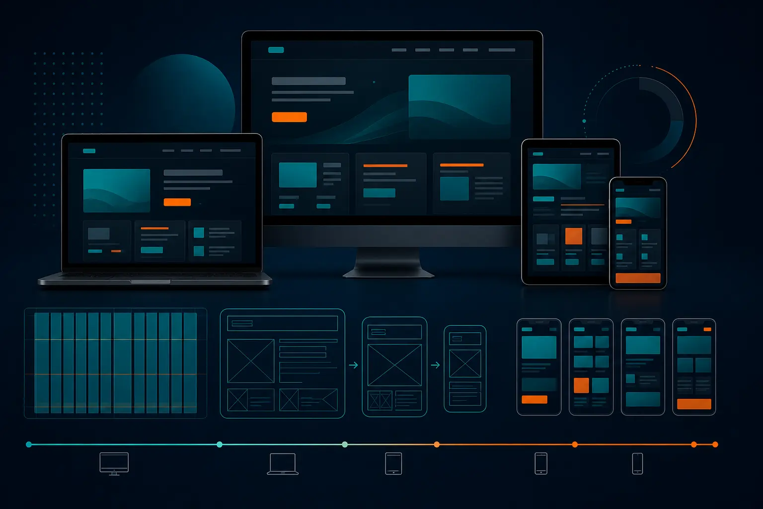
Top 3 Mobile-First Responsive Web Design 2026
Top 3 Mobile-First Responsive Web Design 2026
The 7:42 train was packed, somebody’s coffee was sloshing onto the floor, and our marketing team had exactly one free minute to check the homepage on a phone before the next client meeting. The headline wrapped into a weird four-line stack. The menu icon nudged the logo off-center. The primary button dropped so far down the page you had to scroll to find it. Nobody needed a long debate after that.
That little moment is why mobile-first responsive web design has to start on the smallest screen, not get squeezed into it later. When your homepage, service page, or product page works on a phone first, the desktop version usually gets cleaner too. When it doesn’t, you wind up fixing preventable problems after launch — and you pay for them in trust, visibility, and conversions.
This guide is for the teams who don’t have time for fluffy design talk. If you run marketing for a local service brand, manage product for a SaaS company, lead web strategy for a multi-location business, or just inherited a site that looks great on a MacBook and awkward on an iPhone, you’re in the right place. I picked resources that help you answer the practical question: what should we actually use to get better mobile behavior fast?
And no, the three picks below are not trying to do the same job. One is strongest for a structured build from phone to desktop. One helps teams align around examples and strategy. One helps you validate the experience on real devices before your customers do it for you.
Selection criteria for this mobile-first responsive web design list
I used three filters. Simple ones. If a resource missed even one, it didn’t make the cut.
Start with the smallest-screen-first principle
First, I wanted resources that clearly explain the core rule: mobile-first design means designing for the smallest screen first and then working upward to larger screens. UXPin states that directly, and that clarity matters because too many teams still start with a big desktop canvas and trim their way down. That is not the same thing.
UXPin also frames mobile-first as a tenet of progressive enhancement, which is exactly how seasoned teams tend to think about it. You decide what is essential first. Then you add complexity as screens get larger. That’s a much saner way to build than dumping everything into a 1440-pixel layout and hoping it survives on a phone.
Look for practical implementation guidance, not just definitions
I skipped resources that only define terms. You need more than a nice paragraph about responsiveness. You need to see how a page shifts from phone to tablet to desktop, because responsive design often requires multiple arrangements based on screen size and orientation. Portrait and landscape are not tiny details when your menu, hero image, and form all compete for space.
That’s also why I didn’t want a pure debate piece. A forum thread can be interesting — and yes, even a Reddit discussion can surface real frustration — but it won’t show your team how to handle a cramped navigation, a stacked pricing card, or a CTA that disappears below the fold on a Pixel 8.
** If a guide cannot explain how a page changes from phone to tablet to desktop, it is too shallow for 2026.
Prioritize resources that connect design choices to traffic and accessibility
Good mobile thinking is not just about layout taste. BrowserStack says mobile traffic makes up a major share of web visits, and that is close enough to half your audience that you cannot treat mobile as cleanup work. If your site feels clumsy on a phone, you are not talking about a cosmetic problem anymore.
I also favored resources that connect mobile-first work to accessibility and visibility. BrowserStack explicitly includes the link between mobile-first design and accessibility, and that’s a big reason it made this list. Better spacing, clearer hierarchy, stronger tap targets, and fewer layout surprises often help everyone — not only users on small screens, but users who need interfaces to behave predictably.
Resource Strongest Angle Why It Made the List Best Fit
UXPin Structured prototyping Shows how to create a mobile-first prototype and transform it into tablet and desktop screens Teams building workflows from the ground up
Figma Examples and strategy Centers mobile-first examples, design, and prototyping in one place Teams that need stakeholder alignment
BrowserStack Testing and implementation Ties mobile-first to accessibility, best practices, and real-world device validation QA-heavy or device-diverse organizations
#1 UXPin: best for teams that need a step-by-step prototype workflow
Summary:** UXPin is the strongest pick if your team needs a clear, disciplined process for starting with the phone experience and expanding it into tablet and desktop layouts.
What the guide teaches
UXPin’s guide says it will show you how to create a mobile-first prototype and transform it into tablet and desktop screens. That one promise is why it stands out. It does not stop at “start small.” It pushes you into the next question: what changes as the screen grows?*
The guide also frames mobile-first as designing for the smallest screen and working your way up. That sounds obvious until you sit in a review where somebody wants a giant hero video, a four-column feature grid, and a sticky promo banner on a 390-pixel-wide screen. Starting small forces discipline. It exposes what the page actually needs to do.
Why the workflow matters for product teams
In practice, this approach helps product teams avoid feature sprawl. When you design the hardest screen first, you answer the hardest usability questions first too. What is the primary action? What belongs in the menu? What can wait until the user scrolls? Those are not decorative choices. They are business choices.
UXPin also positions mobile-first as a strategy for both responsive and adaptive design. That matters if your team is deciding whether layouts should fluidly respond or shift between more defined patterns. And it explicitly names the opposite approach: graceful degradation. I’ve used that older “start big and trim later” approach on rushed projects before. It usually creates more compromise, not less.
** Design the hardest screen first.
Best for design systems and prototype-driven organizations
If your organization already works from reusable patterns, UXPin’s logic will feel natural. You can think through the smallest useful version of a card, form, nav, or pricing block before you add desktop extras. That tends to create cleaner handoffs and fewer “wait, which version is correct?” Slack messages later.
-
Choose UXPin if your biggest issue is structure**.
-
Choose it if your team keeps redesigning screens without agreeing on what the mobile baseline should be.
-
Choose it if developers need a clearer story about how components evolve across breakpoints.
If you need a resource that treats mobile-first like an actual build process, not a slogan, this is the one I’d hand your team first.
#2 Figma: best for teams looking for examples and collaborative strategy
Summary: Figma is the best choice when your challenge is not understanding the concept, but getting marketers, designers, and stakeholders to agree on what good mobile-first execution looks like.
Best for: Cross-functional teams that need shared examples, faster reviews, and less abstract discussion.
What the page emphasizes
Figma’s page is explicitly titled around mobile-first design examples and strategies, and that emphasis matters. Some teams do not need another definition. They need something they can point to in a meeting and say, “Yes, like that — but for our brand.” Examples close the gap between theory and approval.
The surrounding product language supports that use case too. Figma Design is positioned as a place to design and prototype in one place, which is useful when you want the conversation to move from rough thinking into something interactive. Figma Sites is also presented as a way to publish fully responsive websites, reinforcing the idea that mobile-first thinking should scale into real, responsive output.
Why examples help stakeholder buy-in
If you have ever tried to explain progressive enhancement to a non-designer in a 30-minute review, you already know why examples matter. Show a clean phone layout next to a bloated one and the room gets smarter fast. Show how the same content expands on tablet and desktop without losing the main action, and suddenly the strategy feels concrete.
I’ve seen this play out with sales leaders, founders, and even legal reviewers. The minute they can compare annotated screens instead of listening to jargon, decisions speed up. You get fewer “Can’t we just keep everything above the fold?” comments and more useful questions about priority, hierarchy, and conversion.
** Examples sell the strategy faster than theory ever will.
Best for collaborative design reviews
Figma fits best when alignment is the bottleneck. Maybe design knows what should happen on mobile, but marketing wants proof. Maybe leadership keeps approving desktop-first concepts because those mockups look more dramatic on a conference room screen. In that situation, shared examples are not a nice extra — they are the fastest path to consensus.
-
Choose Figma if your problem is buy-in**.
-
Choose it if you need a common visual language across marketing, product, and leadership.
-
Choose it if design reviews keep drifting back to desktop aesthetics instead of mobile behavior.
For teams that need to align quickly and review collaboratively, Figma earns its spot.
#3 BrowserStack: best for teams validating mobile-first on real devices
Summary: BrowserStack is the strongest option when your biggest risk is not the design idea itself, but whether that idea actually survives real phones, browsers, accessibility needs, and real traffic conditions.
Best for: QA-heavy teams, companies with broad device diversity, and marketers who are tired of hearing “it looked fine in the mockup.”
What the implementation guide covers
BrowserStack’s article does more than cheerlead for mobile-first. It covers steps to create a mobile-first design, lays out best practices, and includes examples such as Airbnb, Dropbox, and Slack. That matters because practical implementation is where many teams stumble. They understand the principle. Then launch week arrives, and the accordion breaks on Android.
The guide also includes a section on the link between mobile-first design and accessibility. That is a smart inclusion. Good mobile work often overlaps with better accessibility decisions — clearer content order, fewer cluttered interactions, and interfaces that feel less fragile when users tap, zoom, or rotate the screen.
Why testing matters for accessibility and SEO
BrowserStack says mobile traffic makes up a major share of web visits. That number should change how you prioritize QA. If nearly half your visitors arrive on phones, then real-device testing is not just a developer preference. It is a revenue safeguard.
And yes, it affects more than conversions. Mobile behavior shapes user trust, which shapes engagement, which supports visibility over time. If your layout shifts unexpectedly, buttons are hard to tap, or forms become miserable on smaller screens, users bounce. A perfect Figma frame cannot save you from a broken live experience on a real Samsung Galaxy or an aging iPhone SE.
** If it looks right in a mockup but breaks on a real phone, it is not mobile-first.
Best for QA-heavy or device-diverse organizations
If your audience spans multiple device types, operating systems, and browser combinations, BrowserStack becomes especially valuable. This is the pick for organizations that need confidence, not optimism. Think eCommerce teams, healthcare sites with forms, education sites with complex navigation, or lead-gen businesses that cannot afford a dead CTA on mobile.
-
Choose BrowserStack if your pain point is validation**.
-
Choose it if accessibility and device variation are major concerns.
-
Choose it if your mobile traffic is strong, but your team still tests mostly in resized desktop windows.
When the stakes are high, real-device truth beats clean mockups every time.
How to choose the right mobile-first responsive web design option for your team
Here’s the simplest answer: don’t choose by brand familiarity. Choose by bottleneck.
** Start with the risk that could hurt revenue most: the layout, the workflow, or the real-device experience.
Choose UXPin if you need a structured build-out from phone to desktop
Pick UXPin when the team understands the idea of starting small but keeps struggling to turn that into a repeatable process. If every project begins with a giant desktop concept and then gets hacked down for mobile, you need a stronger build order. UXPin’s framing — smallest screen first, then scale up — helps fix that.
This is especially useful when your pain is internal. Unclear handoffs. Constant revisions. Breakpoints treated like afterthoughts. You do not need more inspiration yet. You need a workflow.
Choose Figma if you need shared examples and faster stakeholder consensus
Pick Figma when design is not your only hurdle. Maybe marketing wants a cleaner mobile homepage, but leadership is attached to desktop-heavy layouts. Maybe every review meeting ends with five opinions and no decision. That is where example-led collaboration helps.
Figma’s focus on examples and strategy makes it easier to align people who think visually but do not speak design jargon. If your problem is agreement, go here first.
Choose BrowserStack if you need confidence that mobile behavior survives real-world testing
Pick BrowserStack when the concept is already approved and now you need proof it works. Mobile-first means starting with the smallest screen and scaling up, but responsive design still has to account for different layouts across screen sizes and orientations. That is where many launches get shaky.
If accessibility risk, device variation, or strong mobile traffic are keeping you up at night, BrowserStack is the practical choice. With mobile traffic making up a major share of web visits, this is not the place to guess.
If Your Main Bottleneck Is... Choose Why
Building a clean process from phone to desktop UXPin It emphasizes step-by-step prototyping from the smallest screen upward
Getting teams to align around what “mobile-first” should look like Figma It leads with examples and collaborative strategy
Making sure the live experience works across real devices BrowserStack It connects implementation, accessibility, and testing to actual mobile behavior
Most teams do not need all three at the same moment. They need the right one for the problem in front of them. Design problem? Start with UXPin. Alignment problem? Start with Figma. QA problem? Start with BrowserStack. Clean choice.
Make Mobile-First Responsive Web Design the Default in 2026
The 2026 takeaway for companies of every size
Mobile-first means designing for the smallest screen first, then expanding for larger screens. With mobile traffic making up a major share of web visits, that is not a niche design preference. It is baseline digital performance for companies that care about visibility, reputation, and conversion.
The next step after choosing a resource
Do one practical thing next: take your highest-value page — homepage, service page, pricing page, or lead form — and review it phone-first before you touch desktop again. That one exercise usually reveals the truth fast.
The best mobile-first decisions are the ones users never notice because everything just works.
Mobile-first responsive web design** is how you make your site clearer, easier to trust, and much harder to break when real people arrive on real phones.
Pick the resource that matches your bottleneck, test one important page this week, and see what changes. When your next customer opens your site with one thumb and zero patience, what will they experience?
Build Better Mobile Experiences With Internetzone I
Internetzone I delivers mobile-responsive, SEO-focused web design and managed web services plus national and local SEO, PPC, eCommerce, and reputation support so companies grow visibility, trust, traffic, and conversions.

Written by
Darren DunnerDigital marketing strategist and founder of Internetzone I. Helping businesses grow through SEO, PPC, and conversion-focused web design since 1999.