
Let’s get real for a second. If your site still pinches and zooms on a phone, you are losing customers before your content even loads, which is exactly why responsive design matters more than ever. Search engines reward sites that adapt gracefully to every screen, and users reward those sites with longer sessions and more purchases. In projects at Internetzone I, we have seen how a tiny improvement to touch targets can lift conversions, and how optimizing page speed can shave valuable seconds off bounce rates. You want a clear plan that boosts UX (user experience) and SEO (search engine optimization) together, and that is exactly what this practical checklist delivers for 2025.
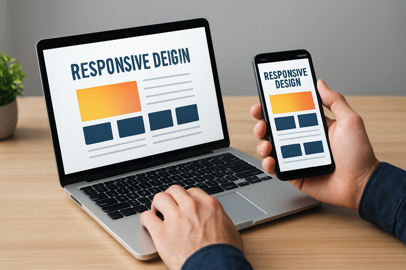
Why Responsive Design Still Rules in 2025
Mobile traffic hovers around or above 60 percent of global visits according to multiple industry trackers, and that usage skew is not reversing anytime soon, so responsive design is a baseline expectation rather than a nice-to-have. Meanwhile, Core Web Vitals, including INP (Interaction to Next Paint), LCP (Largest Contentful Paint), and CLS (Cumulative Layout Shift), continue to influence rankings and user behavior, which means your layout, performance, and perceived speed are inseparable. When we audit client sites at Internetzone I, we often spot the same culprits: uncompressed media, bloated scripts, and layout shifts caused by missing width and height attributes. Fixing those, along with clear breakpoints and accessible navigation, can lift both UX (user experience) scores and SEO (search engine optimization) visibility. The result is a smoother experience that delights users and sends positive engagement signals search engines can trust.
| Trend | Why It Matters | What To Do |
|---|---|---|
| Mobile share of visits | Majority of sessions start on phones | Design mobile-first, scale up with progressive enhancement |
| Core Web Vitals focus | Impacts rankings and engagement | Prioritize INP (Interaction to Next Paint), LCP (Largest Contentful Paint), CLS (Cumulative Layout Shift) |
| Buyer patience | Pages slower than 3 seconds lose visitors | Trim JavaScript (JS) payloads and optimize asset delivery and caching |
The Responsive Design Checklist: 10 Essential Steps That Move UX and SEO
This checklist is the action plan our team at Internetzone I follows when building or revamping sites for Companies of all sizes aiming to enhance their online visibility, reputation, and overall digital marketing performance. Use it end to end, or as a quick sanity check before launch. As you go, remember that every small win stacks: faster paint times lift UX (user experience), consistent layouts reduce bounce, and structured content raises SEO (search engine optimization) relevance. Ready to pressure-test your site and spot low-effort, high-impact improvements that pay off across the funnel?
Watch This Helpful Video
To help you better understand responsive design, we’ve included this informative video from Kevin Powell. It provides valuable insights and visual demonstrations that complement the written content.
- Adopt a mobile-first strategy. Start layouts for small screens, then enhance for tablets and desktops. This keeps content prioritized and performance tight from the outset.
- Define clear fluid grids and breakpoints. Use percentage-based widths and set breakpoints around content, not devices, ensuring typography and spacing scale elegantly.
- Size media responsibly. Serve responsive images with width and height attributes, next-gen formats, and lazy loading to protect LCP (Largest Contentful Paint).
- Optimize for touch. Aim for 44×44 pixel targets, enough spacing, and clear focus states to improve accessibility and conversions on mobile.
- Stabilize layout to prevent jank. Reserve space for ads, embeds, and images to keep CLS (Cumulative Layout Shift) low and interactions predictable.
- Speed up interactivity. Reduce JavaScript (JS) by code-splitting and deferring non-critical scripts to improve INP (Interaction to Next Paint).
- Use accessible, flexible navigation. Implement ARIA (Accessible Rich Internet Applications) labels, logical tab order, and visible skip links to support assistive tech and SEO (search engine optimization).
- Structure content semantically. Use headings, lists, and descriptive links; combine with schema markup to clarify meaning for search engines.
- Harden the tech stack. Use HTTP/2 (Hypertext Transfer Protocol version 2) or HTTP/3 (Hypertext Transfer Protocol version 3), reliable caching, and optimized asset delivery for consistent speed globally.
- Monitor, test, and iterate. Track metrics weekly and run A/B (split) tests to keep improving UX (user experience), conversions, and SEO (search engine optimization).
If this feels like a lot, you are not alone. Businesses often juggle content updates, campaign deadlines, and vendor wrangling, so technical debt grows quietly until performance and rankings slip. Internetzone I keeps your front end and marketing stack moving together by combining Web Design (mobile responsive, SEO-focused) with National and Local SEO (search engine optimization), eCommerce solutions, Reputation Management, Adwords-Certified PPC (pay per click) Services, and Managed Web Services. That cross-discipline approach means when you adjust a menu label for clarity, you also consider anchor text, site architecture, and internal links, which multiplies the value of every change you make.
Responsive Design Metrics and Tools You Should Track

Great design does not win alone; measurement closes the loop and protects your gains over time. For performance, watch INP (Interaction to Next Paint) for responsiveness, LCP (Largest Contentful Paint) for content loading, CLS (Cumulative Layout Shift) for visual stability, and TTFB (Time To First Byte) for server fitness. For SEO (search engine optimization), keep an eye on impressions, click-through rate, index coverage, and Core Web Vitals statuses inside search consoles. For UX (user experience), monitor task completion, scroll depth, and form drop-off, which highlight friction you cannot always see in heatmaps. At Internetzone I, we build dashboards that blend technical and marketing data so you can answer the hardest question quickly: what single change helps both users and rankings this week?
| Metric | Healthy Target | Primary Tools | SEO and UX Impact |
|---|---|---|---|
| INP (Interaction to Next Paint) | < 200 ms | Lighthouse, WebPageTest, field analytics | Faster interactions reduce bounce and improve engagement signals |
| LCP (Largest Contentful Paint) | < 2.5 s | PageSpeed Insights, real-user monitoring | Earlier content paint boosts perceived speed and rankings |
| CLS (Cumulative Layout Shift) | < 0.10 | Chrome UX (user experience) Report, Lighthouse | Stable layout builds trust, reduces misclicks on CTAs (calls to action) |
| TTFB (Time To First Byte) | < 0.8 s | WebPageTest, server logs | Faster server response accelerates all subsequent loading |
| Accessibility score | ≥ 90 | AXE, Lighthouse, screen readers | Inclusive design improves UX (user experience) and indexability |
When metrics slip, it is rarely one thing. Maybe your CMS (content management system) added a theme update with a heavy slider, or a marketing tag duplicated a script, or a third-party embed loads late and shoves content. The fix is to isolate changes with version control, ship smaller releases, and alert the team when any metric crosses a threshold. Internetzone I’s Managed Web Services creates guardrails for this process with staging reviews, automated checks, and rollbacks, so you can experiment without breaking critical UX (user experience) or SEO (search engine optimization) outcomes.
Content, Accessibility, and Performance Across Devices
Great responsive design is not just fluid columns; it is fluid storytelling that adapts the message and the controls to the moment in front of the user. On smaller screens, shorter headlines, visible primary CTAs (calls to action), and progressive disclosure make it easy to scan and decide, while larger screens can reveal supportive detail and comparisons. Accessibility is the lever that makes this work for everyone: sufficient color contrast, keyboard navigability, clear focus outlines, and descriptive ARIA (Accessible Rich Internet Applications) labels push UX (user experience) and SEO (search engine optimization) forward together. Then, performance ties it all together by making each interaction feel effortless, which is what users remember and search engines measure.
- Use semantic HTML (HyperText Markup Language) for structure and assistive tech alignment.
- Adopt responsive typography with clamp-based scales to maintain harmony across viewports.
- Prefer SVG (scalable vector graphics) icons and system fonts to cut render time.
- Preload critical assets and defer non-essential JavaScript (JS) to improve INP (Interaction to Next Paint).
- Localize menus and CTAs (calls to action) for neighborhoods with Local SEO (search engine optimization) targeting.
| Breakpoint Range | Common Use | Recommended Body Size | Minimum Touch Target |
|---|---|---|---|
| 320 to 480 px | Small phones | 16 to 18 px | 44 x 44 px |
| 481 to 768 px | Large phones, small tablets | 18 to 20 px | 44 x 44 px |
| 769 to 1024 px | Tablets | 18 to 20 px | 48 x 48 px |
| 1025 px and up | Laptops, desktops | 18 to 22 px | 48 x 48 px |
Real-World Wins: A Fast Case Snapshot With Internetzone I
A regional retailer came to Internetzone I because mobile revenue lagged desktop despite similar traffic volume, and the team suspected the theme was to blame. Our audit flagged a few big offenders: hero images without width and height attributes delaying LCP (Largest Contentful Paint), a sticky promo bar that triggered CLS (Cumulative Layout Shift), and a bulky analytics package that hampered INP (Interaction to Next Paint). We introduced responsive image sets, reserved space for the promo component, trimmed JavaScript (JS) by 35 percent, and improved caching and asset delivery strategies. Within eight weeks, mobile conversion rose 22 percent, organic entries climbed 15 percent, and support tickets about checkout glitches dropped to near zero, which is a perfect example of UX (user experience) and SEO (search engine optimization) feeding each other.
Importantly, we aligned the entire program with the retailer’s marketing calendar. National and Local SEO (search engine optimization) content pieces were scheduled alongside design sprints, so internal links, schema markup, and seasonal landing pages shipped in sync. Reputation Management protected star ratings during a surge in orders, and Adwords-Certified PPC (pay per click) Services scaled profitable campaigns without overpowering organic tests. That full-stack pairing of Web Design (mobile responsive, SEO-focused) and channel execution is the Internetzone I advantage: one team, one plan, one set of outcomes you can track back to revenue and retention.
Governance and Maintenance for Future-Proof Responsive Sites
Launch day is not finish line day, because sites are living systems that respond to new devices, browsers, and user expectations. Establish a cadence for updates, including design tokens, component libraries, and content templates, so tweaks stay consistent across modules and channels. Document your breakpoints, grid rules, and accessibility patterns, then train editors on image sizing, link hygiene, and alt text to prevent regressions that erode UX (user experience) and SEO (search engine optimization). With Internetzone I’s Managed Web Services, clients get an always-on partner who reviews Core Web Vitals monthly, runs preflight checks before promotions, and rolls out fixes before search engines or customers notice a dip.
| Owner | Responsibility | Cadence | Primary KPI (key performance indicator) |
|---|---|---|---|
| Design | Components, accessibility, pattern library | Quarterly review | Task success rate, accessibility score |
| Engineering | Performance, build pipeline, caching and delivery | Monthly check | INP (Interaction to Next Paint), LCP (Largest Contentful Paint), CLS (Cumulative Layout Shift) |
| Content | Semantics, internal linking, schema | Biweekly sprint | Organic CTR (click-through rate), average position |
| Marketing | Campaigns, A/B (split) tests, attribution | Weekly standup | Conversion rate, ROI (return on investment) |
Quick Answers to Big Questions About Responsive Design
Do you really need a redesign to see gains? Often no. By trimming render-blocking JavaScript (JS), reserving media space, and revisiting breakpoints, you can materially improve INP (Interaction to Next Paint), LCP (Largest Contentful Paint), and CLS (Cumulative Layout Shift) in a few sprints. Is a PWA (progressive web app) required for speed? Not always. Many wins come from compression, caching, and smart asset delivery. Should you build a separate m-dot site? In 2025, a single codebase with responsive design plus solid semantics and caching is almost always easier to maintain and better for SEO (search engine optimization). And if you are worried about the workload, Internetzone I’s Managed Web Services bridge the gaps, so fixes align with your calendar and do not derail releases.
Still wondering where to start? Run a quick audit. Check your header hierarchy, check whether primary CTAs (calls to action) sit above the fold at key breakpoints, and verify that links look like links. Next, use PageSpeed Insights to spot the biggest gains for INP (Interaction to Next Paint) and LCP (Largest Contentful Paint), and scan analytics for pages with high exit rates on mobile. Then pick two improvements for this month, two for next month, and two for the quarter. That steady rhythm makes responsive design maintenance painless and compounding.
The promise: follow this checklist, and you will elevate UX (user experience), rankings, and revenue together without guesswork or gimmicks. Imagine a year from now, where your site feels instant on any device, your content lands higher in results, and your team ships updates without drama. What is the one change you will commit to this week that makes responsive design your competitive advantage?
Additional Resources
Explore these authoritative resources to dive deeper into responsive design.
Elevate Responsive Design With Internetzone I
Internetzone I powers Web Design (mobile responsive, SEO-focused) to lift visibility, strengthen reputation, and drive growth for companies of all sizes pursuing better digital performance.