
The significance of responsive web design is rising. The range of devices people use to connect to the web continues to expand. Electronic devices such as cell phones, tablets, and computers are examples. Having a website that can adapt to different screen sizes and resolutions is crucial. It needs to work on devices of varying sizes.
The solution lies in adopting a mobile-friendly site design. The feature enables web pages to modify their design and content to work with a wider range of display sizes. The basics of responsive web design, along with its advantages and disadvantages, will be covered, among other topics.
People today use an incredible variety of mobile devices and other gadgets. Websites need to implement this to become more user-friendly. Some folks just don’t have time to use a computer to access the internet and view a web page. So, people prefer to go there while carrying a portable gadget. Designers of websites should make them responsive for this purpose.
What is Responsive Web Design?
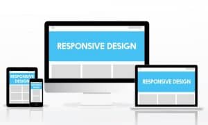
Responsive web designs showing.
Using a method called responsive design, online sites may function properly across a wide range of devices. For instance, there are desktops, laptops, tablets, and cell phones. As the name implies, it includes adapting a website’s look, feel, and functionality according to the device being used to access it.
To achieve its responsive results, three components are used. Grid fluidity, media query flexibility, and picture and media adaptability. These guidelines are known as the foundation of responsive web development.
Take the fact that many websites still aren’t mobile-friendly as an example. Hence, we do not find it as fluid on a mobile device as we do on a PC. A website that responds to the size of the browser window will appear well on any screen size. Making a website that works well on all devices might be difficult. It’s not hard if you know what you’re doing in terms of construction.
The Importance of Responsive Web Design
Responsive web design has become increasingly important. We use a variety of devices to access the internet. If we take a look at the statistics, more than 65% of people visit google via mobile devices. More than 80% of people use a mobile device to access the internet. With the rise of smartphones and tablets, people are no longer confined to using desktop computers for browsing the web.
This shift in usage patterns has made it essential for web pages to be designed with mobile users in mind. Responsive web design ensures that websites are optimized for all devices and screen sizes. It provides a consistent and user-friendly experience regardless of the device being used. This is crucial because a web page that is not responsive can be difficult to navigate and use on a mobile device. An increased rate of dissatisfaction and abandonment may result.
There are some reasons why a responsive web page is important. Google nowadays has a priority on responsive websites. They want the websites to look user friendly on a mobile device. If a user finds it messy or irresponsive, he/she may visit another website that is responsive. Ultimately, you will lose your position on Google or other platforms.
A responsive website can help you to increase traffic on your website. If your website is not responsive on mobile phones, you may lose traffic. So, it is important to make a website that runs well on mobile phones and other devices. For that, you need to do web development for mobile.
Evaluation of Responsive Web Design
Responsive web design has been widely adopted. It is the standard for web development due to its benefits. However, it is important to evaluate its effectiveness and potential challenges.
A responsive web page provides a consistent user experience across devices. This is one of the benefits. With a responsive design, users can access the same content and features on any device. They need not switch to a different version of the site. As a result, you may see higher rates of interaction and conversion. Users are more likely to stay on the site and complete their desired actions.
The SEO of a website also benefits from a responsive layout (SEO). Google and other search engines focus on mobile friendly web pages. Having a responsive design can improve a website’s search engine rankings. It can drive more traffic.
However, there are also potential challenges with responsive web design. It can be difficult to create a design that looks good and functions well across all devices. This is one of the main challenges.
Another challenge with responsive design is that it can result in slower page loading times. Especially on mobile phones with slower connections. As a result, user engagement and satisfaction may suffer.
Fundamentals of Responsive Web Design
There are three fundamentals of responsive design. A web developer can follow these fundamentals to create a responsive web page. These are:
Fluid Grids
Fluid grids are an essential component of responsive web design. They are grid systems that are flexible and adjust to the screen width of the device being used. This means that the website’s content is proportionally scaled and repositioned based on the screen width. You should adjust the font size to make it adaptable to the mobile screen. It ensures that the website looks and functions well on any device.
Fluid grids provide several benefits, including:
Responsive: Fluid grids ensure that the website is responsive. It automatically adjusts to the size of the user’s screen.
Consistency: Fluid grids provide consistency across all devices. It ensures that the website looks and functions the same regardless of the device being used.
Scalability: Fluid grids are scalable. That means that the website can be easily adjusted to accommodate new devices with different screen sizes.
One example of fluid layouts is the Bootstrap grid system. It is a responsive, mobile-first grid system. It uses a set of containers, rows, and columns to create a flexible grid layout. Another example is the Foundation grid system. That is also a mobile-first grid system. It provides an adaptable and flexible layout for responsive web design.
Flexible Images and Media
Responsive images and media are other essential components of responsive web design. The images and media should fit the screen size. This ensures that images and other media elements do not lose quality when viewed on different devices.
Adjustable images and media provide several benefits, including:
Responsive: Responsive images and media ensure that the website is responsive. It adapts to the screen size of the device being used.
High-Quality: Responsive images and media ensure that images and media elements retain their quality. It should not be broken when visiting by various devices and browser width.
Improved User Experience: Responsive images and media provide a better user experience of a web page. It ensures that images and media elements are optimized for each device.
One example of responsive images is using the srcset attribute. It provides different image sizes for different screen sizes. Another example is using CSS to resize images based on the screen size of the device being used. Flexible media can include using HTML5 video and audio elements.
Media Queries
Media queries are a key component of responsive web design. They are used to detect the screen size of the device being used. Media queries adjust the layout and content of the website accordingly. This means that the design of the website can change based on the user’s device. It ensures that the website is optimized for each individual device.
Media queries provide several benefits, including:
Responsive: Media queries ensure that the website is responsive and adapts to the screen size and browser window of the device being used.
Consistency: Media queries provide consistency across all devices. It ensures that the website looks and functions the same regardless of the device being used.
Scalability: Media queries are scalable. That means that the website can be easily adjusted to accommodate new devices with different screen sizes.
A common usage of media queries is to scale the font size in response to the user’s device screen resolution. Another case in point is media queries, which are used to adapt a website’s design and layout to the viewing device in use. With media queries, a website’s layout may be modified to suit a variety of viewing perspectives. Such as landscape or portrait orientation.
Besides these, there are some other components. These are
Responsive Typography: Responsive website design also uses responsive typography. That means that the font size, line spacing, and other typographic elements adjust to different screen sizes. This ensures that the website’s text is readable and legible on any device.
Accessibility: Responsive website design places a strong emphasis on accessibility. It ensures that the website is accessible to all users. That includes those with disabilities. It used alternative text for images and captions for videos.
Uses of Responsive Web Design

Uses of Responsive Web Design
In today’s digital age, almost all websites can benefit from responsive website design. However, there are certain types of websites that particularly need responsive design. They need it because of the nature of their content and target audience.
E-commerce websites: Online shopping has become increasingly popular over the years. A large number of people use their smartphones and tablets to make purchases. E-commerce websites that are not responsive can result in a poor user experience. It can lead to decreased sales.
News websites: News websites need to provide up-to-date information. It should be easily accessible and readable on any device. Responsive design ensures that the content is presented in a way that is optimized for the screen size and browser window of the device being used.
Blog websites: Bloggers need to ensure that their content is easily accessible and readable on any device. Their readership may be accessing the website from a range of devices.
Corporate websites: Corporate websites are often accessed by potential clients, employees, and investors. They may be using a range of devices to access the website. Responsive design ensures that the website is accessible to all users.
Social media websites: Social media websites, such as Facebook and Twitter, are accessed by millions of users every day. A large number of these users access the websites through their smartphones and tablets. Responsive design ensures that these websites are accessible and easy to use on any device.
Difference Between Responsive and Mobile Friendly Design
Responsive design and mobile-friendly design are both important concepts in modern web design. However, they refer to different approaches to creating web pages. They ensure that it works well on mobile phones.
Mobile friendly design is an older approach. It involves creating a separate version of an optimized and responsive website. A mobile friendly website automatically redirects the user to the mobile version of the site. The mobile-friendly version of the site typically has a simplified layout. It has fewer images and larger text to make it easier to use on smaller screens.
Responsive design, on the other hand, automatically adjusts its layout and content to fit the screen size and the browser window of the device. This approach is accomplished through the use of fluid grids, responsive images and media, and CSS styles media queries. Responsive design ensures that the website looks and functions well on any device. No matter it is a desktop computer, tablet, or smartphone.
Responsive design creates a single website that works well on all devices. On the other hand, mobile-friendly design involves creating a separate website that is optimized for a mobile device. Responsive design is generally considered to be the better approach. It provides a more seamless user experience across all devices. It also eliminates the need to maintain multiple versions of the same website.
Advantages of Responsive Web Design
Responsive website design is an approach to web design. It allows websites to adapt to the screen size and browser window of the user. This approach provides many benefits over traditional fixed-width designs. That includes enhanced user experience, increased traffic, and conversion rates.
Enhanced User Experience

User experience analysis for responsive web design.
The primary benefit of responsive site design is an enhanced user experience. This means that users can access the website from any device and still have a seamless and enjoyable experience.
There are many benefits to providing an enhanced user experience, including:
Improved User Engagement
A responsive design ensures that users can easily access and interact with the content on your website. That can improve engagement and encourage users to spend more time on your site.
Better Search Engine Rankings
Search engines such as Google prefer websites that provide a good user experience. A responsive design is one of the factors they consider when ranking websites.
Increased Brand Credibility
A website that looks great and functions well on any device can help establish your brand as a credible and trustworthy authority in your industry.
Increased Traffic and Conversion Rates
Another major advantage of responsive site design is increased traffic and conversion rates. A responsive site ensures that your website is accessible and functional on any device. As a result, you can attract a wider audience. You can also improve the chances of converting visitors into customers.
Some benefits of increased traffic and conversion rates include:
More Leads and Sales
A website that is optimized for mobile devices can help you attract more leads and sales from users.
Lower Bounce Rates
A flexible website can help reduce bounce rates. Users are more likely to stay on your site if it is easy to use and navigate.
Competitive Advantage
Many web pages still use traditional fixed width designs. By embracing responsive design, you can gain a competitive advantage and stand out from the crowd.
Cost-Effectiveness and Easy Maintenance
Responsive design can also be cost-effective and easy to maintain. You only need to maintain one website. As a result, you can save time and money on development and maintenance costs.
Some benefits of cost-effectiveness and easy maintenance include:
Faster Load Times
By using responsive design, you can avoid the need to redirect users to a separate mobile site. That can improve load times and provide a better user experience.
Reduced Development Costs
Building one responsive site is often less expensive than building separate versions for different devices.
Easy Maintenance
Maintaining one website is easier than maintaining multiple versions. That can save time and reduce the risk of errors or inconsistencies between different versions.
Challenges of Responsive Web Design
Responsive design has become the norm for modern web development. However, it comes with its own set of challenges that web developers must face. Some of them are below:
Performance Issues

website performance issues solving
Performance issues are a common problem with responsive web design. As websites become more complex and include more multimedia elements, they can take longer to load. This is especially true for mobile devices. Slower network speeds can exacerbate the problem here. When a website takes too long to load, users are more likely to abandon it.
Some of the common performance issues with responsive design include images that are too large. Unnecessary JavaScript and poorly optimized code are the other issues. Additionally, many websites rely on third-party plugins and tools. That can also slow down page loading times.
To overcome performance issues, it’s important to optimize images and reduce their file size. Developers can also use lazy loading techniques. It delays the loading of non-critical elements until the user scrolls to them. Besides, minifying JavaScript and CSS files, reducing the number of HTTP requests, and using content delivery networks (CDNs) can all help to improve page loading times.
Complexities in Development
Responsive design requires careful planning and execution. It needs to ensure that a website looks and functions well across multiple devices. This can be a challenge for developers, especially those who are new to responsive web design.
Some of the complexities include designing for multiple breakpoints. It ensures consistency across different devices. It can test on a wide range of devices and browsers. Additionally, responsive design often requires more complex coding and development techniques.
It’s important to follow a structured development process to overcome this. That should include thorough planning and testing. You can use frameworks and tools such as Bootstrap and Foundation. It can also help to simplify the development process. It ensures consistency across different devices.
Limited Support for Older Browsers
Not all browsers support the latest web technologies used in responsive web design. This can be a challenge for developers. They need to ensure that their websites function correctly across a wide range of browsers and devices.
Older browsers such as Internet Explorer 8 and below do not support many of the newer web technologies used in responsive web design. For example, CSS3 and HTML5. This can cause layout and functionality issues for users of older browsers.
To overcome the limited support for older browsers, developers can use polyfills and fallbacks. It will ensure that their websites function correctly on the browser window. Additionally, developers can choose to limit support for older browsers. They can focus on delivering the best possible experience for modern browsers. This can help to reduce the complexity of development. If you are a beginner, you can learn about HTML CSS, and Javascript online. There are many web development courses you will find.
How to Create a Responsive Design?
To create a responsive design, there are a few key steps that you should follow:
Plan and Define Your Website’s Layout
Before you start designing, take the time to plan and define your website’s layout. This includes deciding on the number of columns, the spacing between them, and the overall design style.
Use Fluid Grids
Use fluid grids that can easily adapt to different screen sizes. You can use frameworks such as Bootstrap or Foundation or create your own custom grid.
Implement Flexible Images and Media
Use CSS techniques such as max width to ensure that images and media scale proportionally to the screen size.
Use Media Queries
It defines different styles for different screen sizes. Media queries allow you to create a custom design for each device type.
Test and Iterate
Test your design across different devices and browsers. It will ensure that it looks and functions correctly. Make any necessary adjustments and iterate until you have a responsive design that works well across all devices.
Consider Mobile-First Design
Consider designing your website for mobile devices first. This can help you prioritize the most important content and simplify the design.
Optimize for Performance
Keep performance in mind throughout the design process. This includes optimizing images, minimizing HTTP requests, and using efficient code. A fast-loading website is essential for a positive user experience on all devices.
The Responsiveness of WordPress Sites

The Responsiveness of WordPress UI/UX.
WordPress is a popular content management system (CMS) used to build websites. Keeping responsiveness in mind, they design many themes. That means they are optimized to display correctly on different devices. For example, desktops, tablets, and smartphones.
WordPress themes that are designed to be responsive generally use fluid grids, responsive images, and media queries. The reason is to adapt to different screen sizes. This allows the users to view the website on any device without sacrificing functionality or design.
Many modern WordPress themes are also built with mobile-first design in mind. That means the website is optimized for mobile phones first. Then adapted for larger screens. This approach can lead to a more streamlined and efficient design. It can improve the user experience.
Note that not all WordPress themes are created equal when it comes to responsiveness. Some older or outdated themes may not be optimized for different devices. It can lead to a poor user experience on mobile. It’s important to choose a theme that is designed to be responsive and regularly updated. It will ensure compatibility with the latest devices and browsers.
Also, choosing a responsive theme, it’s also important to optimize your WordPress site for performance. This includes using caching plugins, responsive images, and media and minimizing HTTP requests. A fast-loading website is essential for a positive user experience on all devices. It also improves search engine rankings.
Common Breakpoint for Responsiveness
Common breakpoints are used in responsive web design. It defines the point at which a website’s layout changes in response to different sizes. These breakpoints are based on commonly used device screen sizes. It provides a framework for designing a website that is optimized for a variety of devices. Here are some of the most common breakpoints used in responsive web design:
320px: This is the smallest screen resolution and is commonly used for mobiles. Websites optimized for this size will usually have a single column layout.
480px: This size is often used for smaller tablets and larger smartphones. Websites optimized for this size may have a two-column layout.
768px: This is the screen resolution of most tablets in landscape mode. Websites optimized for this size will usually have a two-column layout.
992px: This is the screen size of most desktops and laptops. Websites optimized for this size will usually have a three-column layout.
1200px: This size is used for large desktop screens. Websites optimized for this size may have a four-column layout.
Best Practices of Responsive Web Designs
To create a successful and effective responsive web design, there are several best practices that should be followed. These include:
Mobile-First Design
When designing a responsive web page, start with the mobile layout first. Then work your way up to larger screen resolutions. This approach makes sure that the website is usable for smaller screens. That can lead to a better user experience on all devices.
Use a Fluid Grid
A fluid grid is a flexible grid system that adjusts to different screen resolutions. This helps to ensure that the layout of the website remains consistent and easy to use on all devices.
Optimize Images and Media
Images and media should be optimized for different devices. It needs to ensure fast load times and a positive user experience. Use appropriate file sizes and compression techniques. It will help to reduce the file size without sacrificing quality.
Prioritize Content

Content layout for responsive webdesign.
Focus on the most important content on the website. This can include using larger fonts, highlighting important information, and using clear and concise language.
Use Consistent Navigation
Navigation should be consistent across all devices and easy to use. This includes using clear labels, avoiding dropdown menus, and making sure the navigation is accessible and intuitive.
Test Across Devices
Test the website across a range of devices and screen resolutions. It needs to ensure it’s working properly and providing a good user experience on all devices.
Regularly Update And Maintain
Regularly update and maintain the website. Make sure the compatibility with the latest devices and browsers. Fix any issues that may arise.
Future of Responsive Web Design
As technology continues to evolve, so does the world of web design. Responsive design has been a game-changer in the field. It allows websites to adapt to different screen resolutions. It provides a seamless user experience across all devices. So, what does the future hold for responsive web design?
Emerging Trends in Responsive Web Design
With the increasing use of AI and machine learning, dynamic layouts are becoming more popular in web design. These layouts can adapt to user preferences and behavior. It provides a personalized user experience.
As voice assistants like Siri and Alexa become more prevalent, optimizing websites for voice search will become increasingly important. This includes using natural language and long-tail keywords in the content.
Augmented reality (AR) is a system that superimposes computer-generated imagery and data onto a user’s actual surroundings. As AR becomes more advanced, it will become a powerful tool in web design. It will allow for interactive and engaging user experiences.
Micro-interactions are small, subtle interactions that enhance the user experience. These can include animations, hover effects, and subtle feedback when a user interacts with a website.
Predictions for the Future of Responsive Web Design
As websites become more complex, it’s important to ensure that they’re accessible to everyone. This includes optimizing for assistive technologies like screen readers. Make sure that content is easy to read and understand.
Website speed has always been important, but it will become even more so in the future. With more people accessing websites on mobiles, slow load times can lead to high bounce rates and lost revenue.
As AI and machine learning continue to evolve, websites will become even more personalized to each user. This includes personalized content recommendations, dynamic layouts, and customized user experiences.
With more people accessing the internet on mobiles, responsive design will continue to be an essential component of web design. Websites will need to be optimized for a range of mobile and screen resolutions to provide a seamless user experience.
Conclusion
The use of cell phones is increasing day by day. An adaptive web design is crucial. A responsive site can help you to get more attached to your business. To build a responsive web page, you will need three components. As we mentioned, fluid grid (flexible grid), responsive images, and media and media queries. A responsive web page is great to look at and can access from any device and any browser window.
It is important to build a responsive web page. The mobile friendly version of websites is back dated. You can learn web development if you want to build a responsive web page. You can join a web development Bootcamp if you have a short time.