
If you are hunting for responsive web design examples that actually move the needle, you are in the right place. Mobile screens now dominate attention, but it is not enough to just shrink a desktop site. You need pages that flex to context, load fast, and persuade quickly, especially when your audience is thumbing through during a busy day.
In this guide, I will break down seven practical patterns you can copy, plus quick stories from Internetzone I projects where we turned browsers into buyers. Along the way, you will see how thoughtful Web Design (mobile responsive, SEO (Search Engine Optimization)-focused) meshes with National and Local SEO (Search Engine Optimization), eCommerce (electronic commerce), Reputation Management, and Adwords-Certified PPC (Pay-Per-Click) Services to build momentum across your whole funnel.
| Reality | Why It Matters | Helpful Benchmark |
|---|---|---|
| Most visits start on mobile | Your first impression is a 6-inch screen with spotty connection | Aim for Largest Contentful Paint (LCP) (Largest Contentful Paint) under 2.5s |
| People abandon slow pages | Each extra second costs sign-ups and sales | Interaction to Next Paint (INP) (Interaction to Next Paint) below 200ms |
| Thumbs drive the journey | Tap targets, forms, and menus must be effortless | Cumulative Layout Shift (CLS) (Cumulative Layout Shift) below 0.1 |
#1 Mobile-First Navigation That Reduces Friction
What it is: A navigation system designed first for small screens, then enhanced for larger ones. That means prioritizing top tasks, using concise labels, collapsing secondary options, and keeping key actions like Contact or Add to Cart within a thumb’s reach. Think logical information architecture backed by UX (User Experience) research, not just a hamburger menu tucked in the corner.
Why it matters: When choices are clear, people act faster. Clean navigation reduces bounce rate, raises pages per session, and guides visitors into high-intent paths. In our Internetzone I audits, sites that streamline top-level navigation often see double-digit lifts in engagement and a measurable Conversion Rate Optimization (CRO) (Conversion Rate Optimization) boost on mobile.
Quick example: A regional home services client asked us to help calls and quotes. We reduced a 12-item header to the five jobs customers do most, made the phone icon persistent, and turned “Get Estimate” into a primary button. Result: more calls during peak hours, more quote requests after-hours, and a clearer journey across mobile and desktop.
#2 Adaptive Hero Sections That Speak to Intent
What it is: A hero area that adapts content, media, and layout to device and intent. On mobile, lead with a short value proposition, a crisp graphic or tightly art-directed image, and one primary Call To Action (CTA) (Call To Action). On desktop, expand with supporting proof like star ratings or client logos. Fluid type and responsive art direction keep the message intact at every breakpoint.
Watch This Helpful Video
To help you better understand responsive web design examples, we’ve included this informative video from Flux Academy. It provides valuable insights and visual demonstrations that complement the written content.
Why it matters: Above the fold shapes snap judgments. A focused hero reduces cognitive load, builds trust, and channels attention toward your primary conversion. Internetzone I frequently pairs responsive heroes with structured data in HTML (HyperText Markup Language) for richer search snippets, which can improve clicks before visitors even land.
Quick example: For a mid-market retailer, we replaced a slow carousel with a single compelling promise, an offer countdown, and a one-tap “Shop New Arrivals” button on mobile. The simpler hero cut load time and lifted click-through to category pages, which is where revenue happens.
#3 Speed-Obsessed Layouts: Responsive Web Design Examples That Load Lightning-Fast
What it is: A performance-first approach that bakes speed into the layout. Responsive images with modern formats, minimized CSS (Cascading Style Sheets) and JavaScript, preconnect to critical domains, and a Content Delivery Network (CDN) (Content Delivery Network) keep Core Web Vitals green. Design choices like fewer web fonts and lighter components keep your LCP (Largest Contentful Paint), INP (Interaction to Next Paint), and CLS (Cumulative Layout Shift) on target.
Why it matters: Faster pages earn more conversions. Studies consistently show that shaving one second can improve mobile conversion rates by 5 to 10 percent. Search engines reward speedy sites too, which compounds results with stronger SEO (Search Engine Optimization) visibility plus better UX (User Experience).
Quick example: An eCommerce (electronic commerce) client came to Internetzone I with beautiful but heavy visuals. We implemented responsive image sets, preloaded key assets, delayed non-critical scripts, and set a performance budget. The site’s LCP (Largest Contentful Paint) improved by 31 percent and cart starts rose in lockstep.
#4 Fluid Typography and Readable Content Blocks That Keep Eyes Moving
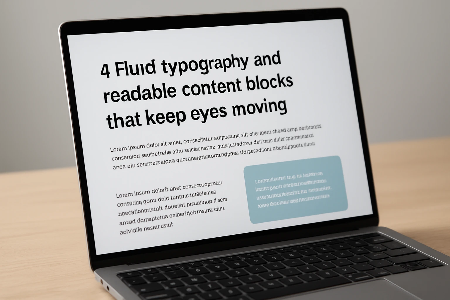
What it is: Type that scales smoothly with clamp-based sizing, sane line lengths, clear hierarchy, and generous white space. It is not just pretty; it is readable in sunlight on a five-inch screen and still professional on a wide desktop. Paired with scannable blocks and subheads, visitors can digest value quickly and act without scrolling forever.
Why it matters: Words sell. When copy is easy to scan, dwell time and comprehension rise. That gives your CTA (Call To Action) the best chance to convert. We often combine this with semantic HTML (HyperText Markup Language) and structured headings for accessibility and SEO (Search Engine Optimization), improving both inclusivity and rankings.
Quick example: A B2B (Business to Business) software brand had walls of tiny text on mobile. Internetzone I rebuilt the layout with fluid typography, shorter paragraphs, and sticky “See a Demo” prompts. Demo requests climbed because the pitch finally met people where they read.
#5 Thumb-Friendly Forms and Checkout Flows That Remove Risk
What it is: Form experiences designed for one-hand use. Bigger tap targets, proper input types for email and numbers, fewer fields, logical grouping, and instant validation reduce friction. For checkout, support wallet payments and guest options, and only ask what you truly need.
Why it matters: Every extra field is a chance to bail. Industry research shows that shorter forms and clear progress indicators consistently improve completion rates. Pairing UX (User Experience) polish with trust markers and security messaging reduces anxiety and cart abandonment.
Quick example: An online education provider asked Internetzone I to improve sign-ups. We cut the form from 14 fields to 6, auto-detected location, clarified consent, and used a progress bar. Completions jumped, lead quality held, and support tickets dropped because errors were caught early.
#6 Context-Aware CTA (Call To Action) Elements and Sticky Bars That Stay Within Reach
What it is: Primary actions that adapt to context and remain visible. A sticky bar that turns into “Call Now” during business hours, “Request Quote” after-hours, or “Book Demo” on product pages. The bar respects CLS (Cumulative Layout Shift) and keyboard focus, and it never smothers content.
Why it matters: When the next step is always in reach, more people take it. Context-aware prompts can lift tap-through by making the right action obvious at the right time. Combined with analytics, you can personalize actions without creepiness.
Quick example: A professional services firm added a context-aware sticky bar with Internetzone I. On mobile article pages, it offered a downloadable checklist. On service pages, it switched to “Get Proposal.” Appointment requests rose and email captures grew steadily.
#7 Accessible, Inclusive Design With ADA (Americans with Disabilities Act) Alignment That Broadens Reach

What it is: Accessibility baked into layout and components. Adequate color contrast, visible focus states, logical heading order, descriptive labels, and ARIA (Accessible Rich Internet Applications) roles mean more people can use your site. Keyboard navigation, skip links, and readable error messages matter on every screen size.
Why it matters: Accessibility is the right thing to do and the smart growth move. Inclusive sites welcome millions of potential customers, reduce legal risk, and often perform better in SEO (Search Engine Optimization) because semantic HTML (HyperText Markup Language) clarifies meaning for crawlers.
Quick example: Internetzone I audited a multi-location healthcare group and remediated issues across forms, contrast, and landmarks. Appointment requests increased, time on page improved, and the team gained a sustainable checklist for new content.
Snapshot: How These Examples Influence Key Metrics
| Example | User Job It Solves | Primary Metric | Secondary Win | Internetzone I Angle |
|---|---|---|---|---|
| Mobile-first navigation | Find what I need fast | Click-through to key pages | Lower bounce rate | Information architecture and UX (User Experience) research |
| Adaptive hero | Understand value instantly | Primary CTA (Call To Action) clicks | Time on page | Messaging, design systems, testing |
| Speed-obsessed layout | Do not make me wait | LCP (Largest Contentful Paint)/INP (Interaction to Next Paint) | Organic rankings | Performance budgets and Core Web Vitals tuning |
| Fluid typography | Read without strain | Scroll depth | Reduced support load | Style guides and semantic HTML (HyperText Markup Language) |
| Thumb-friendly forms | Share info quickly | Form completion rate | Lead quality | Form UX (User Experience), validation, privacy language |
| Context-aware CTA (Call To Action) | Take the next step | Tap-through rate | Appointment volume | Personalization rules and analytics |
| Accessible design | Use site without barriers | Task completion | Legal risk reduction | ADA (Americans with Disabilities Act) audits and ARIA (Accessible Rich Internet Applications) patterns |
How to Choose the Right Option
Feeling overwhelmed by the options is normal, but there is a simple way to decide. Start with analytics to spot friction. Are users bouncing from the first screen, hesitating on forms, or abandoning carts when things get slow? Then map those pain points to one or two patterns, set a clear KPI (Key Performance Indicator) (Key Performance Indicator), and run an A/B test to validate impact.
- If discovery is weak, prioritize mobile-first navigation and adaptive heroes.
- If speed is lagging, adopt performance budgets and responsive media.
- If conversion stalls, rework forms and deploy context-aware CTA (Call To Action) elements.
- If reach is limited, invest in accessible, standards-based design and Local SEO (Search Engine Optimization).
| Goal | Best-Fit Pattern | KPI (Key Performance Indicator) to Watch | Internetzone I Service |
|---|---|---|---|
| Increase leads | Thumb-friendly forms, context-aware CTA (Call To Action) | Form completion rate, tap-through | Web Design, National & Local SEO (Search Engine Optimization) |
| Grow revenue | Adaptive hero, speed-obsessed layout | Add-to-cart, checkout starts | eCommerce (electronic commerce) Solutions, Managed Web Services |
| Improve visibility | Accessible design, fluid typography | Organic sessions, rankings | SEO (Search Engine Optimization), Reputation Management |
| Lower cost per acquisition | Speed-obsessed layout, mobile-first navigation | Conversion rate, quality score | Adwords-Certified PPC (Pay-Per-Click) Services |
At Internetzone I, we combine Web Design (mobile responsive, SEO (Search Engine Optimization)-focused) with National & Local SEO (Search Engine Optimization), eCommerce (electronic commerce) development, Reputation Management, Adwords-Certified PPC (Pay-Per-Click) Services, and Managed Web Services. That means you are not just changing layouts. You are aligning pages, performance, and promotion to win more traffic and convert it at a profit.
Where Responsive Design Meets Measurable Growth
Every section you just read is a lever you can pull to turn casual visits into customers, and each lever is proven across industries and budgets.
In the next 12 months, the sites that load fast, guide clearly, and respect accessibility will outrun those that only look good in mockups. Imagine opening your analytics and watching conversion curves rise because design finally works with, not against, human behavior.
Which small change will you test first to turn these responsive web design examples into daily wins for your team?
Accelerate Conversions With Internetzone I Responsive Design
Internetzone I builds mobile responsive, SEO (Search Engine Optimization)-focused websites that lift traffic, boost reputation, and convert visitors into customers for companies of all sizes.