
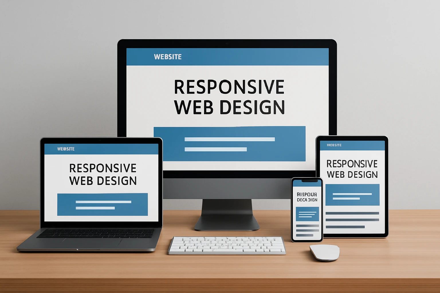
If you are hunting for web responsive design examples you can actually copy and ship this quarter, you are in the right place. Mobile now accounts for most browsing sessions, and even small friction points nudge users to bounce. The right responsive patterns feel invisible to users, but your analytics will notice in a hurry.
Industry studies suggest a one second delay can drop conversions by about seven percent, while clear, thumb-friendly actions can lift tap-through rates by double digits. I have seen it firsthand during audits at Internetzone I, where a single mobile-first tweak turned a sleepy page into a steady lead machine. Ready to borrow the best ideas and make them yours?
#1 Thumb-Friendly Sticky Action Bar
What it is: A persistent, bottom-anchored bar on small screens that keeps the primary action within thumb reach. Think of a fixed strip that displays one or two high-priority actions such as Call, Get Pricing, or Add to Cart. It adapts across breakpoints so it appears only when space is tight and attention is scattered.
Why it matters: On mobile, most users navigate with one hand. Placing a call to action in the natural thumb zone reduces cognitive load and makes commitment feel effortless. Industry studies suggest that moving a key control into the thumb zone can lift engagement by 10 to 25 percent. At Internetzone I, we design these bars to be mobile responsive and Search Engine Optimization (SEO)-focused, pairing fast-loading icons with clear microcopy and event tracking so you can measure real lift.
Quick example: A local service site shows a sticky bar with Book Service and Call Now during business hours, then switches to Get a Quote after hours. The bar hides on large screens where the header has ample room.
#2 Priority+ Navigation That Adapts Gracefully
What it is: A navigation system that keeps the most important links visible while the rest tuck into a More overflow as the viewport shrinks. Unlike a basic hamburger, this pattern progressively reveals or hides links based on available space, so users never lose sight of what matters most.
Watch This Helpful Video
To help you better understand web responsive design examples, we’ve included this informative video from Dani Krossing. It provides valuable insights and visual demonstrations that complement the written content.
Why it matters: Confusing navigation is a conversion killer. By preserving top tasks at every size, you lower pogo-sticking and reduce time-to-content. Internetzone I often pairs Priority+ with descriptive labels and breadcrumb trails for stronger user experience and better crawl paths for Search Engine Optimization (SEO).
Quick example: On desktop, you see seven links. On a mid-size tablet, the least-clicked two flow into More. On phones, you keep Shop, Pricing, and Contact visible while the rest live behind a single tap.
#3 Responsive Hero With Fast Media and Clear Value
What it is: A hero section that swaps images or video per breakpoint, uses fluid type, and loads the smallest media required via srcset in HTML. The headline stays scannable, the subtext is legible, and there is one unmistakable call to action above the fold.
Why it matters: First impressions make or break intent. If your hero takes five seconds to load, many users are gone. By optimizing images, compressing video, and aligning copy hierarchy, you improve Core Web Vitals and reduce bounce. Internetzone I blends speed work with persuasive messaging, so Search Engine Optimization (SEO) and conversion rate optimization win together.
Quick example: A Software as a Service landing page serves a lightweight Scalable Vector Graphics (SVG) illustration on mobile, a higher-resolution image on desktop, and keeps the Try It Free button in the hot zone on every device.
#4 Mobile-First, Single-Column Forms
What it is: Forms designed from the smallest screen up. Single column, large tap targets, smart defaults, relevant input types, and built-in validation. Fields pile vertically, labels are clear, and optional fields stay collapsed unless needed.
Why it matters: Forms are where revenue happens. Reducing fields, clarifying help text, and matching input types to tasks can spike completion rates. One Internetzone I client saw a 22 percent lift after we trimmed their form from 11 fields to 6 and added phone-friendly input types in Cascading Style Sheets (CSS) and HTML. Bonus: fewer errors mean fewer costly follow-ups.
Quick example: Name, email, phone use native keyboards; company name is optional; a progress bar shows you are 60 percent done. The Submit button converts to a sticky Next on mobile so the thumb never stretches.
#5 Web Responsive Design Examples: Content-First Layouts
What it is: Layouts that prioritize reading comfort and task flow across breakpoints. Fluid grids, responsive typography, and content stacking that preserves meaning. Instead of shrinking everything, the layout reorders and adapts so the story still makes sense.
Why it matters: People skim. A content-first approach boosts comprehension and confidence, both precursors to conversion. Internetzone I uses typographic scales, line-length limits, and section reveals to keep attention moving toward the main call to action, while internal links support Search Engine Optimization (SEO) topic clusters.
Quick example: A case study page turns a three-column testimonial wall into a swipeable carousel on phones, paired with a bold Request Proposal button beneath social proof.
#6 High-Converting Product Cards for Mobile Commerce
What it is: Product tiles that respond to screen size by emphasizing essentials: image, price, rating, shipping badge, and a concise action. Variants and secondary details tuck behind accordions or quick views to avoid crowding.
Why it matters: Shoppers decide fast. A clean card reduces decision fatigue and keeps thumbs moving. When we rebuilt a catalog at Internetzone I, adding prominent price, inventory cues, and a sticky Add to Cart lifted add-to-cart rate by 14 percent and improved click-through to checkout.
Quick example: Cards display Prime-like fast shipping badges, large images that crop intelligently, and a heart icon for wishlists. On desktop, hover reveals more photos; on mobile, a short swipe cycles images.
#7 Performance-First Images and Code Splitting
What it is: A technical pattern that pairs responsive images with lazy loading, defers non-critical scripts, and splits bundles so each page serves only what it needs. It is invisible to users, but your metrics will glow.
Why it matters: Faster pages convert better. Improving Largest Contentful Paint (LCP) and Cumulative Layout Shift (CLS) correlates with higher engagement and revenue. Internetzone I bakes this in during builds, using modern HTML attributes and lightweight Cascading Style Sheets (CSS) to keep pages snappy and Search Engine Optimization (SEO) friendly.
Quick example: Home page ships a 60 kilobyte hero image on phones, 140 kilobyte on desktop via srcset, lazy loads below-the-fold carousels, and defers chat widgets until user intent is detected.
#8 Accessible Patterns That Scale Across Devices
What it is: Inclusive components that honor Web Content Accessibility Guidelines (WCAG) like color contrast, focus states, proper heading hierarchy, and semantic elements that adapt well on every screen.
Why it matters: Accessibility is good business. Millions of customers rely on assistive tech, and search engines reward usable structures. Internetzone I audits for ARIA roles and keyboard navigation, and we test tap targets so thumbs do not misfire. This reduces support tickets and builds trust.
Quick example: Accordions use buttons with aria-expanded state, focus rings are visible, links have descriptive text, and tap targets are at least 44 by 44 pixels. Everyone wins, including your Key Performance Indicators (KPIs).
#9 Location-Aware Contact and Conversion Shortcuts

What it is: Smart, context-based shortcuts like click-to-call, map links, store availability, and one-tap directions that appear prominently on mobile. Hours and service areas update in real time, and search bots can parse structured data.
Why it matters: Local intent converts fast. If a prospect can call or navigate in one tap, your acquisition costs drop. Pairing this with National and Local Search Engine Optimization (SEO) from Internetzone I ensures you show up when and where buyers are ready to act, and Pay Per Click (PPC) campaigns can mirror the same extensions for consistency.
Quick example: A clinic’s mobile header shows Call, Directions, and Book Visit. On desktop, these sit in the top-right. On weekends, the booking button toggles to Join Waitlist to match availability.
Conversion Lifts You Can Realistically Expect
Every site is different, but benchmarks help set expectations. Internetzone I tracks before-and-after metrics to separate wishful thinking from real impact. Below is a simple snapshot you can use as a starting point for forecasting and prioritization.
| Pattern | Primary Metric | Typical Lift Range | Time to Implement |
|---|---|---|---|
| Thumb-Friendly Sticky Bar | Tap-through to lead or cart | 10 to 25 percent | Days |
| Priority+ Navigation | Time-to-content, bounce rate | 5 to 15 percent improvement | Days |
| Responsive Hero | Largest Contentful Paint (LCP), top-fold clicks | 8 to 20 percent | Days to weeks |
| Mobile-First Forms | Form completion rate | 10 to 40 percent | Days |
| Content-First Layouts | Scroll depth, call to action clicks | 7 to 18 percent | Weeks |
| Product Cards | Add-to-cart, product views | 8 to 22 percent | Days to weeks |
| Performance-First Images | Largest Contentful Paint (LCP), conversion | 5 to 15 percent | Days |
| Accessible Patterns | Task success, support tickets | Qualitative uplift | Weeks |
| Location-Aware Shortcuts | Click-to-call, directions taps | 12 to 30 percent | Days |
How to Choose the Right Option
Start with goals, then match patterns. If leads are the issue, move high-value actions into the thumb zone and fix forms first. If organic visibility lags, combine fast heroes, content-first layouts, and structured data with National and Local Search Engine Optimization (SEO). If reputation or paid spend is shaky, unify your message with Reputation Management and Pay Per Click (PPC) landing pages that mirror the same responsive patterns.
| Your Priority | Best-Fit Patterns | Owner | Proof to Track |
|---|---|---|---|
| More qualified leads | Sticky bar, mobile-first forms, responsive hero | Web Design and conversion rate optimization | Form completion rate, call volume |
| Higher organic traffic | Content-first layouts, fast media, accessible structure | Search Engine Optimization (SEO) | Rankings, impressions, click-through rate |
| Stronger online reputation | Location-aware shortcuts, testimonial sections, schema | Reputation Management | Review count, average rating |
| Better paid return | Priority+ navigation, message-matched heroes, fast pages | Pay Per Click (PPC) | Cost per lead, quality score |
| Fewer support issues | Accessible patterns, clear IA, readable type | Web Design | Task success rate, ticket volume |
Here is a simple decision path: identify the one conversion that matters most, fix the friction closest to that action, then expand improvements outward. Internetzone I can handle the heavy lifting across web design that is mobile responsive and Search Engine Optimization (SEO)-focused, National and Local Search Engine Optimization (SEO), Pay Per Click (PPC), Reputation Management, eCommerce builds, and Managed Web Services to keep momentum compounding.
Why Internetzone I Is a Safe Pair of Hands
Most teams juggle too much: rankings stall, reviews wobble, and landing pages underperform. Internetzone I, Inc. unites strategy, design, and growth under one roof so you stop guessing. Our AdWords-certified Pay Per Click (PPC) services, National and Local Search Engine Optimization (SEO), web design that is mobile responsive and SEO-focused, eCommerce solutions, Reputation Management, and Managed Web Services work together by design.
Real talk: structure beats hustle. We run discovery, align goals, engineer responsive patterns, then validate with analytics and user feedback. If you have ever wondered whether your responsive choices are actually moving the needle, our dashboards and testing playbooks answer with clarity. That means fewer surprises, smarter scale, and compound wins you can show in a board meeting.
The nine patterns above are battle tested, practical, and designed to convert without feeling pushy. Imagine your site loading fast, reading clean, and nudging action naturally across every device. Which small change would remove the biggest friction for your visitors this week and bring these web responsive design examples to life?
In the next 12 months, teams that prioritize responsive speed, clarity, and inclusive design will outrun competitors still arguing about pixels. What would your pipeline look like if every visit felt tailor-made for the screen in your customer’s hand?
Bring Responsive Wins to Life With Internetzone I
Power mobile-responsive, Search Engine Optimization (SEO)-focused web design that helps companies improve visibility, reputation, and overall digital marketing performance.