
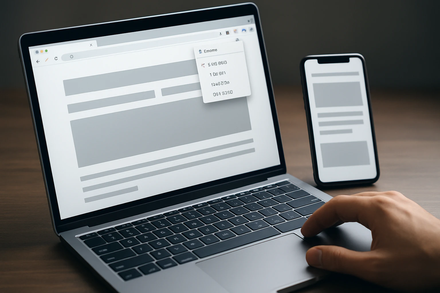
It’s 9:07 a.m. A marketing manager has the same landing page open on a desktop monitor, a tablet, and a phone. The desktop version looks sharp. The tablet is a little cramped. Then the phone view collapses the illusion completely — the hero headline breaks, the CTA drops, and the signup form slides below the fold.
That’s the moment a mobile/responsive web design tester chrome extension stops feeling like a nice extra and starts feeling like insurance. If you manage campaigns, review client work, or own conversion pages, you need a fast way to see what happens when a polished 1440px layout gets squeezed down to something closer to 390px.
I’ve sat through that review more times than I care to count, usually right before launch and usually with someone saying, “Wait, did anybody check mobile?” The teams that recover fastest are rarely the ones with the biggest tool stack. They’re the ones using the right tester for the job — side-by-side comparison for debugging, exact viewport sizes for QA, or clean screenshots when a client wants proof.
This guide is for in-house marketers, agencies, designers, and growth teams who care about conversions, reputation, and client-ready evidence. I weighed device coverage, side-by-side workflow, shareable output, privacy notes, update freshness, and ratings where the source material gave us those trust signals.
Selection criteria
What a good responsive tester must show
A useful tester needs to show more than a generic “phone view.” You want enough device variety to catch real layout problems, plus orientation changes and, ideally, multiple screens at once. The Chrome Web Store listing for Responsive Tester says it can test multiple devices at the same time and switch between portrait and landscape mode, which is exactly the sort of baseline I look for before I care about anything flashy.
Device range matters too. The Mobile simulator listing says it offers 58 devices, including 45 smartphones, 5 tablet models, and 11 special devices such as smartwatches, kiosks, and computers. Yes, that breakdown doesn’t quite match the total in the listing copy — a small inconsistency worth noting — but the message is still clear: it aims for broad coverage, not a token handful of presets.
Which workflow features save the most time
The best extension for your team is often the one that removes one annoying step. Need side-by-side inspection on an ultrawide monitor? That is a different workflow from “I need a clean PNG for a client deck in the next five minutes.” Need exact breakpoints at 1024px and 1280px? Different job again.
When I’m reviewing pages with marketers and designers together, the time savers are obvious: multi-screen views, saved sizes, quick orientation switches, and outputs you can drop into Slack, email, or a slide deck without cleanup. Fancy feature lists sound impressive, but workflow wins lunch-break arguments and launch-day reviews.
Practical rule: prioritize tools that fit the way your team reviews pages, not just the number of device presets they advertise.
Why trust signals matter for teams
If you work alone, you might install a tool on instinct. If you work in a team, trust signals start to matter fast. Recent updates, visible ratings, privacy language, and source transparency all make procurement easier. Responsive Viewer stands out here: its listing says it does not collect, store, or track personal data, and it links its source code on GitHub.
I also pay attention to freshness. A Chrome extension updated in 2026 tells a different story than one last updated in 2023. That does not automatically make the older one bad, but it changes how comfortable I feel recommending it for a team that depends on Chrome every day.
| Extension | What stands out | Shareable output | Trust signal in the source material | Best fit |
|---|---|---|---|---|
| Mobile simulator – responsive testing tool | Broad device library and demo-friendly controls | Video capture in WEBM, GIF, MP4; transparent PNG screenshots | 4.9 rating from 54.7K ratings; updated April 21, 2026 | Agencies, marketers, client demos |
| Responsive Viewer | Multiple screens in one view | Not highlighted in the excerpt | 4.2 rating from 5,348 ratings; updated March 24, 2026; privacy-forward listing | Front-end debugging and side-by-side review |
| Responsive Tester | User-agent emulation with multi-device checks | Not highlighted in the excerpt | 3.1 rating from 594 ratings; updated November 15, 2023 | Fast checks on common devices |
| Window Resizer | Pixel-perfect window sizing | Saved custom sizes for repeat checks | Current trust details not provided in the excerpt | Design and QA breakpoint tuning |
| Viewport Resizer | Quick previews with reusable profiles | Custom profiles | Current trust details not provided in the excerpt | Recurring spot checks |
#1 Mobile simulator – responsive testing tool
This is the strongest all-around pick here. It covers the biggest range of use cases: testing layouts, previewing many device types, and creating stakeholder-ready proof without jumping between three different tools.
Best for: agencies, in-house marketing teams, and anyone who needs both testing and presentation-ready output.
Why it ranks first
The headline reason is breadth. The listing highlights 58 available devices, with categories covering smartphones, tablets, and special device types. Even with that quirky breakdown mismatch in the store copy, it is still the most expansive device-focused option in this list based on the source material.
The trust signals are also strong. The Chrome Web Store shows a 4.9 rating from 54.7K ratings, and the listing was updated on April 21, 2026. For teams choosing a tool they may rely on every week, that combination — lots of reviewers, very high rating, recent maintenance — is hard to ignore.
Best for agencies and client demos
This is where the extension separates itself. The listing calls out one-click video capture in WEBM, GIF, and MP4 formats, plus transparent PNG screenshots. That matters more than people admit. When a client asks, “Can you show me what breaks on mobile?” a quick MP4 or clean PNG answers the question faster than a long email.
It also includes dark mode, landscape mode, zoom, and more than 10 customization options, including PWA mode, fullscreen, and native keyboard. If you’ve ever had to build a deck for a Monday meeting or send a bug clip to a developer by 4:30 p.m., you know how much time those details save.
Use this when the output needs to be shown to stakeholders, not just fixed by developers.
Where it still falls short
If you only need a bare-bones viewport check, this may be more tool than you need. The listing also notes in-app purchases, which will matter for teams that prefer strictly simple, free installs. And like the listing itself reminds users, simulation is not the same as final validation on a real device.
So yes, I rank it first. But I would still grab a real phone before launch — especially for sticky headers, keyboards, and odd touch interactions that simulations can approximate but not fully prove.
#2 Responsive Viewer

Responsive Viewer is the cleanest choice when your main job is comparing layouts across multiple screens at the same time. It feels especially right for front-end work, design QA, and “why is this card grid behaving differently at three widths?” conversations.
Best for: front-end developers, designers, and teams that value side-by-side inspection and clear privacy language.
Multiple screens in one view
The core pitch is refreshingly direct: show multiple screens in one view for responsive testing. That sounds simple because it is simple — and that is why it’s useful. Instead of flipping between a dropdown of devices one by one, you can watch several breakpoints together and spot the exact moment a headline wraps, a nav collapses, or a pricing card grows awkwardly tall.
When I’m debugging layout issues, this is often the fastest way to work. You don’t need theater. You need visibility. Put the 375px, 768px, and desktop views next to each other, make one CSS change, and see what moved. That workflow saves real time.
Privacy and open-source trust signals
This listing gives teams something many extensions never bother to make clear: it says the extension does not collect, store, or track personal data. It also links its source code publicly on GitHub. For companies that have to answer security or procurement questions, that matters a lot.
The Chrome Web Store shows a 4.2 rating from 5,348 ratings, with an update date of March 24, 2026. That gives it a current-maintenance signal and a meaningful review base without pretending it is the same kind of mass-market tool as the top pick.
If privacy review is part of your procurement process, this listing gives you a clear advantage over tools that are vague about data handling.
Best for front-end debugging
If your day involves CSS bugs, spacing drift, and component checks, Responsive Viewer earns its spot. It is built for inspection, not presentation polish. That’s a feature, not a flaw.
What keeps it in second place is simple: the source material does not emphasize capture and sharing the way Mobile simulator does. If you need client-ready screenshots and videos every week, the top pick has the edge. If you need a cleaner debugging lane, Responsive Viewer may be the better daily companion.
#3 Responsive Tester
Responsive Tester is the quick-grab option. It focuses on basic viewport checks, user-agent emulation, and simple multi-device testing without trying to be a whole demo platform.
Best for: marketers and developers who want fast checks on common mobile, phablet, and tablet sizes.
User-agent and screen-resolution testing
The listing describes it as a way to test responsive web designs or mobile pages that detect specific user agents. That makes it useful for basic compatibility checks where you want more than a resized window. If you’ve ever wondered whether a page behaves differently when the browser identifies as a certain mobile device, this is the kind of tool built for that question.
It also supports common mobile, phablet, and tablet devices and can test multiple devices at the same time. For quick checks, that’s plenty. Not every team needs an elaborate simulator when what they really want is, “Did this landing page survive the last deploy?”
Portrait and landscape switching
Orientation changes still catch people off guard. A layout that looks fine in portrait can become awkward in landscape fast, especially on tablets and compact phones. Responsive Tester makes that switch easy, and that alone makes it handy for routine QA.
The install flow in the listing is also straightforward: open the page, click the extension, choose the resolution, and check the result. No ceremony. No learning curve worth worrying about.
Best for fast checks on common devices
This tool lands at number three because it is practical, not because it is the most polished. The Chrome Web Store listing shows a 3.1 rating from 594 ratings and a version update date of November 15, 2023. Compared with tools showing 2026 updates and stronger review momentum, that lowers my confidence for team-wide adoption.
Best fit: quick responsive checks, not a full client presentation workflow.
If your need is “check it now and move on,” Responsive Tester still has a place. If your need is “impress a client” or “satisfy a privacy review,” it is not the first tab I would open.
#4 Window Resizer
Window Resizer is a precision pick. It is less about device theater and more about exact dimensions — which, honestly, is exactly what some teams need.
Best for: designers and QA reviewers who already know their target breakpoints and want consistent, repeatable sizing.
Pixel-perfect breakpoint control
The Hoverify article describes Window Resizer as a tool that adjusts window dimensions with pixel-perfect accuracy. That may sound unglamorous, but this is the kind of boring precision that prevents ugly bugs. If a button wraps at 1023px and behaves at 1024px, “close enough” is not good enough.
I’ve had launches where a single-pixel difference changed whether the nav collapsed. Those are the moments when exact control beats a broad simulator every time.
Exact breakpoints beat “close enough” when a button wraps or a nav collapses one pixel too early.
Saving repeatable custom sizes
The same source highlights the ability to save custom sizes for repeat testing. That is huge for teams with defined breakpoints, design systems, or recurring QA checklists. If your workflow always checks 375, 768, 1024, and 1280, saved sizes remove friction immediately.
It also makes reviews more consistent across team members. Everyone can test the same widths instead of guessing or eyeballing them.
Best for designers and QA reviewers
I would not choose Window Resizer first for stakeholder demos because the source excerpt focuses on sizing precision, not screenshots or video. But for internal review, it makes a strong case.
If your bugs live at exact breakpoints rather than across dozens of named device presets, this can be the sharper tool.
#5 Viewport Resizer
Viewport Resizer is the simple, repeatable option. It is built for quick previews across devices and reusable profiles, which makes it a nice fit for teams that run the same checks again and again.
Best for: recurring spot checks, lightweight QA, and teams that want saved device profiles more than demo features.
Quick device previews
The Hoverify article says Viewport Resizer quickly previews a site on various devices. That alone earns it a place here. Sometimes speed matters more than depth. You just want to answer a question: Does this page still look normal on the few screen sizes we care about?
For marketers reviewing landing pages or content teams checking a new campaign page, fast previews are often enough to catch obvious issues before they become expensive ones.
Custom profile creation
The other helpful detail is custom profile creation. That gives the tool repeatability, and repeatability is what turns a quick check into a usable team process. Saved profiles are especially handy when your audience clusters around a few familiar viewport types or when your design system is built around fixed breakpoints.
It is also easier to onboard someone into a preset workflow than to ask them to rebuild widths from memory every time.
Best for recurring spot checks
Viewport Resizer stays in fifth place because the source material frames it as a preview and profile tool, not a full sharing or debugging platform. That is not a knock. It just sets expectations correctly.
Use this when your team needs repeatable presets more than advanced sharing or capture features.
If your workflow is light, fast, and repetitive, it can be exactly the right amount of tool.
How to choose the right mobile/responsive web design tester chrome extension
Choose by workflow
Start with the job, not the feature list. Do you review pages with clients? Debug CSS with developers? Run QA against known breakpoints? Those are three very different needs.
- If you need broad device coverage and polished demos, start with Mobile simulator.
- If you need multiple screens visible at once for debugging, Responsive Viewer is the better fit.
- If you need quick user-agent and orientation checks, Responsive Tester stays useful.
- If you need exact sizes for breakpoint tuning, Window Resizer is the specialist.
- If you need saved device profiles for repeated spot checks, Viewport Resizer makes more sense.
Choose by output format
Ask one blunt question: what needs to come out of the tool? If the answer is “a clean file I can send,” Mobile simulator has the strongest case because the listing explicitly includes screenshots and video capture for demos and tutorials. WEBM, GIF, MP4, transparent PNG — that is practical output, not vanity.
If the answer is “I just need to see multiple versions together,” Responsive Viewer wins on clarity. If the answer is “I need repeatable numbers,” Window Resizer and Viewport Resizer make more sense than a fuller simulator. This is why I keep saying workflow first. Output tells you what workflow you actually have.
| If your team needs… | Start with… | Why |
|---|---|---|
| Client-ready proof | Mobile simulator | Screenshots and video capture are built into the pitch |
| Live breakpoint comparison | Responsive Viewer | Multiple screens in one view speeds debugging |
| Quick compatibility checks | Responsive Tester | User-agent emulation and multi-device checks |
| Exact breakpoint QA | Window Resizer | Pixel-perfect dimensions and saved sizes |
| Repeated preset checks | Viewport Resizer | Custom profiles keep routine reviews consistent |
Choose by trust and maintenance signals
For team adoption, I give extra weight to recent updates, visible ratings, and privacy language. Mobile simulator and Responsive Viewer both show 2026 updates in the source material. Responsive Viewer also makes a clear privacy claim about not collecting, storing, or tracking personal data. Responsive Tester still has useful functionality, but its November 2023 update date and lower rating make it a more cautious recommendation.
One more thing — and this part matters. Extensions help you catch layout issues early, speed up QA, and make reviews far less painful. They are not the last word on touch behavior, keyboard quirks, or device-specific oddities.
Final rule: extensions help you catch layout issues early, but a real device should still be the last validation step.
Which Chrome Responsive Tester Should You Pick First?
Start With Your Daily Use Case
Pick the tool that matches your real workflow: Mobile simulator for polished proof, Responsive Viewer for side-by-side debugging, Responsive Tester for quick checks, and the resizers for exact, repeatable breakpoint control.
Then Verify On Real Devices
A mobile/responsive web design tester chrome extension will save you time, catch ugly surprises early, and make launches calmer — but your last pass should still happen on real hardware. Which page on your site would you test first today?
Grow Smarter With Internetzone I
Build mobile-responsive, SEO-focused sites and support them with SEO, PPC, eCommerce, and reputation management for stronger visibility and conversions.