
On a crowded train platform in Newark, I watched a marketer pinch a homepage twice on her phone just to read the main headline. Then the page shifted again. The button dropped lower. She glanced at the departure board for Track 4, sighed, and bailed before the hero image even finished settling.
That tiny moment says almost everything about responsive web design for mobile devices in 2026. If your page makes people work that hard, you do not just lose a clean user experience. You lose trust. You lose time. You lose conversions that were probably expensive to earn in the first place.
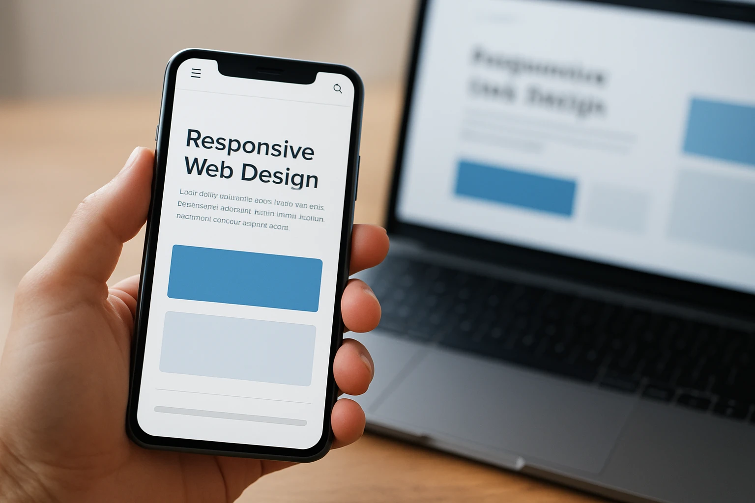
This guide is for companies that want better visibility, stronger reputation signals, and pages that actually hold together on an iPhone, a Pixel, or whatever your customer has in one hand at 8:12 a.m. Which approach should you choose? I’d keep it practical. The best option is rarely the flashiest one — it’s the one your team can launch, keep fast, and still improve three months from now.
Selection criteria for responsive web design for mobile devices
Business fit: does it support visibility, reputation, and conversion goals?
I did not pick these seven options because they look slick in mockups. I picked them because they support outcomes you can feel in a pipeline report: readable service pages, usable forms, cleaner local trust signals, fewer frustrated bounces, better lead quality. That framing lines up with web.dev’s responsive design basics, which sits alongside resources for user experience, performance, accessibility, and identity. That’s a strong hint. Responsive work is not a cosmetic layer. It sits right inside the business engine.
Mobile usability: does it stay readable and tappable on a small viewport?
If text turns tiny, buttons crowd together, or images crush the content, the design failed the moment the viewport narrowed. MDN treats responsive design as part of a broader web development skill set that includes responsive images, CSS layout, accessibility, performance, and Progressive Web Apps. I like that perspective because it matches real life: on a 390px-wide screen, readability and load behavior matter more than clever decoration.
Operational fit: can the team ship, update, and test it consistently?
This one gets ignored until launch week. A design can look wonderful and still be a maintenance nightmare. If every copy change breaks spacing, or each landing page needs a specialist, the system is too fragile. Even practical learning platforms like W3Schools place responsive templates inside website-building resources, which reflects a simple truth: teams need approaches they can actually use, update, and test under deadline.
| Criterion | What good looks like | What usually goes wrong |
|---|---|---|
| Business fit | Clear messaging, visible calls to action, trustworthy contact paths, strong page intent | Pretty layout, weak conversion path, buried trust signals |
| Mobile usability | Readable text, tap-friendly controls, no sideways scrolling, stable layout | Tiny headlines, clipped media, jumpy content, accidental taps |
| Operational fit | Easy updates, repeatable patterns, dependable QA, manageable release process | One-off layouts, brittle code, slow edits, inconsistent testing |
If it only works after desktop design decisions, it is not a strong mobile-responsive choice.
#1 Fluid grids — best for content-heavy sites
What it is
Watch This Helpful Video
To help you better understand responsive web design for mobile devices, we’ve included this informative video from Dani Krossing. It provides valuable insights and visual demonstrations that complement the written content.
Fluid grids use relative widths instead of hard pixel boxes, so layouts stretch and compress with the screen instead of fighting it. When I inherit a long-form service page that was built for a 1200px desktop and then squeezed onto mobile as an afterthought, this is usually the first thing I fix.
Why it made the list
The strongest mobile experiences start with layout fundamentals, not visual tricks. MDN’s CSS learning materials highlight layout topics such as Flexbox and column layouts for a reason — once the structure adapts cleanly, everything else gets easier. Fluid grids keep article bodies, FAQs, sidebars, cards, and forms feeling proportionate from desktop down to phone width.
Best for
Choose fluid grids if your site lives on words: resource centers, blog archives, multi-service pages, documentation, and SEO-heavy landing pages. If people often arrive from Google on a deep internal page instead of the homepage, fluid grids pull a lot of weight.
#2 Flexible images and media — best for visual-heavy brands
What it is
Flexible images and media scale inside their containers rather than forcing the whole page wider than the screen. That can be as basic as sensible CSS, or as advanced as serving different image sizes for different devices. The point is simple: your visuals should adapt without wrecking layout or loading giant files for no reason.
Why it made the list
MDN has a dedicated responsive images topic, and that tells you how central this is. A 2400px hero that crops the product detail, hides text under the fold, or stalls the page on a phone is not helping your brand. It is making your best asset harder to enjoy.
Best for
This is a priority for restaurants, ecommerce catalogs, real estate teams, hospitality brands, portfolios, and any company whose credibility depends on what people see in the first two seconds. If your phone experience feels blurry, cramped, or slow, start here fast.
#3 Mobile-first breakpoints — best for simple, fast-loading pages
What it is

Mobile-first breakpoints mean you design for the smallest practical screen first, then add complexity as space becomes available. Instead of shrinking a desktop layout and hoping for mercy, you start with the essentials: headline, offer, proof, action.
Why it made the list
This approach keeps you honest. The web.dev article points out that responsive design matters even more as mobile internet use keeps growing. When you begin with a narrow viewport, you make better decisions about hierarchy, spacing, and payload. You stop hiding clutter inside “just one more section.”
Best for
Use this for lead-gen pages, local service websites, campaign microsites, event pages, and straightforward company sites where speed matters more than layered visual complexity. If most traffic comes from mobile search or social clicks, mobile-first breakpoints are often the smartest default.
A page is only responsive if the layout still feels intentional when the screen gets narrow.
#4 Flexbox-based navigation and stacking — best for simple marketing sites
What it is
Flexbox gives you a fast, reliable way to stack and align navigation, cards, benefits lists, and form fields across screen sizes. On desktop, blocks can sit side by side. On mobile, those same pieces can flow into a tidy vertical sequence without a full redesign.
Why it made the list
For small marketing sites, you usually do not need an elaborate architecture. You need a menu that collapses cleanly, a hero section that does not overpower the CTA, and content blocks that reflow without weird gaps. Flexbox solves that kind of everyday problem with less overhead than many teams expect.
Best for
It shines on brochure-style websites, short-form landing pages, event sites, and local-business pages with maybe 5 to 15 core URLs. I reach for this when a team says, “We need it live by Friday,” and there is no appetite for reinventing the universe.
#5 Responsive templates and themes — best for quick launches
What it is
Responsive templates and themes give you a working starting point — layout, spacing, navigation, cards, footer, and often basic mobile behavior too. You swap in your branding, tighten the copy, and get a site live without designing every block from zero.
Why it made the list
There is a reason lean teams keep coming back to this. W3Schools says it has offered free tutorials since 1999, says millions of internet users rely on those tutorials every day, and also offers an in-browser code editor plus responsive website templates. That does not make every template great, of course. It does explain why fast-launch teams love them: the runway is shorter.
Best for
Templates work best for startups, temporary campaigns, proof-of-concept launches, smaller organizations, and anyone who needs a mobile-friendly site now, not after a long custom build. Just be careful. Once you twist a template into something wildly custom, the time savings disappear fast.
Templates are best when speed to launch matters more than custom design complexity.
#6 Design systems and component libraries — best for multi-page brand consistency
What it is
A design system or component library is a shared set of reusable parts: buttons, cards, forms, navigation patterns, spacing rules, and interaction behavior. Instead of rebuilding those pieces page by page, your team assembles from approved components that already work across devices.
Why it made the list
This is where growing brands stop improvising. If 12 people can publish to the site, you do not want 12 different ideas of what a mobile card or button should do. A solid component library keeps the brand steady, reduces design drift, and makes QA far less chaotic when the site has dozens or hundreds of pages.
Best for
It is a strong fit for multi-location brands, universities, large service companies, product ecosystems, and teams with several contributors touching content every week. If governance matters as much as launch speed, this option earns its keep.
#7 Testing workflows for accessibility and performance — best for protecting SEO and conversion
What it is
This is the repeatable habit of checking mobile behavior before and after changes go live. Not once. Every release. A real workflow usually includes the same small set of checks:
- Open the page on a real iPhone and Android device
- Run PageSpeed Insights for performance clues
- Review feature support against Baseline
- Check forms, menus, and core actions with accessibility in mind
Why it made the list
MDN includes accessibility and performance alongside layout in its curriculum, which is exactly right. And web.dev — in the article credited to Pete LePage and Rachel Andrew — points readers toward resources like PageSpeed Insights and Baseline. That’s the grown-up view of mobile responsiveness: not just “does it fit,” but “does it load, work, and stay usable under pressure?”
Best for
If your site depends on organic traffic, paid landing pages, high-intent forms, product pages, or checkout flow, this belongs on your shortlist immediately. A beautiful mobile page that loads poorly or fails basic accessibility checks still costs you trust and revenue.
A beautiful responsive site that loads poorly on mobile still costs trust and conversions.
How to choose the right option
Choose by team size and internal skill level
If one marketer and one generalist developer run the site, start simple. Flexbox-based layouts and responsive templates are usually safer than a full-blown system. If you have a designer, front-end support, and a content team publishing weekly, fluid grids and mobile-first breakpoints make more sense. If multiple departments touch the site, move toward a component library and formal testing. You are not choosing the most advanced option. You are choosing the most maintainable one for your actual team.
Choose by launch speed and update frequency
Launching in two weeks? Do not overengineer. A template or a lean Flexbox layout can get you live faster and still look sharp on a phone. Updating pages every week? Then fragile one-off sections will punish you later. Common best practice still holds: the simplest maintainable option beats the clever one that nobody wants to touch after launch.
Choose by traffic source and page type
Where does your traffic come from? What pages do they hit first? SEO-heavy service pages usually benefit most from fluid grids, readable typography, and solid testing. Paid traffic to a short landing page often does best with mobile-first breakpoints and tight Flexbox stacking. Visual brands need flexible media near the top of the plan. High-stakes pages — product detail, booking, contact, checkout — need testing workflows whether you like process or not.
| If this sounds like you | Start with | Add next |
|---|---|---|
| Small team, fast deadline, under 15 pages | #5 Responsive templates and themes | #4 Flexbox-based navigation and stacking |
| Content-heavy site with search traffic | #1 Fluid grids | #7 Testing workflows for accessibility and performance |
| Visual brand with lots of media | #2 Flexible images and media | #3 Mobile-first breakpoints |
| Paid campaign or lead-gen landing pages | #3 Mobile-first breakpoints | #4 Flexbox-based navigation and stacking |
| Larger organization with many contributors | #6 Design systems and component libraries | #7 Testing workflows for accessibility and performance |
If the team cannot maintain it after launch, it is the wrong option regardless of how polished it looks.
That wider lens matters. web.dev keeps responsive design tied closely to user experience and performance, while MDN groups it with accessibility and performance too. That is exactly how you should evaluate your decision. Not by trends. By whether people can reach, read, trust, and act on the page without friction.
What Wins on Mobile in 2026
Key takeaway: mobile responsiveness is a business decision, not just a design tweak
The best choice is the one your team can launch fast, keep fast, and improve without drama.
The best mobile experience is the one users do not have to think about.
Next step: audit one high-traffic page on a phone today
Treat responsive web design for mobile devices like a revenue decision — open your busiest page on a phone, try to read and tap with one hand, and note every snag. What would your customers fix first if they stood beside you and watched?
Build Better Mobile Experiences With Internetzone I
Get mobile-responsive web design plus search, ads, eCommerce, and reputation support that helps companies strengthen visibility, trust, traffic, and conversions.