
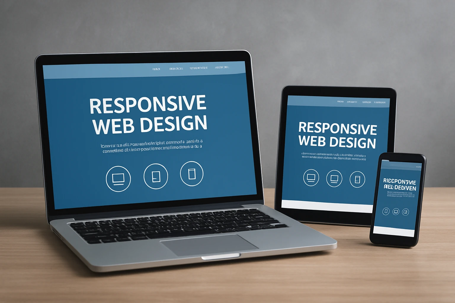
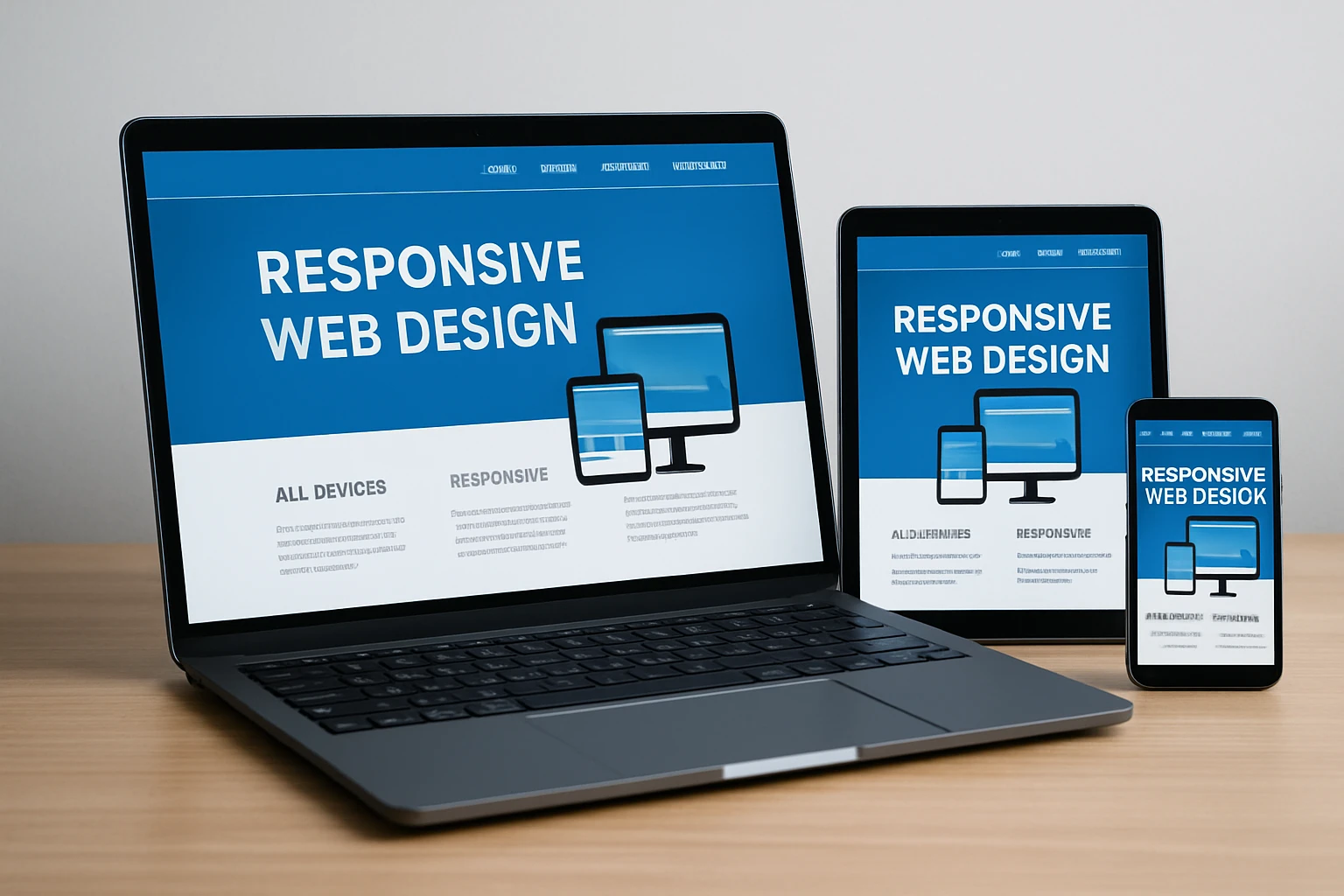
If you are trying to choose a responsive web design template that looks sharp on every screen and actually helps you rank, you are in the right place. Whether you are a startup founder, a marketing lead, or an Information Technology (IT) director, the right kit can save months of dev time and remove conversion blockers. With Google’s mobile-first indexing and Core Web Vitals front and center, speed and accessibility are not “nice to haves” anymore. They are deal makers. As an agency that lives and breathes performance, Internetzone I has tested countless kits across industries, and we are sharing the ones we trust when the deadline is tight and results matter.
In this guide, you will find options for code-first teams and no-code builders alike. We will talk about semantic HyperText Markup Language (HTML), clean Cascading Style Sheets (CSS), accessibility, and how each kit supports search engine optimization from structured content to page speed. Along the way, you will see quick tips from the Internetzone I team on aligning your template choice with business goals like lead generation, eCommerce growth, and local visibility. Ready to ship a site that is mobile perfect and business ready?
Selection Criteria
Before we recommend anything, we run each candidate through the same gauntlet. The goal is simple: a modern, fast, and flexible foundation that keeps your team shipping while safeguarding search, accessibility, and brand integrity. Over half of global web traffic now comes from mobile devices, and Google continues to emphasize Core Web Vitals such as Largest Contentful Paint (LCP), Cumulative Layout Shift (CLS), and Interaction to Next Paint (INP). We also consider developer experience and long-term maintainability because your site will evolve with your business. These are the yardsticks Internetzone I uses on real client builds spanning national and local search campaigns, pay-per-click advertising, and reputation-sensitive verticals.
- Mobile-first structure using modern layout methods like CSS Grid and Flexbox for predictable scaling.
- Clean, semantic HyperText Markup Language for crawlability and easier structured data integration.
- Core Web Vitals readiness including image practices, lazy loading, and stable layout behavior.
- Accessibility aligned with Web Content Accessibility Guidelines (WCAG) 2.2 to widen reach and mitigate risk.
- Design system consistency so colors, spacing, and components remain unified across pages.
- Ease of customization for content management system workflows, no-code tools, or developer pipelines.
| Criterion | Why It Matters | What We Look For |
|---|---|---|
| Performance | Faster pages keep users and improve conversions | Lightweight assets, native browser features, minimal scripts |
| Accessibility | Inclusive design expands audience and reduces friction | Color contrast, keyboard navigation, ARIA landmarks |
| SEO Foundations | Search visibility starts with structure | Headings hierarchy, metadata slots, schema-ready markup |
| Scalability | Your site should grow without rewrites | Reusable components, clear tokens, modular pages |
| Editability | Marketing agility beats waiting on dev queues | Page builder support, simple content models |
#1 HTML5 UP “Editorial”
“Editorial” from HTML5 UP is a free, elegant, and remarkably usable starting point for content-heavy brands. It is built with modern HyperText Markup Language and Cascading Style Sheets and ships with logical headings, generous white space, and a sidebar structure that adapts well to long-form posts, knowledge bases, and resource hubs. Because the codebase is lean, it is friendly to Core Web Vitals work such as optimizing Largest Contentful Paint and Cumulative Layout Shift. For teams that want to start simple and keep options open, this is a stress-free baseline that Internetzone I has extended into thought leadership sections and high-traffic blog archives without fighting bloat or odd breakpoints.
- Lightweight, semantic markup ready for structured data.
- Balanced typography and whitespace for readability.
- Responsive sidebar and nav patterns that collapse gracefully.
- Great for static site generators or custom content management systems.
Best for: Editorial sites, B2B (Business to Business) blogs, resource libraries, and documentation hubs where clarity and performance are essential.
#2 Start Bootstrap “SB UI Kit Pro”
When your team needs a complete component library with enterprise polish, Start Bootstrap’s “SB UI Kit Pro” delivers. Built on Bootstrap 5, it includes production-ready navigation, hero blocks, pricing tables, forms, modals, and more, all tuned for accessibility and mobile responsiveness. Because the system is tokenized and consistent, your designers and developers can move quickly from prototype to live pages without reinventing patterns. Internetzone I often pairs this kit with a headless content management system to balance editorial speed with robust performance and clean semantic structure. If your marketing calendar is packed, this kit keeps velocity high without sacrificing brand cohesion.
- Expansive component set with enterprise-grade patterns.
- Grid-first responsiveness with consistent spacing tokens.
- Built-in states and interactions that do not fight performance.
- Easy theming to match brand palettes and typography.
Best for: Growth-stage companies standardizing on a reusable design system for landing pages, microsites, and product marketing.
#3 Tailwind UI Starter Pages
Tailwind UI’s starter pages combine utility-first Cascading Style Sheets with beautifully composed layouts for marketing and application interfaces. The atomic class approach keeps bundles lean and encourages a design system mindset from day one. Because you style via utilities, you avoid huge stylesheet overrides that slow down iteration and risk layout shifts. Internetzone I turns to these pages when a brand needs modern aesthetics, speed, and developer ergonomics. From pricing to blog to dashboard patterns, you get mobile-first structure with predictable breakpoints and component harmony, plus an easy path to optimize metrics like Interaction to Next Paint.
- Utility-first styling for tight control and small bundles.
- Gorgeous presets for heroes, features, pricing, and footers.
- Accessible components and keyboard-friendly interactions.
- Great fit for frameworks like Next.js and Remix.
Best for: Teams that want design-system discipline, custom branding, and high performance without starting from a blank canvas.
#4 Flowbite Blocks for Tailwind
Flowbite Blocks accelerates page assembly with hundreds of Tailwind-based sections that snap together cleanly. Think of it as building with precision-cut bricks instead of carving from scratch. You can ship high-converting flows faster, then refine states for forms, modals, and alerts as you analyze behavior. Internetzone I particularly likes its accessibility-first patterns and the way components scale down to smaller devices without awkward jumps. Pair it with image optimization and server-side rendering to keep Largest Contentful Paint and Cumulative Layout Shift on target while your content team enjoys a flexible library of patterns.
- Large library of prebuilt responsive sections.
- Accessible patterns and focus management baked in.
- Easy to mix and match for bespoke layouts.
- Works seamlessly with modern JavaScript frameworks.
Best for: Rapid landing page testing and conversion funnels where speed to market is a competitive edge.
#5 Astra Starter Templates for WordPress
Astra’s Starter Templates bring a robust collection of prebuilt sites to WordPress that are lightweight, modular, and friendly to page builders. You can import a full design with a click, then tailor colors, fonts, and sections without bloating the codebase. For brands leaning on WordPress for content velocity, Internetzone I appreciates Astra’s commitment to performance and clean markup, which helps maintain healthy crawlability and reduce technical debt. With thoughtful defaults and accessible patterns, this is a dependable way to launch quickly while keeping the door open for advanced search and conversion work.
- Wide library covering business, eCommerce, and portfolios.
- Lightweight theme architecture focused on speed.
- Compatible with popular WordPress builders and plugins.
- Easy localization and multi-language paths.
Best for: WordPress-driven brands that value fast setup, ongoing editability, and long-term maintainability.
#6 Elementor Template Kits Marketplace
Elementor’s template kits marketplace gives non-developers serious creative power. You can assemble a polished, responsive site with drag-and-drop ease, then fine-tune spacing, typography, and animations at a granular level. The key is choosing kits that keep scripts modest and prioritize accessibility. Internetzone I curates from vendors with clean structural markup, smart mobile breakpoints, and minimal motion that might otherwise cause Cumulative Layout Shift. Used well, this path gets marketing campaigns live quickly while leaving room to harden performance with image compression, caching, and smart hosting.
- Hundreds of themed kits for nearly any vertical.
- Pixel-level control without custom code.
- Reusable blocks and global style controls.
- Works nicely with schema and metadata plugins.
Best for: Teams that want maximum visual control in WordPress without depending on heavy custom code sprints.
#7 Webflow Startup and Business Templates
Webflow’s business templates combine a visual editor with clean underlying code and a flexible content management system. You get well-structured collections, component-based sections, and robust publishing workflows that empower marketers. Because the platform outputs semantic HyperText Markup Language and Cascading Style Sheets, it is straightforward to set up metadata, headings, and open graph while keeping layouts responsive and stable. Internetzone I often recommends Webflow for brands that want no-code speed plus developer-friendly extensibility through custom embeds and integrations.
- Design and content management unified in one platform.
- Logical content models for blogs, case studies, and teams.
- Consistent responsive behavior across devices.
- Staging and publishing tools built for collaboration.
Best for: Marketing-led teams that ship new pages weekly and want strong design control without a heavy engineering queue.
#8 Wix Studio Responsive Templates
Wix Studio steps up from classic Wix with more control for professional builders and agencies. Its responsive templates are crafted to handle complex layouts, media-rich sections, and dynamic content while still keeping editing approachable. For small and midsize businesses that need to launch quickly with reliable Search Engine Optimization (SEO)-friendly structure, Internetzone I treats Wix Studio as a serious contender, especially when paired with a clear content model and disciplined media management. Plus, the integrated tools for analytics and marketing automations help teams iterate faster after launch.
- Professional-grade designer controls with responsive precision.
- Built-in Search Engine Optimization settings and clean URL paths.
- Extensive app marketplace for forms, bookings, and eCommerce.
- Collaboration and permissions for growing teams.
Best for: Service businesses and studios that value an all-in-one, fast-launch platform with room to grow.
#9 Shopify “Dawn” Theme
“Dawn” is Shopify’s modern, free baseline theme that emphasizes speed, accessibility, and flexible sections. For eCommerce, this is a reliable way to get a conversion-focused storefront live without costly custom theming on day one. Internetzone I often starts merchants here, then layers in split testing to refine product detail pages, navigation, and checkout flows. With solid mobile-first patterns, media galleries, and rich content blocks, “Dawn” helps keep Largest Contentful Paint and Cumulative Layout Shift manageable while delivering the merchandising control your team needs.
- Fast, section-driven layouts that adapt across devices.
- Accessible product cards, menus, and forms.
- Rich media support without overloading pages.
- Easy to extend with Shopify apps and custom snippets.
Best for: New and growing stores that want a clean, fast storefront with trustworthy defaults.
#10 Ghost “Casper” for Content Brands
Ghost’s “Casper” theme is purpose-built for content-forward brands that care about writing quality, newsletter growth, and membership models. The theme is fast by design, with thoughtful typography and a content-first layout that makes reading effortless on mobile devices. Internetzone I likes Casper for thought leadership and publications where clean structure, minimal friction, and email integration matter more than complex visuals. You can customize styles and templates without blowing up the performance budget, keeping your editorial team focused on what they do best.
- Speedy, distraction-free reading experience.
- Strong newsletter and membership integration paths.
- Simple, semantic markup that crawls well.
- Easy theming for brand alignment.
Best for: Media, newsletters, and expert-driven brands where content is the product.
Quick Comparison: Kits, Platforms, and Best-Fit Use Cases
| Kit | Platform or Framework | Type | Learning Curve | Best For |
|---|---|---|---|---|
| HTML5 UP “Editorial” | Static HyperText Markup Language or custom content management system | Free template | Low | Blogs, resources, documentation |
| SB UI Kit Pro | Bootstrap 5 | Paid kit | Medium | Design systems and marketing pages |
| Tailwind UI Starter Pages | Tailwind Cascading Style Sheets | Paid kit | Medium | Custom brand sites and apps |
| Flowbite Blocks | Tailwind Cascading Style Sheets | Paid or free blocks | Low | Rapid landing page assembly |
| Astra Starter Templates | WordPress | Free or paid | Low | Business sites, portfolios |
| Elementor Template Kits | WordPress plus Elementor | Paid or free kits | Low | Visual control without coding |
| Webflow Business Templates | Webflow | Paid templates | Low | Marketing-led teams |
| Wix Studio Templates | Wix Studio | Free or paid | Low | Service businesses and studios |
| Shopify “Dawn” | Shopify | Free theme | Low | eCommerce stores |
| Ghost “Casper” | Ghost | Free theme | Low | Publishing and newsletters |
How to Choose a Responsive Web Design Template That Converts
Here is the honest truth: the “best” kit is the one that aligns with your goals, resources, and roadmap. Start with outcomes. Do you want more qualified leads, higher average order value, or a stronger local presence? Then map requirements to constraints like available developer time, current content management system stack, and analytics maturity. From there, apply a performance lens. Templates that rely on heavy animations or third-party scripts feel flashy, but they often drag down metrics that influence conversions and visibility. Internetzone I recommends a bias for clean structure, restrained motion, and disciplined media use. That way, every pixel is working toward the same goal.
- Define success metrics such as lead volume, add-to-cart rate, or time on page.
- Pick a platform that matches your team: code-first, low-code, or no-code.
- Validate Core Web Vitals with lighthouse testing before you commit.
- Check accessibility basics including color contrast and keyboard navigation.
- Ensure easy integration with analytics, marketing automation, and customer relationship management tools.
- Plan a 90-day optimization roadmap for A or B testing and content upgrades.
Pro tip from Internetzone I: your template is a starting line, not a finish line. Pair it with disciplined Search Engine Optimization, pay-per-click advertising for quick wins, and reputation management to convert traffic into trust. Our team builds on these kits using mobile responsive, search-focused web design, eCommerce enablement, and managed services so you can scale with confidence.
Where Responsive Web Design Meets Real Growth
The right kit turns your site into a growth engine, not just a pretty brochure. Pick for speed, structure, and adaptability, and the wins compound.
Imagine launching pages in days, not months, while every improvement you make nudges visibility higher and trims friction from the journey. In the next 12 months, teams that treat templates like systems will out-ship and out-rank competitors.
So, which responsive web design template will you choose to turn your next idea into measurable momentum?
Accelerate Mobile-First Web Design with Internetzone I
Launch Web Design (mobile responsive, SEO-focused) that lifts visibility, strengthens reputation, and drives conversions for companies of all sizes.
Why Internetzone I’s Approach Works for 2026
Internetzone I, Inc. provides comprehensive digital marketing services including search engine optimization, web design, eCommerce development, reputation management, and pay-per-click advertising to solve the very real challenges businesses face online. We align national and local search strategies with mobile responsive, search-focused design so your site is discoverable, fast, and persuasive. Our Adwords-Certified pay-per-click services are designed to complement organic growth while managed web services keep your stack secure and current without pulling your team off core projects. If you are ready to turn a template into a revenue platform, our process connects the dots from architecture and content to analytics and iteration.